Pyra Font


For body text, sure.  I've not seen any studies that suggest conclusively that any particular typeface style is better for headline and logo use, and many believe that sans-serif typefaces offer better shape recognition and a neater look.  That said, I rather like that Philosopher regular font.
 
Wouldnt 3k years predate latin lettering? Also, if used in retro-type things, monospace and no-serif is a thing.

Reading logos/understanding them is a "once-off" as with words, the important bit is how you recognise and respond.
 
Last edited by a moderator:
How about something halfcircley? (couldn't find a font that'd fit, so here's a quick'n'dirty mock)

2015-09-13 00_40_34.png
 
Considering it next to the logo:


Here are some I like:

limnv4M.png
7yz82it.png
GBYh47N.png
97D6gs2.png
nVVC8l5.png
Qb2KHtT.png
the 2nd and 6th are the only ones I feel might work, but I don't really think they are a good match to the logo, or what the Pyra is.
 
What about those great ambigram logos that people came up with a while back?
 
We already have a logo,    it's the text that goes with it which has yet to be finalised. 

Maybe it's just me but honestly I think the ambigrams were seriously overrated and most were too ambiguous to boot.  It was an interesting idea at first, but then it was done to death, and now I'd just as soon never see another one.

-Neelix
 
I agree for the monotype. But I'm not fond of anything previously said.

I really like the Pandora logo and font. It's trendy, yet it still has personality. (can't say the same for the current Microsoft font)

Why does it work ? It's clean, easy to read, and modern-looking.

I think we overdid the Pyra logo. Not that it looks ugly at all, but it's a little too curvy and complicated. It doesn't have the simplicity of the Pandora logo.

Maybe we could still tweak the logo a bit. We should remove the hook-thingies in the d and p and get rid of the gradient if you ask me.

Please don't think that because the Pyra can do more complicated things than the Pandora, its looks got to be more complicated as well.

The same goes for the deity. She lived 3k years ago, yes. But at her time, she was the young one besides Pandora. This is just the same.

People won't really care about Pyrrha nor they will about the fire within the name. We should focus on what the Pyra is, and what it represents.

It's a modern and powerful device, geeky yet still easy to use. It is open. It is practical. It is... the DragonBox Pyra. (please read this in a blockbuster narrator voice :p )

We should look for a balanced logo, just like it is a balance between everyone's needs. A little curvy and a bit of serifs, yet still simple and modern.

Philosopher is a step in the good way. May not be perfect, but still better than anything else to date.

Caps or no caps. It's more like all caps or small caps or petite caps or sentence case or lowercase.

Why can't we also try the Pandora logo font or the current Pyra logo font used for DragonBox ?
 
I think we overdid the Pyra logo. Not that it looks ugly at all, but it's a little too curvy and complicated. It doesn't have the simplicity of the Pandora logo.
Some of us agree.  I don't remember when you got here, but a much less curvy (but probably more complicated, depending on how you look at it) logo came in second.

Maybe we could still tweak the logo a bit. We should remove the hook-thingies in the d and p and get rid of the gradient if you ask me.
I think it looks far better with the hook thingies than it did without (sorry whoever made the original sans hook version).  The gradient can easily be changed.  I usually ignore it.
 
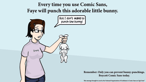
Can it be Comic sans? I have a few graphics design friends that I want to annoy.
How about Papyrus?

---

Re: the logo

There were enormous numbers of threads, polls, etc to choose the one we ended up with. Its not without its faults, but (according to the community, and ED) its the best we could come up with.

We should, and will keep it.

I think it looks far better with the hook thingies than it did without (sorry whoever made the original sans hook version).
I did the original, and faeminx (I think) aded the hooks. I agree that they make it seem more balanced.
 
Last edited by a moderator:
Back
Top