Release PokerTH 0.8.3 'beta'


Looking really good Mr Rob, looking forward to seeing the update on the Repo. Great to see you got the font size a little bigger in the log too.


I fancied myself as a reasonable hold'em player, this game has taught me the valuable lesson that I'm not half as good as I thought I was :rolleyes: .
 
Ah, it's still alive, nice. For me, it is important, that the community cards are big enough, I don't need the Player cards that big at all.


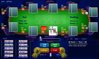
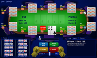
The new Card size is really useful, you even see the old, more detailed Card themes much better, the new simplified themes even more (but I prefer the classic 2 colour card versions). :) The new Background table also looks nice, maybe a little bit to much stuff on the graphic around but at least it looks like a table and the better contrast between background and table focusses more into the center of the scene. You are getting better and better in fitting the stuff into the 800x480pixel we have on the Pandora, really nice. :)
I'll probably leave the cards the current size; pretty much as big as they can be in their current space. And the default cards (2c) and table will be set by default. But some people like the other themes, tossing those in there isn't too much work.


And should anyone want to make a Pandora card back....

Edit: you also made the font in the log window bigger, right? Perfect. ^^


Edit 2: be careful with the custom bidding input window. It needs some space around and some distance from the buttons or you can accidently hit the call button instead of clicking in the small window to manualy change the value (without using the slider)
We are on identical yet opposite pages. I've gotten into the habit of using the scroll bar to select a bid instead of typing one in (online games have a timeout, so you need to be a little quick. Plus hitting the right number keys on the Pandora can be a little difficult (especially in a darker room)) so I tossed the scroll bar on top so I wouldn't accidentally hit call reaching for the scroll bar.


Best of both worlds may be adding a tiny buffer between the buttons.

Looking really good Mr Rob, looking forward to seeing the update on the Repo. Great to see you got the font size a little bigger in the log too.


I fancied myself as a reasonable hold'em player, this game has taught me the valuable lesson that I'm not half as good as I thought I was :rolleyes: .

Will be in the repo soonish. I'm away from my fast internet this Thanksgiving, meaning I have an especially slow upload connection at the moment. Plus there's still a couple more things to do.
 
Pandora Card Back? Hmm, nice Idea maybe I'll try something one day but first, I need some template for this. ;)


It's nice that there can be independent editable Card front and back. ^^


By the way, I often use the slider for setting the bidding value in the input field. I use manual input very rareley but I already had some "accidents" with this. Nothing serious of course.
 
Attached is a zip file with various card backs from different PokerTH themes. I'm obviously not looking for a Pandora logo on them all, but certainly one or two where the logo would work well would be appreciated.

back.zip
 

Attachments

  • back.zip
    114.6 KB · Views: 220
Thanks. They already look pretty good IMHO. ^^


Edit: Some quick Alternations, see attachment. :)

back.zip
 

Attachments

  • back.zip
    64.6 KB · Views: 218
Last edited by a moderator:
Slowly but surely, getting closer to a new PND.


Changes so far:

1. Bigger text size in both the chat and in the log.


2. I'll set the default configuration to not log at all (really no need for it, can be changed in the options menu). I'll also set the default configuration to full screen.


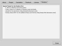
3. Added a Pandora tab to the About PokerTH screen, thanking people who helped (F_Slim and Fusion_Power, plus credits to the people who made the additional theme and cards. I'll also add a list of people who let us use their avatars in game. Let me know if I'm forgetting anyone.

Screenshot-About PokerTH 0.8.3-1.png


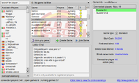
4. Game lobby now fits in 800x480 window.

Screenshot-Internet Game Lobby.png


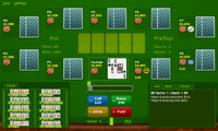
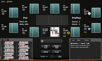
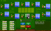
5. Themes fitting nicely, including the default, alternative, and a theme by stixxx (with permission) on DeviantArt.
Screenshot-PokerTH 0.8.3 - The Open-Source Texas Holdem Engine.png


Screenshot-PokerTH 0.8.3 - The Open-Source Texas Holdem Engine-1.png


Screenshot-PokerTH 0.8.3 - The Open-Source Texas Holdem Engine-2.png


6. More card themes and backs, provided by Nobus1967 (with permission) on DeviantArt and Fusion_Power.
Screenshot-PokerTH 0.8.3 - The Open-Source Texas Holdem Engine-3.png


Screenshot-PokerTH 0.8.3 - The Open-Source Texas Holdem Engine-6.png


7. The name of each player is displayed at most seven characters. If more than seven, truncates at six and puts a period. You can have user names as long as normally allowed, and will still be displayed correctly for opponents. Just for our board I've reduced it to maximize card size.


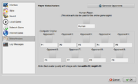
8. Added a button on top of the users in the settings. At the moment, I think we have less than 10 community members who volunteered their avatar in game, so it just picks them and populates what's available, one button click does it all. Should we ever need more than 10, I can program some randomizing in.

Screenshot-Settings-1.png


9. Added about 20 pixels of buffer between the text box for bids and the call and raise buttons.


Thanks for reading. I'll still be adding in some avatars, is there anything else I'm forgetting for features?


Edit: Oh, and now you'll find a link for the repo on http://pokerth.net/download.html. Obviously most Pandora people would go to the repo for this, but extra publicity is always nice.
 
Last edited by a moderator:
Thanks for reading. I'll still be adding in some avatars, is there anything else I'm forgetting for features?


Edit: Oh, and now you'll find a link for the repo on http://pokerth.net/download.html. Obviously most Pandora people would go to the repo for this, but extra publicity is always nice.

For those who have volunteered their avatars, will there be any option in place to not use ones own avatar for an opponent player?


Speaking of which, please feel free to add mine. :)


- Neelix
 
This looks really great on the screens! Can't wait to get my Pandora to try it :D


So far I counted exactly 10 avatars (including me, some from the German forum and Neelix). Still waiting for ED (#11) and I guess you will put yourself in, so we already have 12 ... maybe a few more will join.
 
Sadly, my Avatar looks like Crap on 25x25, even at 50x50 Pixel, so I skip that until I found something better. ^^"


But great work so far, Mr Rob. :) You really have managed to use the available Screen Space most efficient, it looks much better and more clear than before. I like the new graphic themes, especialy the midnight blue Poker room Background.
 
Last edited by a moderator:
Great work Mr Rob, looks like you've taken real care in optimising PokerTH for the Pandora screen.


Looking forward to trying the new PND. :)
 
For those who have volunteered their avatars, will there be any option in place to not use ones own avatar for an opponent player?
Not implemented, yet, but yes, I had the same thought. Just pick your avatar first, then randomly populate the rest from the set of avatars minus you.

So far I counted exactly 10 avatars (including me, some from the German forum and Neelix). Still waiting for ED (#11) and I guess you will put yourself in, so we already have 12 ... maybe a few more will join.
Yep, I'll add myself. Seems odd to send you an image to send me. If I get extremely ambitious I'll add EvilD as an unlockable character? </joking> Also I was completely unaware of any German forums, where are they?!

Sadly, my Avatar looks like Crap on 25x25, even at 50x50 Pixel, so I skip that until I found something better. ^^"
Eh, I think it would look just fine. So including it wouldn't hurt, and you can always find a better when I release another version (and they have betas of 0.9 out, so there'll be new version in the future).
 
Last edited by a moderator:
PokerTH 0.8.3.2, I bid thee release! And out of beta status (if a mod wanted to move this thread out of beta, I'd greatly appreciate it :) .).


A big thank you to Fusion_Power for providing some Pandora specific card backs, F_Slim for helping out and organizing the collection of avatars, and to all those who donated your face for the game.


Changes:


1. Bigger text size in both the chat and in the log.


2. Default configuration: does not log. (enable under configuration). Also, full screen. It will keep your current configuration from 0.8.3.1 if you have it.


3. Added a Pandora tab to the About PokerTH screen, thanking people who helped (F_Slim and Fusion_Power), plus credits to the people who made the additional theme and cards. I'll also added a list of people who let us use their avatars in game.


4. Game lobby now fits in 800x480 window.


5. Themes fitting nicely, including the default, alternative, and a theme by stixxx (with permission) on DeviantArt.


6. More card themes and backs, provided by Nobus1967 (with permission) on DeviantArt and Fusion_Power.


7. The name of each player is displayed at most seven characters. If more than seven, truncates at six and puts a period. You can have user names as long as normally allowed, and will still be displayed correctly for opponents. Just for our board I've reduced it to maximize card size. I realized this was dumb, if the names are too long now they just appear underneath the card, almost identical to abbreviation.


8. Added a button on top of the users in the settings. Click it, and it will generate a list of opponents drawn from Pandora community members. If you select your avatar first, your avatar cannot be chosen as an opponent.


9. Added a item in the select avatar screen strictly for Pandora users.


10. Added about 20 pixels of buffer between the text box for bids and the call and raise buttons.


Go forth and test! It can be found in the repo.
 
Last edited by a moderator:
I only got them yesterday evening, basically last minute. But still in time, so you're in :)


As Mr Rob said: there will be further updates, so if you want to join with your avatar, you can still do so. Just send me a PM or look out for the next "send your avatar" thread.
 
I did a quick test and it looks very good so far. :) Even the old Card Themes look better now and the bigger font in the log windows is a real improvement, same for the backgrounds and the Pandora community Player button. I only miss a graphical preview of the card backsides, like it is done with the front and background themes. In my short test I only found the file view.
 
Yeah, I noticed that, too. I don't think it's really a bug, just a feature that hasn't been built upstream yet. Certainly would be nice to have (maybe 0.8.3.3?) but I was sitting on this build for a while and thought, "heck, let's ship".
 
I played a couple of games with the new version and it is working great.


Adding the community avatars is a great idea, it is fun to see some familiar names as your oponnents.


I will also say that it is VERY hard to beat 10 other players, but that is how poker works...


Thanks for the work on this Mr Rob!
 
Back
Top