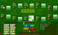
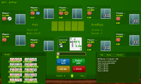
Release PokerTH 0.8.3 'beta'


I already wrote that I have these Folders now...but I had to change the logfile path to the SD manualy. Look at the VVVVVV thread, there I also had to create the hidden save folder manualy, before, Saves didn't work because the program didn't created the folder for it. ;)


Nice Site by the way but I will play offline until I'm better in Poker. At the moment I couldn't live without the "Chance" window for example and I still oversee to much possible card combinations. :D Once, I even overseen my own Full House and I wondered first, why the hell I've won the round. :ph34r:

Though I don't want to sound too obstinate, I still reject your claim, ha ha. :D


To test it, I just deleted my pokerth appdata directory. Ran the game after that, and it created the necessary files and even logged to the log-files directory, without any changes to the configuration whatsoever.


Remember, it's not my PND run script that's doing this, it's all PokerTH's doing, just as it would on any ol' Linux box. Configuration directory doesn't exist? It makes it. Period. If it didn't that be a pretty odd bug upstream.


And yes, not every game is like this (though I never ran into your VVVVVV problem, saves worked just fine for me).


In other news, I've rather enjoyed PokerTH on the Pandora, it's a fun little poker game, made more fun via online play against other humans. In the grand scheme of things, it's really just a simplified version of Wesnoth.
 
Mr_Rob - Many thanks.


I've been away all week-end (guess where) and only just spotted this. Downloading now but too late to play it now.


Would be PM me your paypal details so I can buy you a beer (or two (if you like cheap beer :p ))?
 
Last edited by a moderator:
I dont know if its been mentioned anywhere but for those wondering how to make this game full screen you press the start button :p
 
Or choose "Full Screen" from the Menu. ;)


Yesterday night I again played some rounds PokerTH, short rounds to be honest since I have no patience I usualy go "all in" after 2 Hands. :lol: But of course I also play longer Rounds but I only won 1 match of 9 or 10. ^^" But that's all the Opponents fault of course. :rolleyes:
 
Last edited by a moderator:
start button is easier :p

Wait, I'm confused. How on earth does hitting start make it fullscreen? Does that mean that hitting left-alt on the desktop version also makes it fullscreen (deosn't work)? I'm being baffled by a milkshake. :eek:


I'm currently 2/7 on the online games; it's becoming quite fun.


Last edited by a moderator:
I dont know why it works but it does! have you tested it yourself?


anyway its either the start button or select, or maybe even the pandora button but im sure its start.
 
I dont know why it works but it does! have you tested it yourself?


anyway its either the start button or select, or maybe even the pandora button but im sure its start.
Ha, just tried it, and no luck. I know Ctrl-F will do it, so select-F should also go.


In any case, I take no credit for this feature, as I didn't even know about it. :D
 
Any updates in sight? :) I play it quite alot and the small community cards are always a stab in my eyes, there is some space left for making them bigger. This in combination with the better to read card themes would be a big improvement. ^^
 
Any updates in sight? :) I play it quite alot and the small community cards are always a stab in my eyes, there is some space left for making them bigger. This in combination with the better to read card themes would be a big improvement. ^^

Ha, working on it. I do want to push the rest of the fixes into one update (game and lobby window fixes, avatars, along with new cards and some alignment issues), and just haven't gotten to it yet. Of late I've been playing Tales of Phantasia, which eats up my devel time, ha ha ha. Possibly this weekend? Or maybe next weekend over Thanksgiving here in the states.


PokerTH has also released some beta versions of their 0.9.x series, hopefully that'll be an easy build, too....
 
I have not set my ingame Avatar yet but you had remembered me to do so. :D Game says 50x50px is the best res for the Avatar, I guess they are even smaller in the Pandora Version. I never played an online Match so far but I connected to the lobby just to take a look. This screen really is to big for the Pandora, I guess it will not be easy to resize it without loosing informations of the Lobby screen. However, good to see that there is some nice online activity with PokerTH. :)
 
I have not set my ingame Avatar yet but you had remembered me to do so. :D Game says 50x50px is the best res for the Avatar, I guess they are even smaller in the Pandora Version. I never played an online Match so far but I connected to the lobby just to take a look. This screen really is to big for the Pandora, I guess it will not be easy to resize it without loosing informations of the Lobby screen. However, good to see that there is some nice online activity with PokerTH. :)

Yep, I'm using 25x25 for the avatars at the moment, and'll probably stick with that size (though there's an odd bug, you actually see the top left corner of the avatar in my version. On the list of things to fix).


As for the game lobby, it shouldn't be too bad. Really the issue is the panels don't resize themselves, just shrink things down a bit (have 6 games shown before you have to scroll, etc) and it should be good.


It just takes time to build and test, which slows me down a bit.
 
If I play online, do the other players see my Avatar also in 25x25 or can I use a normal size 50x50 avatar and the Pandora PokerTH just shows it in 25x25? I don't want to be the "small blind" of the Poker table. :lol:


And do I have to set my Country Flag manualy or will this automaticly displayed in the lobby?
 
The way I understand it, the game should just forward the avatar you chose to the other clients. I've made the avatars in my PND to be 25x25, but if you make and use a larger one, it should be just larger on their ends. Again, it's just an appearance thing on our end of things.


I believe the flag is figured out when you create an account on Poker Heroes. You enter your nation, and the rest is automatic.
 
Ah, thx. I have not made any account yet, I thought it was possible to just join a game over the lobby with my nickname. Of course, a real account makes sense.


But first, I have to practise more. Sometimes I win against the AI players but I still loose to often. :D
 
Hello all:


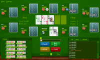
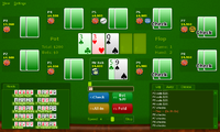
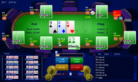
Tiny work for PokerTH trying to optimize the size more. (Just look at my user's seat, I haven't altered the other players yet.)

Nobus four color super big cards of doom:


Screenshot-PokerTH 0.8.3 - The Open-Source Texas Holdem Engine.png


Default four color (I'll include two color cards, too. Just showing the four colors off):


Screenshot-PokerTH 0.8.3 - The Open-Source Texas Holdem Engine-1.png


The biggest thing is that I've truncated the user name to eight characters. If it is longer, I cut off the last one and add an ellipse. With that, the cards are pretty much as big as I can rationally make them.


My main question: Are they too big and we'd rather see the user name in full (shrink the cards down ten pixels and use that whole top line for the player names)? Are things like the current bid and your cash large enough to read? There's a tiny bit of room to make them bigger.
 
Ah, it's still alive, nice. For me, it is important, that the community cards are big enough, I don't need the Player cards that big at all.


The new Card size is really useful, you even see the old, more detailed Card themes much better, the new simplified themes even more (but I prefer the classic 2 colour card versions). :) The new Background table also looks nice, maybe a little bit to much stuff on the graphic around but at least it looks like a table and the better contrast between background and table focusses more into the center of the scene. You are getting better and better in fitting the stuff into the 800x480pixel we have on the Pandora, really nice. :)


Edit: you also made the font in the log window bigger, right? Perfect. ^^


Edit 2: be careful with the custom bidding input window. It needs some space around and some distance from the buttons or you can accidently hit the call button instead of clicking in the small window to manualy change the value (without using the slider)
 
Last edited by a moderator:
Back
Top