comradekingu
Glowing ember
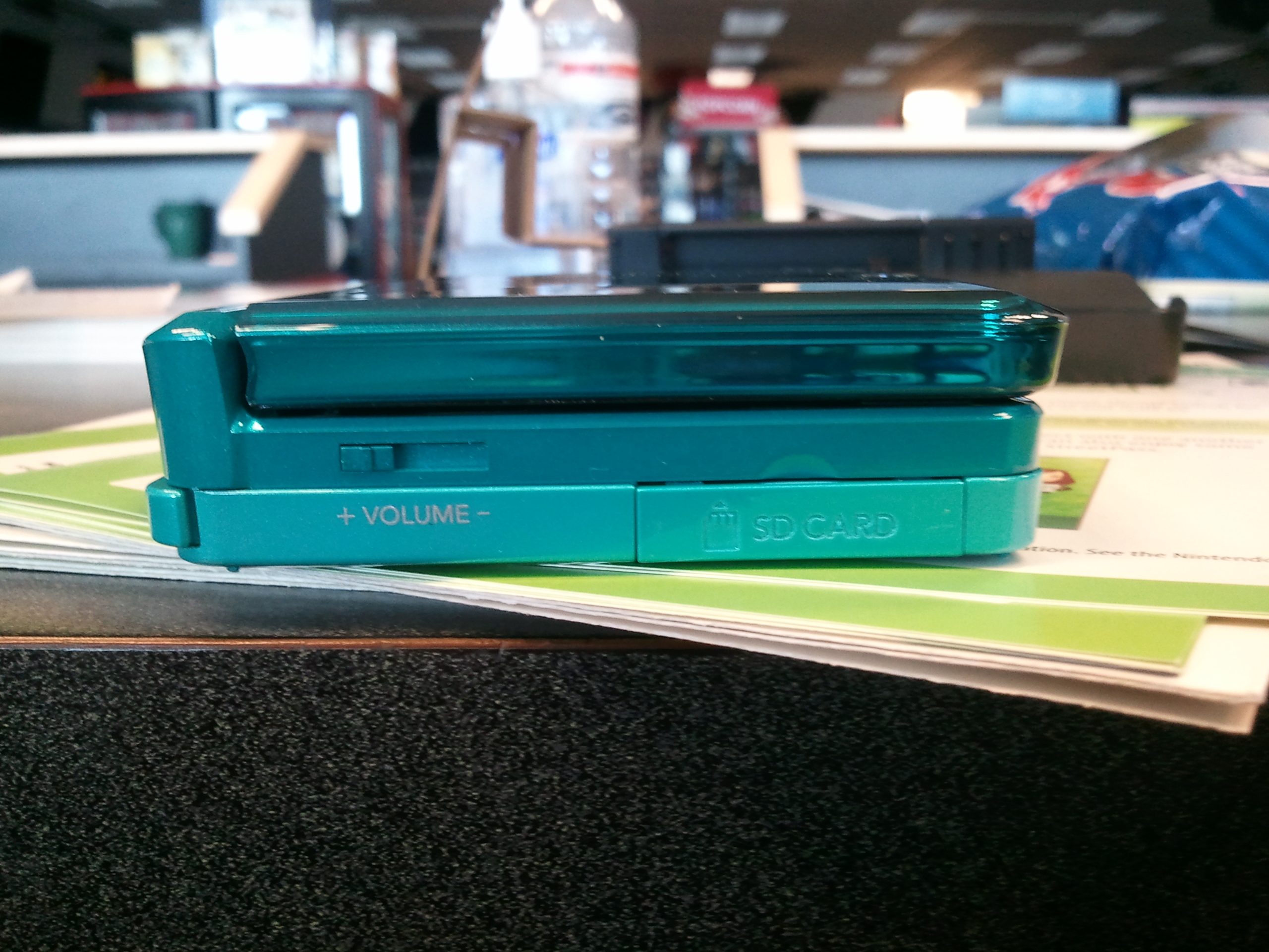
The current lid is slippery, and the thumb is prone to slipping off when opening. The feel to a device is important, as is the intuivitiy of its use.
Personally i keep my thumb in line with where the cross section is, then push it upwards and grinding it against the bezel edge to open it fully.
The latter part feels too edgy, like im touching a knife by its blade without meaning to.
It all works well, except it isnt easy enough.
The issue has been raised, and it has been suggested to make a slot for the nail to slip into, in between the case and the lid.
This however defeats the slight purpose the edge bevel has in protecting against sand getting into the key area. More importantly you need to turn your hand around to do this motion.
The not twisting your hand around and still opening it with the nail

is the only one handed approach, as the device weighs substantially more than the screen, so gravity wont do it. Also opening it one handed away from you with the thumb means opening it away from you.
To mitigate this, more friction is needed on the screen lid.
http://hunting.about.com/od/guns/g/definition-of-checkering-on-guns.htm is one way to do it, but it might chafer against pockets and the like.
An indented kind that is still a positive pattern would do, like this
http://en.wikipedia.org/wiki/Knurling Im thinking the size of the hinge, above where the volume wheel is now, on both sides for ambidexterity.
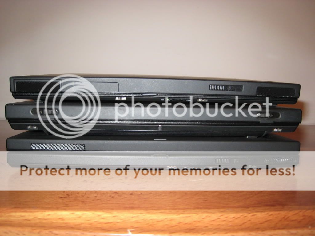
(edit: i just realized this is the thinkpad way of doing it)

However that breaks with the uniformity of the rest of the device, and it breaks up the visual aspect, its not sleek, its robust. It is utilitarian, but is it in essence a needed feature?
What if the case itself was coarse enough to provide friction? It would be less prone to smaller scratches. Also it wouldn't slide so well upside down.
A smooth texture is nice to the touch, so it all rather depends.
Maybe we can return to this when we know more about the case design process, but i wanted to share my thoughts with those who do anyways.
Personally i keep my thumb in line with where the cross section is, then push it upwards and grinding it against the bezel edge to open it fully.
The latter part feels too edgy, like im touching a knife by its blade without meaning to.
It all works well, except it isnt easy enough.
The issue has been raised, and it has been suggested to make a slot for the nail to slip into, in between the case and the lid.
This however defeats the slight purpose the edge bevel has in protecting against sand getting into the key area. More importantly you need to turn your hand around to do this motion.
The not twisting your hand around and still opening it with the nail

is the only one handed approach, as the device weighs substantially more than the screen, so gravity wont do it. Also opening it one handed away from you with the thumb means opening it away from you.
To mitigate this, more friction is needed on the screen lid.
http://hunting.about.com/od/guns/g/definition-of-checkering-on-guns.htm is one way to do it, but it might chafer against pockets and the like.
An indented kind that is still a positive pattern would do, like this
http://en.wikipedia.org/wiki/Knurling Im thinking the size of the hinge, above where the volume wheel is now, on both sides for ambidexterity.
(edit: i just realized this is the thinkpad way of doing it)

However that breaks with the uniformity of the rest of the device, and it breaks up the visual aspect, its not sleek, its robust. It is utilitarian, but is it in essence a needed feature?
What if the case itself was coarse enough to provide friction? It would be less prone to smaller scratches. Also it wouldn't slide so well upside down.
A smooth texture is nice to the touch, so it all rather depends.
Maybe we can return to this when we know more about the case design process, but i wanted to share my thoughts with those who do anyways.
Last edited by a moderator:


