New Case Design

Do you prefer the New Design or the Previous Design

  • I Prefer the new edges

    Votes: 0 0.0%
  • Na let's stick with the old edges

    Votes: 0 0.0%

  • Total voters
    0

That's hawt. Can somebody make up another paper mockup with this new design? I really want to compared it to my DS Lite.
 
After seeing MDave's pic, I think I'll be buying some neon blue paint...

Funny, when the case design was first shown the biggest complaint was the boxy, sharp edges, and now a lot of people prefer that! You can't please everyone :) I'd be happy either way, I think, they both have their merits.
 
MDave said:
I wonder how close I am guessing what its final appearance will be, and guessing where the LEDS are going to be :)

Oh, having the logo painted blue would look pretty swish!
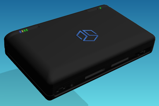
Wonderful!
That will be my first mod :)
 
Last edited by a moderator:
+1 for the round design...

But, played enough around with ds consoles, please make sure is still has some "edges" somewhere...
If the ds is slightly damped or my hands are bit greasy it slips like hell....
Depends also of the "texture" of the case of course...
 
The old one looks like a mini thinkpad which is a good thing. It looks like it means business ... serious business.

The new one looks like a trendy mini child's netbook, either that or a glassers case ... which is meh.

But the pandora team seems to want the pandora to be more popular than geeky these days so i guess the curvy kiddy design it is :(
 
both designs seem somewhat extreme to me. The first one was very serious and edgy. The new one looks like a bulky kids toy to me, though having it in black will make a big difference.

The thing is: I want to take the pandora to university with me and use it as a pda with my homemade tools in the lab. I will get in serious problems if my Prof. thinks it's a N-DS.

I would have loved the shape of my HP nc 8000 - relativly straight edges when looking from the front or the sides but smooth, round corners when looking from above. It looks nice, serious and professional.

Anyway, It would be really nice if we could have a model of the case in any format supported by blender, so we can start doing crazy texturing contests :)
 
(x) Never mind - I'll take it anyway

I would prefer the Blue Pandora Logo - illuminated by blue LEDs, as a matter of course :p (disengageable, to save power).
 
I really liked the box look, however this design looks very sexy as well... I think in the end, this will be sweet...

And thanks for clearing up the color confusion craigix!
 
hede said:
(x) Never mind - I'll take it anyway

I would prefer the Blue Pandora Logo - illuminated by blue LEDs, as a matter of course :p (disengageable, to save power).
Actually, with some fiber optic and a blue film, you could use the light generated by the LCD backlight, as there seems to be a small gap where the ribbon cable comes out of the LCD panel that light shows through (check out the vids of the mk1 pandora's). ;) Now that's efficient!
 
Last edited by a moderator:
Mithrildor said:
Something between it. Not to blocky , but not to round... Like the DS phat.
exactly not square enough to cut you when you reach into your pocket, but also not too round so it slips out of your hands when you reach in your pocket.
 
Last edited by a moderator:
MDave said:
I wonder how close I am guessing what its final appearance will be, and guessing where the LEDS are going to be :)

Oh, having the logo painted blue would look pretty swish!

pandora_blueemblem.png
That looks really cool, but I thought people agreed a light in the lid was cheesy?

It does look gorgeous though, especially with such a soft glow and not the bright 'keep you up at night' glare. It looks like an interesting case mod some day.
 
Last edited by a moderator:
I prefer the new one because my pockets do not take kindly to sharp edges. That and MDave's render of the final Pandora case has an upside-down logo.
Edit: Nevermind, all the renders have an upside-down logo.
 
Username said:
[...]That and MDave's render of the final Pandora case has an upside-down logo.
It's supposed to be like that :) So that people looking at an opened Pandora see it the right way.
 
Last edited by a moderator:
I like the new rounded edges more. The old design looked sharper and more professional, but this one leaves more room for fun, not to mention it will be a lot easier to just slide it in your pocket.

Looking forward to the first shots of an assembled fully-functional unit :)
 
mali said:
Username said:
[...]That and MDave's render of the final Pandora case has an upside-down logo.
It's supposed to be like that :) So that people looking at an opened Pandora see it the right way.

Yeah, I remember first seeing that on a Mac and thinking the same thing... "hey, that apple logo is upside down!" Then I started noticing hipsters in coffee shops advertising their appleness. (Totally joking here, but also totally serious :blink:) I also notice you said "opened Pandora" I think I'll register that domain, openedpandora.org
 
Last edited by a moderator:
How about the new curvy edges WITH thinkpad 'soft touch' plastic.

Seriously - as long as it's robust and NOT pink.
 
I loved the old retro look. I love the new look, and prefer it. Although craigix has said it will be black, white looked good too.
MDave said:
Oh, having the logo painted blue would look pretty swish!
pandora_blueemblem.png


That is soooo cool!
 
Last edited by a moderator:
The old design looks like my Thinkpad R61 which is cool but at the Pandora's size it also looks like a box for a set of jeweler's screwdrivers or alan keys. The new design looks kinda more polished I think.
 
MWeston said:
MDave said:
I wonder how close I am guessing what its final appearance will be, and guessing where the LEDS are going to be :)

Oh, having the logo painted blue would look pretty swish!
That looks really cool, but I thought people agreed a light in the lid was cheesy?

It does look gorgeous though, especially with such a soft glow and not the bright 'keep you up at night' glare. It looks like an interesting case mod some day.


I agree. No lid light!
I'm also firmly in the camp that found the previous look rather sexy but this is all very nice too.
Despite that and my vote I think that if its intended to reach a wider audience on subsequent production runs the new one is likely to be a better choice.
 
Last edited by a moderator:
Back
Top