You are using an out of date browser. It may not display this or other websites correctly.
You should upgrade or use an alternative browser.
You should upgrade or use an alternative browser.
Looking For Design And Branding Suggestions
- Thread starter dflemstr
- Start date
dflemstr
It's a ball.
Yeah, "How?" is the question though.SomeGuy99 said:I say keep the design simple, functional and practical.
Last edited by a moderator:
dflemstr said:Yeah, "How?" is the question though.SomeGuy99 said:I say keep the design simple, functional and practical.
Rip something off. That's how the internet works right?
Last edited by a moderator:
fusion_power
Advanced Member
Just design it like you would like to see a page like this and how you would think it is the most easiest way to handle it.dflemstr said:Yeah, "How?" is the question though.SomeGuy99 said:I say keep the design simple, functional and practical.
Well, I guess this is more complicated, otherwise there wouldn't be so much user unfriendly GUIs out there. I also don't know what is the best way. I only know what is the worst way when I see it. :lol:
Finding the ultimate Usability indeed seems not to be an easy task, except you are Steve Jobs. ^^"""
Last edited by a moderator:
milkshake
Advanced Member
I have started my redesign I have lots of ideas this is just a demo implamentation of my menu bar, it has css3 transitions that only work in google chrome (including the one on pandora) and safari at the moment apparently they will be implament to firefox 4 or 3.7 but anyway have a quick look, by any means its not complete this is only a demo of a menu and doesnt reflect its final appearance.
http://www.liquidfists.com/demo
tell me what you think.
edit: it also works fine in fennec and Arora (looks odd in Arora though) including transitions.
doesn't show gradiant background in midori but trasition works.
it does work in firefox just without nice looking transitions.
http://www.liquidfists.com/demo
tell me what you think.
edit: it also works fine in fennec and Arora (looks odd in Arora though) including transitions.
doesn't show gradiant background in midori but trasition works.
it does work in firefox just without nice looking transitions.
fusion_power
Advanced Member
I can tell you it doesn't work onto Opera at my PC. 
I see white fonts onto white Background, the grey BG is completely missing. ^^"
But because we don't use Opera onto the Pandora, I guess this is no real Problem. (I wonder what Opera does different compared to other browsers)
I see white fonts onto white Background, the grey BG is completely missing. ^^"
But because we don't use Opera onto the Pandora, I guess this is no real Problem. (I wonder what Opera does different compared to other browsers)
dflemstr
It's a ball.
First off, you don't really have to write all of the JS code yourself if you don't want to. Just describe a concept and let me take care of the dirty workmilkshake said:I have started my redesign I have lots of ideas this is just a demo implamentation of my menu bar, it has css3 transitions that only work in google chrome (including the one on pandora) and safari at the moment apparently they will be implament to firefox 4 or 3.7 but anyway have a quick look, by any means its not complete this is only a demo of a menu and doesnt reflect its final appearance.
http://www.liquidfists.com/demo
tell me what you think.
edit: it also works fine in fennec and Arora (looks odd in Arora though) including transitions.
doesn't show gradiant background in midori but trasition works.
it does work in firefox just without nice looking transitions.
Now for some comments:
The menu as a whole looks pretty nice; very Android-inspired
Also, you're using CSS3 for animations, which is problematic for older browsers as you said.
And the thing uses very specific sizes (the toggle button uses pixel size values) which means that if I load a translation for "Menu" like "Översikt" in Swedish, it'll look weird when the text overflows.
Have you considered using jQuery, which will use CSS3 if it's available, and fall back to Java-Script-based animations otherwise?
The jQuery code for the whole animation would be:
Code:
$(function() { //This function will be called on document.onload
  $('#menuToggle').toggle( //Register an event handler for the 'toggle' event
    function() { //When the menu is clicked the first time
      $('#navmenu').animate({
        width: '180px',
        height: '320px'
      }, 500);
    },
    function() { //When the menu is clicked the second time
      $('#navmenu').animate({
        width: '24px',
        height: '100px'
      }, 500);
    }
  );
});
Last edited by a moderator:
milkshake
Advanced Member
i dont use jquery because I feel like i need to know javascript better so coming up with my own method makes me learn, dunno if that makes sense.
well i dont need to use the javascript code anyway i can use css as long as it support by browser but there is no onclick equivalent so i would replace it with.
this is commented out in the css incase you didnt want to use the javascript method.
but this would be reliant on css but would not need the javascript.
although it is a rollover method because its touch screen and most people will use the pen it wont make too much difference.
I like that you looked at my code took me a while to write cos I had to brush up on my web knowledge cos I haven't coded anything for almost a year.
ive got some sketched on my marker pad of my ideas ill finish them off work on them some more then try and take some photos and send them.
well i dont need to use the javascript code anyway i can use css as long as it support by browser but there is no onclick equivalent so i would replace it with.
this is commented out in the css incase you didnt want to use the javascript method.
Code:
nav.sidemenu:hover {width:180px; height:320px}but this would be reliant on css but would not need the javascript.
although it is a rollover method because its touch screen and most people will use the pen it wont make too much difference.
I like that you looked at my code took me a while to write cos I had to brush up on my web knowledge cos I haven't coded anything for almost a year.
ive got some sketched on my marker pad of my ideas ill finish them off work on them some more then try and take some photos and send them.
milkshake
Advanced Member
also you could have it so the menu is there under normal html and if javascript is enabled it will pump in its own attributes etc that would be a work around?
God Ginrai
Godmaster
dflemstr said:@both: I'd really like to see a radically different design. You are both talking about adding this and that detail here and there, but what I'm looking for is a new way to browse the applications in general.
...
- Displaying the applications in a grid instead of in a list with on-hover information bubbles
Hey, dflemstr, how about a design similar to the popular Gmenu for the GP2X? A lot of people liked it, and I think that a website design that mimics some aspects of it could be very successful.
For example:
At the top you could have a bar with important categories and maybe a big search button. (Not a search box, but a button) At the bottom you could have the Website name, and account information. (like number of downloads in your Download Queue, which you could click to pop up your download queue)
If you clicked one of the categories, it would populate the grid based on that category. If you clicked one of the icons in the grid, the icon would move to the top left of the grid and details about the application would show up. This would cover up the grid only. At the bottom of the details would be two buttons, side by side: "Add to Download Queue" and "Download Now". A click on the icon again and/or some sort of back button would then make the details disappear and the icon move back to its place. Now, we don't actually have to go as far as making the icons actually move, we could just make the icon and details pop up over the grid, so don't worry yourself about that.
I will try to come up with mockups when I have time, but I hope my explanation was sufficient to give you an idea of what I'm envisioning.
EDIT: Oh, and I'm still quite partial to the name "The Box" (same with the favicon)
-God Ginrai
Last edited by a moderator:
bzar
A Commando
^ I like this idea
milkshake
Advanced Member
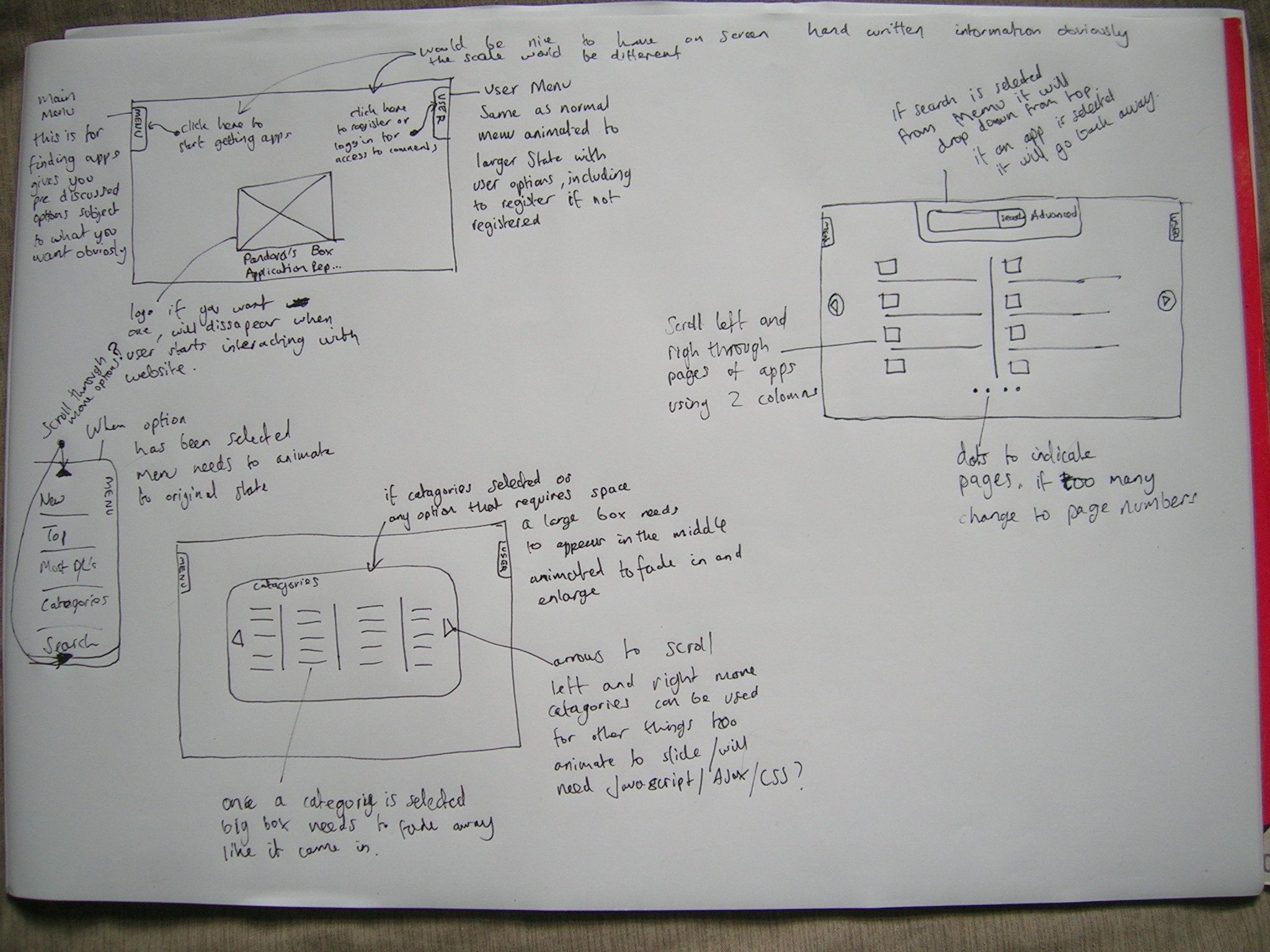
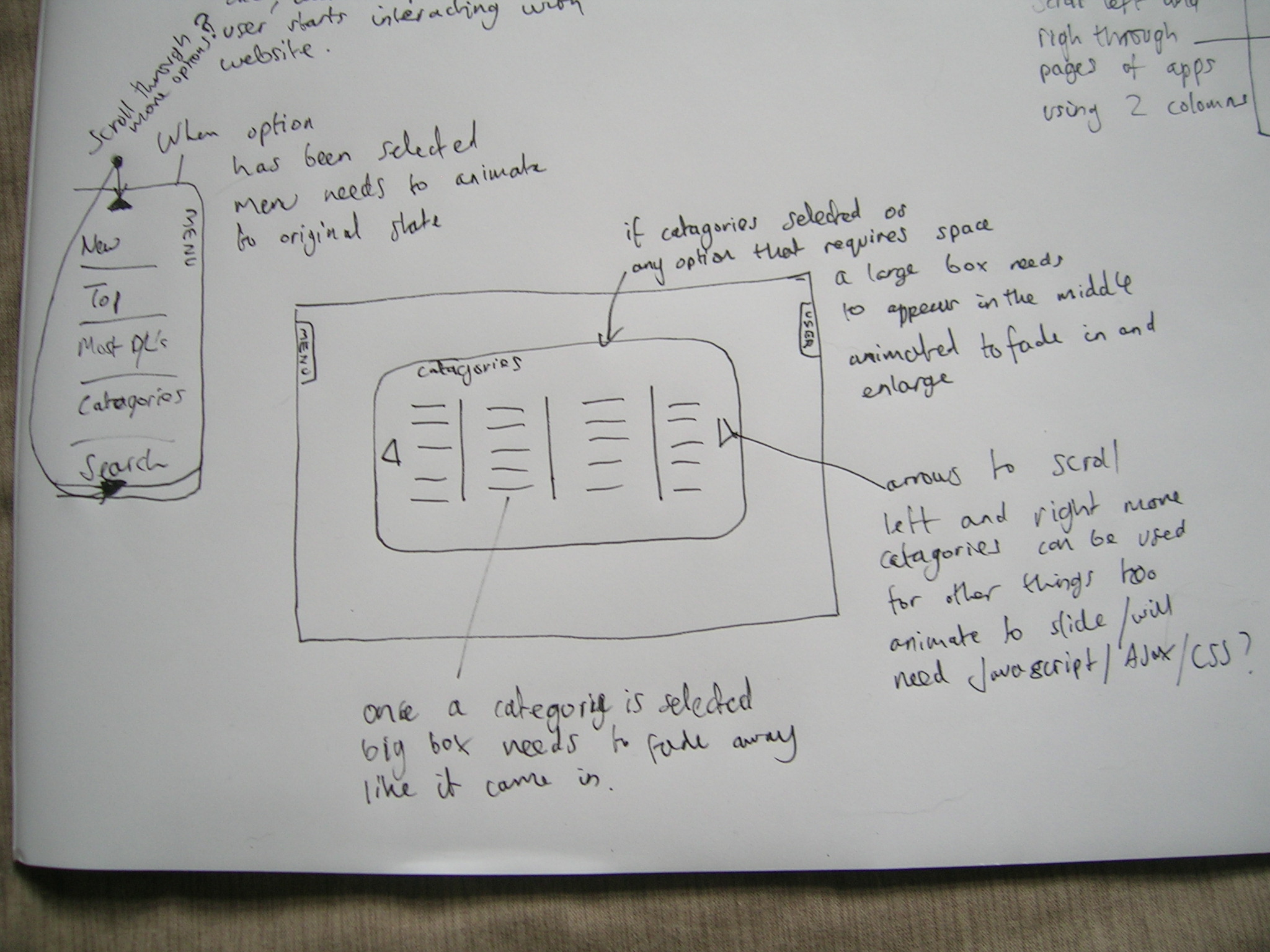
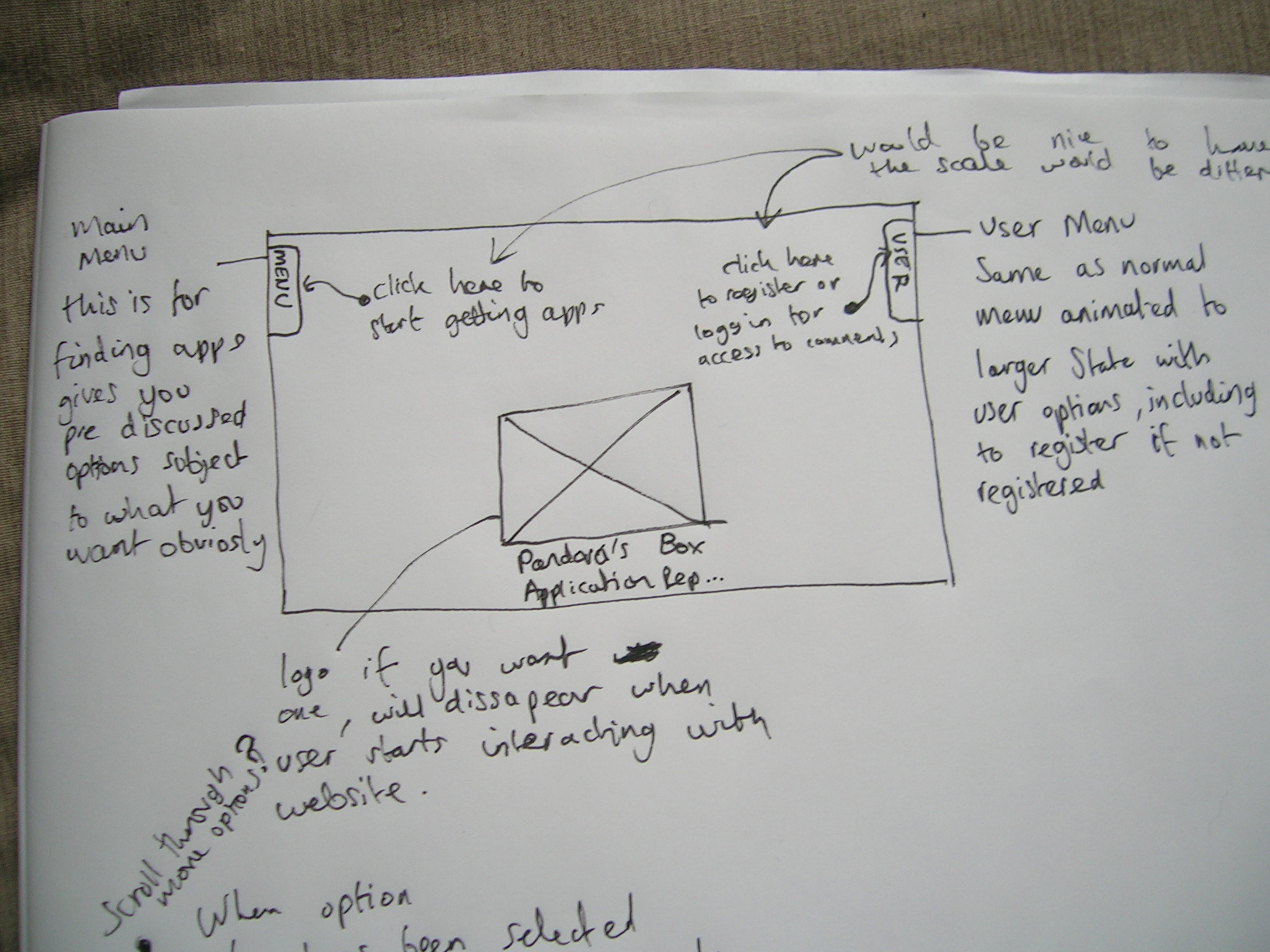
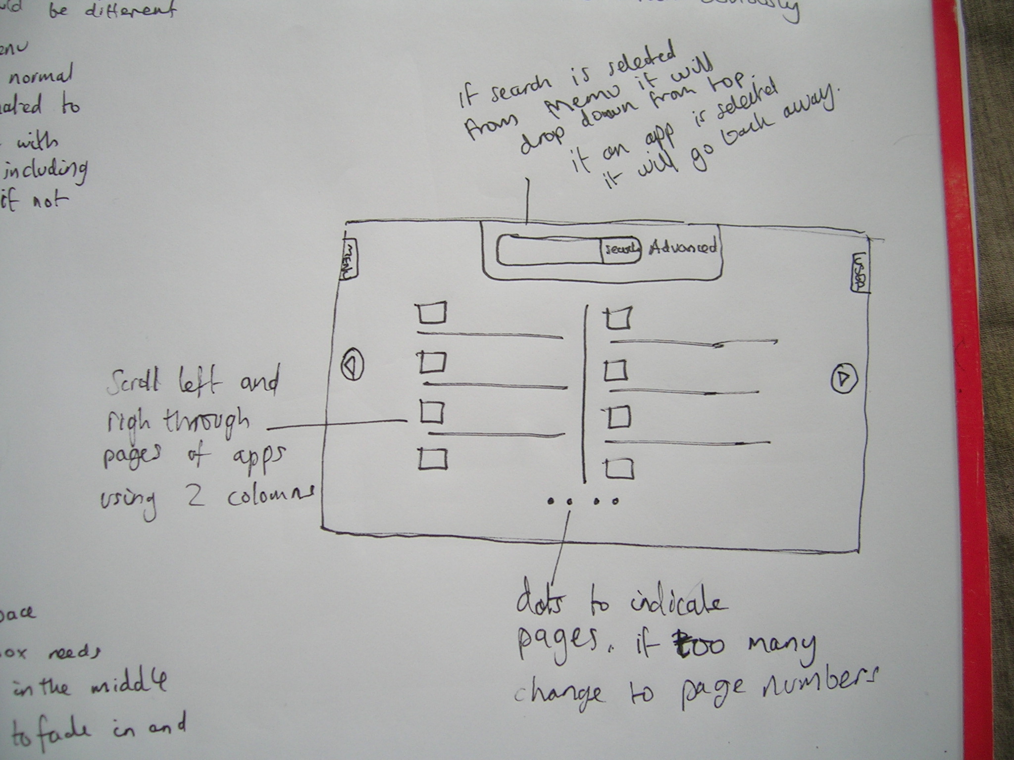
Here is my design (without any theme or colour pallet for the moment).
I drew it out on my marker pad, and scribbled annotations which should explain how it will work.
hope you like, leave comments.
also I've updated my demo to show a menu at both sides one for menu/nav and one for user - see my drawings youll see what im going for.
http://www.liquidfists.com/demo/
ive not altered my code apart from change it to not use javascript although the .js file is still linked.
dflemstr
It's a ball.
Yes. That's actually what I wanted to do eventually (into panorama ofc).LeChuck87 said:is it possible to integrate the box into panorama/minimenu/pangea/..? (in dependence on ginrai's suggestion)
@milkshake I'll have a look at your design now, so yeah. First impressions: the design is a win, but I'm still worried about the side menus; how would I go about showing those for non-JS enabled browsers?
Also, you seem to indicate that you'd like to use page transitions when switching pages (e.g. when the user clicks a menu item, the menu should hide itself and the 'content area' should load the new page asynchronously). This is very much possible, but non-JS browsers would be unusable (unless I do some nifty fall-back hacks, hehe
Wondering about two things that your design doesn't cover:
- How would system messages be shown to the user?
- Where would a loading indicator be displayed?
I'll start implementing your design on a separate branch and test it internally; be right back with more information soon.
@God Ginrai, I like the gmenu's design, but it's a little too compact for my taste. A web page has more space and can be allowed to show more information about apps than an icon and the name of the app. But the design itself can be made similar to what milkshake proposed so we'll see if I can find a compromise.
Last edited by a moderator:
LeChuck87
Member
- Joined
- Nov 9, 2009
- Messages
- 171
- Age
- 38
dflemstr said:Yes. That's actually what I wanted to do eventually (into panorama ofc).LeChuck87 said:is it possible to integrate the box into panorama/minimenu/pangea/..? (in dependence on ginrai's suggestion)
well.... get it done
imo it's far more comfortable to use it that way.
e.g.
traditional way: Menu->Webbrowser->Apps-Store->Download->Close Webbrowser->Use.
in comparison to
Menu->Store-Tab->Download->Use.
but that's just my opinion.
Last edited by a moderator:
milkshake
Advanced Member
what do you think to my scribbles? and ideas?
Edit: ive seen that you have looked and cant wait for the extra info.
I don't know if I fully annotated everything but obviously if you need to ask anything about my annotations or have questions I will answer best I can.

also you don't have to go with the curved edges thing that was just a place holder it can be themed anyway any colour you like.
Edit: ive seen that you have looked and cant wait for the extra info.
I don't know if I fully annotated everything but obviously if you need to ask anything about my annotations or have questions I will answer best I can.
you could have the system messages and or loading indicator either drop down from the top like the search box or you could have something specific for those tasks come push out from the bottom insteaddflemstr said:Wondering about two things that your design doesn't cover:
- How would system messages be shown to the user?
- Where would a loading indicator be displayed?
also you don't have to go with the curved edges thing that was just a place holder it can be themed anyway any colour you like.
Last edited by a moderator:
milkshake said:what do you think to my scribbles? and ideas?
Edit: ive seen that you have looked and cant wait for the extra info.
I don't know if I fully annotated everything but obviously if you need to ask anything about my annotations or have questions I will answer best I can.
Sorry Milkshake... I admire your inventiveness, but those expanding menu things are really off-putting. This is only my opinion, but I don't think a website should deviate from the 'see stuff, click it' design model.
Seriously, when I saw those things on the side of my screen, stress levels rose.
I hope nobody copies the Apple Appstore... that thing is an unnavigable mess and quite aggravating.
Last edited by a moderator:
milkshake
Advanced Member
SomeGuy99 said:Sorry Milkshake... I admire your inventiveness, but those expanding menu things are really off-putting. This is only my opinion, but I don't think a website should deviate from the 'see stuff, click it' design model.
Seriously, when I saw those things on the side of my screen, stress levels rose.
I hope nobody copies the Apple Appstore... that thing is an unnavigable mess and quite aggravating.
The thing is that that's what I started to do but dflemstr wanted something more original and I don't think it requires much though to use the menu popping out and I cant see why it would stress you out??
Last edited by a moderator:
Tempel
Active Member
Slightly off-topic, but just to clarify: dflemstr, you've said that you can support multiple interfaces, selectable on a per-user basis, right? That is, a user can log in and pick from any available interface. Am I remembering correctly? If not, could this get implemented?
Anyways, if that's the case, then you could have any number of interfaces, but the issue right now is making one to be a good default. So something targeted at people who wander over for the first time, or want to download things easily without making an account. So I would advise you designerly types to consider them to be your audience. Interfaces that make it easier for power users or whatever can come later.
Anyways, if that's the case, then you could have any number of interfaces, but the issue right now is making one to be a good default. So something targeted at people who wander over for the first time, or want to download things easily without making an account. So I would advise you designerly types to consider them to be your audience. Interfaces that make it easier for power users or whatever can come later.
milkshake said:The thing is that that's what I started to do but dflemstr wanted something more original and I don't think it requires much though to use the menu popping out and I cant see why it would stress you out??
Originality is over-rated where websites are concerned. I appreciate a cool and creative design as much as the next guy, but a website is primarily something that is used, and should be functional.
For example, you need to consider accessibility issues. Will it support a screen reader? Can somebody using a clicker easily tab between page segments?
Last edited by a moderator:
Similar threads
- Replies
- 51
- Views
- 12K
- Replies
- 8
- Views
- 3K
- Replies
- 13
- Views
- 4K

