Looking For Design And Branding Suggestions


dflemstr

It's a ball.
Joined
Jul 31, 2008
Messages
2,514
Location
Stockholm, Sweden
Website
Visit site
As you should have noticed by now (because of my frequent rants, etc.), I've developed a web application that fills the function as an "app store", aka. a source of PND files and applications.

I started this project a couple of weeks ago, and have been cramming in features ever since then as often as I had the time to. This means that the application has a respectable list of features (only half of which are exposed to the user at the moment), but: it lacks horribly in the UI department; I've basically just abused some CSS tricks that I know and thrown something together that works. People have also been complaining about the project's code name, which is "The Box".

So, I'm now asking anyone who's in the mood to come with design suggestions for me to implement. They can be as shallow as single mock-up images (preferably sized 800×480) or as deep as complete HTML pages with attached CSS and image files.

Don't be shy to suggest radical designs; I can implement anything that is expressible in HTML but it might not look pixel-perfectly like your mock-up.

I'm also asking for a final (product) name for this project. "The Box" is and has always been a code name, and a final name for the released product is needed.

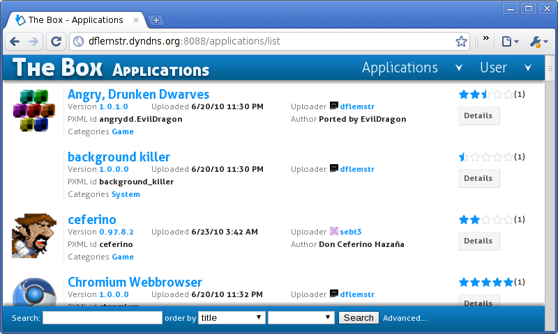
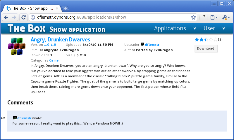
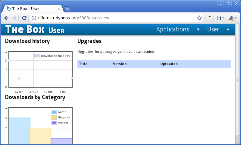
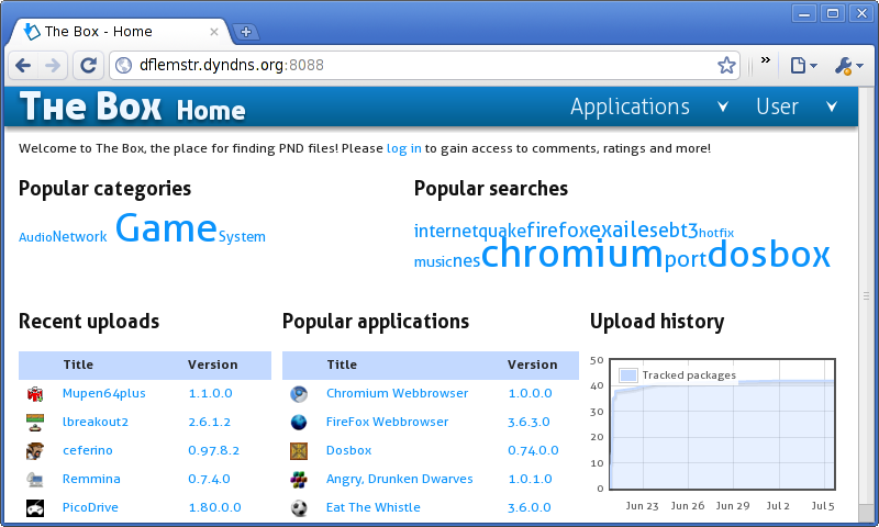
If you haven't bothered visiting the test page at http://dflemstr.dyndns.org:8088/ yet, be informed that the current design looks like this (nothing too fancy):
91i5vl.png

b49r2t.png

wrc6sh.png

s5iv6g.png
Thanks in advance.
 
The fonts are still weird looking (not truetype). :)

Sorry, not very helpful...
 
SomeGuy99 said:
The fonts are still weird looking (not truetype). :)

Sorry, not very helpful...
Could you give a screenshot of what you mean? The fonts *are* TrueType (I provide multiple versions of the fonts: Embedded OpenType (eot), Scalable Vector Graphics (svg), GZipped Scalable Vector Graphics (svgz), TrueType Fonts (ttf) and the Web Open Font Format (woff)).

If you mean the shape of the fonts: yeah, a new design would hopefully use different fonts.
 
Last edited by a moderator:
They look like fonts in Linux with the anti-aliasing switched off. Using XP and Chrome.


theboxh.png
 
Fonts are fine for me, Win 7 + Firefox. I'll also add that even if you don't like the look of it, it's so much more clean and pleasant than the 'official' appstore. :)
 
This is a bug in the Windows font renderer; it doesn't respect kerning attributes. You should enable font anti aliasing and maybe also ClearType® for float-sized fonts to render correctly. I'll look into switching fonts (AGAIN!) so that they work on older systems but I'd like to stick with a font for once.

Anyways, this won't matter if someone comes along with a mock-up that doesn't use custom fonts.
 
I have a concept name/logo dont be too harsh its a concept.

concept.jpg


well I though it was the most obvious, instead of "the box" how about "Pandora's box" i mean its not copyright or anything as its a Greek myth.
and it sounds good.

Pandora's Box : Application Repository :)
 
milkshake said:
Pandora's Box : Application Repository :)

Thanks for that :)

I was about to state the same thing : the box is the best name it could get.

About the design, I'm way happier with the box than the file-archive (which look like some 80s nerd site, no offence intended ED) or the apps-store (sorry craigx). Ok I'm not a big fan of the arrows, but you won't be able to create a design that will please anyone.

About the features, I realy love the box. It will just scale once there are many more pnd around ( I cant see the app-store scaling up...)
 
Last edited by a moderator:
I also found a drawing on google image search which could be good as a logo, I think its been scanned out of an old book.

concept2.jpg
 
Sorry for the 5 second downtime; I switched fonts to make SomeGuy99 happy (Using a font optimized for aliased rendering and small displays; thanks to foxblock (I think) for suggesting it)

So hit [Shift]+[F5] to get the new font data.

milkshake said:
Pandora's Box : Application Repository :)
Yeah it sounds good, but I don't know how I would make it fit... I mean, the name needs to be present in a lot of locations, and making it fit will be a problem (PBAR is *not* a viable alternative in those situations ;) )

Also, the logo will probably follow with whatever theme the app will have; it's not like this is a desktop app with e.g. a desktop icon, so you won't actually need an actual *icon* per-se. The only icon/logo-like thing a web app would have is the favicon (which currently looks like this:
103h8bm.png
) but it should be *tiny* and wouldn't play a too important role in the grand scheme of things anyways. Still: awesome vector art! :p
 
Last edited by a moderator:
so does that mean we are agreed? unless someone has a better idea?

"Pandora's Box: Application Repository"

Where would you need to make it fit? i mean in your current design you have it at the top but im gonna try coming up with an alternative layout too.
but for now you could just use have Pandora's Box written at the top and have application repository in the site title ala..
Code:
<title>Pandora's Box: Application Repository</title>
 
@milkshake, Well there's an issue with people who use tabs (e.g... me), who will be seeing "Pandora's Box: App..." instead of "The Box - Home" in the tab's name field, so if you have multiple tabs open with different listings etc, it could get annoying to find the one you're looking for. (I'm always annoyed with sites that don't pay attention to stuff like this so that's why I'm paying attention to it)

I guess that I could use "Home - Pandora's Box: Applic..." instead, or just plain "Home - Pandora's Box"

Anyways, that seems to be settled for now unless someone comes up with new ideas; now the remaining issue would be the design
 
dflemstr said:
This is a bug in the Windows font renderer; it doesn't respect kerning attributes. You should enable font anti aliasing and maybe also ClearType® for float-sized fonts to render correctly.

I'm not going to do that. Not to sound like a dick, but I shan't be changing my fonts settings for the 0.1% of websites that want to be different.

dflemstr said:
Sorry for the 5 second downtime; I switched fonts to make SomeGuy99 happy (Using a font optimized for aliased rendering and small displays; thanks to foxblock (I think) for suggesting it)

Thanks! If were only to make me happy, I wouldn't have mentioned it.

It still looks the same though.
 
Last edited by a moderator:
SomeGuy99 said:
Thanks! If were only to make me happy, I wouldn't have mentioned it.

It still looks the same though.
You haven't emptied your browser cache (aka you might not have pressed [Shift]+[F5] often enough ;) )
It's definitely not the same, and Adobe BrowserLab™ confirms that ;)

@Javacat, Would you prefer pagination instead? (aka. with a "prev" and "next" button)
 
Last edited by a moderator:
a) I suggest alternating each application's background slightly on listing pages like http://dflemstr.dyndns.org:8088/applications/list

B) ":"s might look nicer for the information bits. Eg "Author Ported by EvilDragon" -> "Author: Ported by EvilDragon"

c) The right-most part (stars and "details") of each line is aligned to the top of it which looks weird to me. I'd suggest vertically aligning it in the middle of each line.

d) US American time & date format which makes absolutely no sense to sane people. ;-)

e) Parts are not working without Javascript.

f) Is there an example description page? I would suggest putting the description into a visible light box (ok, I like boxes) and have space for 3-4 screenshots in a row below.

g) The tag clouds need spaces.
 
SomeGuy99 said:
dflemstr said:
This is a bug in the Windows font renderer; it doesn't respect kerning attributes. You should enable font anti aliasing and maybe also ClearType® for float-sized fonts to render correctly.

I'm not going to do that. Not to sound like a dick, but I'm won't be changing my fonts settings for the 0.1% of websites that want to be different.

did you not read your own post

dflemstr said:
This is a bug in the Windows font renderer; it doesn't respect kerning attributes.

meaning its not the site that wants to be different its just a bug
bug.png

:)
 
Last edited by a moderator:
dflemstr said:
SomeGuy99 said:
Thanks! If were only to make me happy, I wouldn't have mentioned it.

It still looks the same though.
You haven't emptied your browser cache (aka you might not have pressed [Shift]+[F5] often enough ;) )
It's definitely not the same, and Adobe BrowserLab™ confirms that ;)

@Javacat, Would you prefer pagination instead? (aka. with a "prev" and "next" button)

Tee hee. It really hasn't changed! I just cleared my browser cache, even loaded it up in Firefox (for the first time) and no difference.

milkshake said:
meaning its not the site that wants to be different its just a bug

How come 99.9% of websites on the internet are compatible with my bug? None of them asked me to change my font settings. :)
 
Last edited by a moderator:
Back
Top