Looking for a Website designer


Nice, I just noticed this thread...

I can also help out with entering some content if needed in future, html/css stuff.

Looking at the page _wb_ created and linked, with binky's logo...

...If we do decide on an ambigram logo, I'd like to see some css rotation on the logo so as to show off the ambigram-ness of it.

Shameless linkage; http://www.playpandora.com ...like when hover the logo there, but of course would work much better if the ambigram logo was to do that

Just a little nice touch, not too flashy and will be graceful on non-css3 browsers as it will just show as the normal static logo image

Good idea. Added that. But we have to decide on a logo first, the one I put there is just a stub until something is decided.
 
dswt.png


Artefacts gone now.
I like this one as well.

Black and red is a great combination.
 
Nice, I just noticed this thread...

I can also help out with entering some content if needed in future, html/css stuff.

Looking at the page _wb_ created and linked, with binky's logo...

...If we do decide on an ambigram logo, I'd like to see some css rotation on the logo so as to show off the ambigram-ness of it.

Shameless linkage; http://www.playpandora.com ...like when hover the logo there, but of course would work much better if the ambigram logo was to do that

Just a little nice touch, not too flashy and will be graceful on non-css3 browsers as it will just show as the normal static logo image
 
Good idea. Added that. But we have to decide on a logo first, the one I put there is just a stub until something is decided.
Logo won't be ready for FOSDEM, so please put a simple text there so we'll have something until then.

I can also give you access to my server so that you can work directly on the site there.
 
Maybe someone should create a private github for this instead until its ready then anyone can work on it and merge stuff back into the master branch.
 
I suggest it gets built in Bootstrap for responsiveness and wordpress is used as cms.

I can't design my way out of a paper bag but once there is a design I can build it.

Let me know if I can be of assistance!
 
Last edited by a moderator:
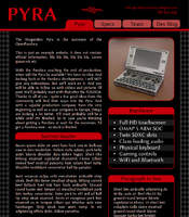
I think Binky's design is a great start. I've made some modifications which I think are much better for a concept design.

fNtdGhw.png


The diamond pattern behind the text is way too distracting, and gradients look unprofessional and tacky more often than not. I also got rid of the multi column layout as it seems better without.

Just my two cents here ;)

Edit:

Took a look at WB's design, which looks great as well. here's a few things I played around with in the css.

I made the header in the box have no border radius on the bottom.

Yv4K4Vf.png


And I made the menu buttons have a gradient background on hover, like so:

7r82Bvc.png
 
Last edited by a moderator:
No no no wordpress please! I don't mind bootstrap though :)
If ED is ok with working in the HTML no Wordpress only makes my life easier. But if he wants a blog attached it would make sense. On the other hand I can easily give him some fil in the gaps html which he can just paste on top everytime he has a new message thus creating a blog :)

Bootstrap makes a lot of sense but the people doing the design should take responsiveness in consideration when making the design. Like thinking in columns (Bootstrap works with 12 columns for instance) and not only design a desktop version but also decide where the content will go to when people switch to a landscape tablet, portrait tablet, landscape phone and portrait phone.

Seeing as FOSDEM is closeby my suggustion would be to make a nice and simple placeholder site and have that up and running on the domain and at the same time have a development site elsewhere and as soon as that is sexy and finished copy it over the other one. 
 
Last edited by a moderator:
Dark theme looks good and is much better for the eyes than the usual plain white websites.

However, I suggest to change the red to something less warez/porny appearence. ;) I still like blue, try different blue tones. Or maybe silver or even goldish?
 
Another doodle:

I really like it, the look is a bit like a dark castle somehow... reminds me a tiny bit of secret of everests medieval :) .
 
No no no wordpress please! I don't mind bootstrap though :)
If ED is ok with working in the HTML no Wordpress only makes my life easier. But if he wants a blog attached it would make sense. On the other hand I can easily give him some fil in the gaps html which he can just paste on top everytime he has a new message thus creating a blog :)
As mentioned in the post, the blog is simply a pulled in forum from official boards. That's already setup (and included in _wb_'s first design).

I'm happy using something custom, as it means it's more secure and we can fit it to our needs.

If you use something like Joomla or Wordpress you need to make compromises for some features and always need to keep it up-to-date because of security reasons. 

Seeing as FOSDEM is closeby my suggustion would be to make a nice and simple placeholder site and have that up and running on the domain and at the same time have a development site elsewhere and as soon as that is sexy and finished copy it over the other one.
That's what I wrote in the first post ;)
 
No no no wordpress please! I don't mind bootstrap though :)
If ED is ok with working in the HTML no Wordpress only makes my life easier. But if he wants a blog attached it would make sense. On the other hand I can easily give him some fil in the gaps html which he can just paste on top everytime he has a new message thus creating a blog :)
As mentioned in the post, the blog is simply a pulled in forum from official boards. That's already setup (and included in _wb_'s first design).


I'm happy using something custom, as it means it's more secure and we can fit it to our needs.


If you use something like Joomla or Wordpress you need to make compromises for some features and always need to keep it up-to-date because of security reasons. 

Seeing as FOSDEM is closeby my suggustion would be to make a nice and simple placeholder site and have that up and running on the domain and at the same time have a development site elsewhere and as soon as that is sexy and finished copy it over the other one.
That's what I wrote in the first post ;)
One of those once in a lifetime situations where a lesser mind (me! before I inadvertily start something) thinks alike with a great mind :)
 
I actually hate web development, but here is mine:

http://cloudef.eu/pyra/


(better use those reset stylesheets and ready styles made by others)
i like this design best so far it onlu looks like a mobile site on a mobile browser and a desktop site on desktop! good bootsrapping!
It's not Bootstrap. Actually better seeing as the css doesn't have any unnecessary lines and no js to load.

So Cloudef just needs content, assets and a color scheme and the job is done. :)

Nice work Cloudef!
 
It's actually just http://cssr.ru/simpliste/ with Snobbish style.

I thought EvilDragon just needs something simple, and putting all the necessary information to single page would be best IMO. And the blog on separate "tab link".
 
^ I think it would be worth putting more (dummy) content on there just to see what happens to the page layout as the window size varies.

I looks a bit rubbish at maximum width to me..
 
Back
Top