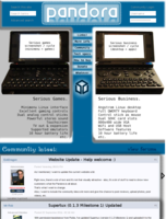
Website Update - Help welcome :)


EvilDragon

Administrator
Staff member
Joined
Mar 4, 2003
Messages
29,986
Age
46
Location
Ingolstadt
As I mentioned, I want to update the current website a bit.


Right now, there's a lot of text and it's not that visually attractive - also, it's a lot of stuff to read to show new customers what the Pandora is all about.


That's what I want to change.


Also, I want to include the community idea a lot more and give the chance to post reviews, upload photos, post videos, etc.


The site is currently a Joomla 1.5 website, though I could upgrade to Joomla 1.7 anytime.


I'm currently looking for some help with the website, as I'm pretty busy with organizing so many other things as well as fixing Pandoras, etc.


If we could create some team, that would probably be great :)


Right now, here's what I'd love to change:

  • Unclutter the website, make it more attractive and clean (less text, more pictures). Quickly show the different uses (Coding, Gaming, Working, etc.) and possibilities (run different OSes from SD Card, connect to TV and USB controllers / keyboards, etc.) to new users. Set the focus on the community idea.
    Also, create more useful sections: Infos for Developers (incl. links to GIT, Wiki, Dev-Tools, etc.), Infos for Users (links to how-tos, firmware images (also older ones)), etc.
  • Add a system which lets the user add review links (to magazines or the boards), upload categorized pictures (i.e. customized desktops, user pictures of Pandoras, etc.), include user-created YouTube-Videos.
  • Improve the current theme. I'd love to have a nice looking theme where the repo, articles and menu looks nicer and more professional


You can add your ideas here or tell me if you wish to help out. :)


Let's work together to give the Pandora the website it deserves :)
 
I'd help, too. I've done some odds and ends PHP/SQL/HTML work in the past, so it's nothing new. Though lots of people could probably say that, and you'll have too much help. Too many hands in the soup, ha ha.


As for suggestions, it might be nice to set it all up as a Wiki. Now I know you're thinking "I want it to look professional and Wiki's don't usually give that feel". But the counter-point would be (as an example) the Battle for Wesnoth site (wesnoth.org). With some nice CSS and layouts, you can get a nice look, plus give authorized access to a few community members who don't need tech knowledge to update the site. You could probably sync the repo's look and feel with that set up fairly easily.


And it would be nice to have central user accounts across the repo, boards, and website (for comments and user reviews), though that may not be logically feasible at this point....
 
I could attempt to make a joomlatheme. Joomla 1.7 would be good though, as it allows better userrightsmanagement.


Well, first I could make a mokup for discussion on monday.
 
Last edited by a moderator:
Also, create more useful sections: Infos for Developers (incl. links to GIT, Wiki, Dev-Tools, etc.), Infos for Users (links to how-tos, firmware images (also older ones)), etc.

The wiki already holds a good amount of useful data, i think the website should not contain any specifics other than links to the wiki which give the details.
 
I think we should make the website more like what you would see in any other community site, don't TRY to sell the Pandora to people with a website, instead make a website that just looks like a community system. Have user's galleries and video up on a sidebar, maybe like one of those mini slideshow.


Also having the latest 3 releases with dates on them would show that the community is active, and new stuff is coming out.


Most recent posts near the top so newcomers can easily see the types of discussions we have on the boards without going into the boards.


A small snippet of the latest official news post, but not the whole thing, just the top and first paragraph or so, then link to the forum post.


Right at the top, it would be great to show the capabilities of the system, not specs that is specific information that should be on a separate page a little deeper in. Show in a picture, some homebrew running, and show a list of emulatable games.


I think by having a small introduction for the Pandora, then instead of showing them in words what the system is about, show them with the community.


I think the most important thing is to avoid making an ad, but make something that the community will use, and use every day.


At the very top banner, have the Pandora name and logo, and have composited images of random applications running on the Pandora, but have the screenshots fade between each other across the top so the user gets a feel of what the Pandora does, by just looking at the banner.


-----------------------------


I would love to help with the banner, I think I have a good idea in my head.


I'll make a mockup of what I think would be a good site tonight.
 
Last edited by a moderator:
But the main purpose of the homepage is to sell the pandora, the community can have it's own comunity pages elsewhere or linked fromthe homepage, though I do like some of the ideas like latest developments and app etc
 
Also, create more useful sections: Infos for Developers (incl. links to GIT, Wiki, Dev-Tools, etc.), Infos for Users (links to how-tos, firmware images (also older ones)), etc.

The wiki already holds a good amount of useful data, i think the website should not contain any specifics other than links to the wiki which give the details.

I don't want to put the DATA on the main site, just quick informations and links.


Right now, it's not easy for a developer to find out how to participate (be it with OS development or apps).

But the main purpose of the homepage is to sell the pandora, the community can have it's own comunity pages elsewhere or linked fromthe homepage, though I do like some of the ideas like latest developments and app etc

RIght, and while I appreciate to have a community section there (for pictures, videos, reviews), the main site should still be a professional product page.
 
Maemo.org is a fine example of what I would expect from the Pandora site.


Tight integration, prominent featuring of applications and clear developer information/communication... it'll show off the finer points of the Pandora's software support and community, and sales of the Pandy should take care of themselves.
 
Maemo.org is not selling a physical product as such (is the os really) so it can't be comparable too much to what the pandora homepage will need but again I do like some of the ideas around their homepage.
 
Proportions are not perfect, but this is my basic idea, I would probably move the link bar to make it horizontal and under the banner, and move the development, and production dates, stats on to the right side. Maybe right above the "gallery" have the support email and forum link.


Also, something like the Beagleboard site would be good, I don't like the way the Pandaboard site is setup though. http://beagleboard.org/
pagelmn.jpg
 
Last edited by a moderator:
Don't forget to optimize it for 800x480 or perhaps even a bit smaller (e.g. 720x400).
 
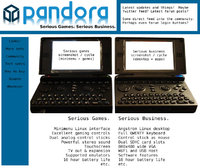
I can't remember who said it [edit: it was F_Slim, over here], but I saw somewhere on the boards that someone said they thought the dual-nature of the Pandora should feature prominently. Advertising it as a "general purpose hand-held Linux" machine may be technically accurate, but it doesn't tell the whole story. Just as advertising it as a "hand-held gaming console" doesn't tell the whole story either.


What I'd like to show to prospective customers is a main page that shows both sides of the Pandora, and highlights features that are important to each, because really, they are different.


Also, I appreciate the sentiment behind the "Ultra portability without sacrificing capability" but I think we could do a little better. As much as I'd like to consider it "ultra-portable" it is a bit big. Even if that bulk does let it get 10 hours on a charge! Maybe, as below, "Serious games. Serious business." Too meme-y? ;)


So the following is just a really quick mock-up and suggestion. I made it 760 wide, so it'd fit nicely on a Pandora's screen with a scroll bar. I'm sure the design could be prettied up, and please don't take any of the text as gospel! I just threw it together really fast. And the photo is horrible, but I think having two Pandoras side-by-side/shoulder-to-shoulder would be a nice element.


websitemockup.jpg
 
Last edited by a moderator:
That idea is nice, yes.


As mentioned, I wanted to emphasize the various usages of the device, so this is a good idea to tell the users right up from the start what it's all about.
 
I like the current Open Pandora Frontpage. It's nice and clean. We shouldn't put to much stuff in the page, at least not on the first page. Overview is important and for example the concept that Darkknight512 posted above is a little bit to much for one site IMHO.
 
I already like the new 'interactive' Pandora on the main page.


Perhaps a superlative version of this to show new visitors all the features.


Anyone good with html5? ;)


Something like this but more 'sparkle' and 'interactive' would definitely show how awesome the Pandora is.


And perhaps the suggestion of having dedicated pages to show the 'game' and 'developer' experience would be neat.


For instance some major softwares/environments/tools that are currently available or in progress.


I bet there are a number of really unique things in these areas that only the Pandora has to offer.


ps; *uhg* @ joomla
 
Last edited by a moderator:
I like the current Open Pandora Frontpage. It's nice and clean. We shouldn't put to much stuff in the page, at least not on the first page. Overview is important and for example the concept that Darkknight512 posted above is a little bit to much for one site IMHO.
I think the problem with the current home page is the way in which it attacks people with technical gubbins and a huge BUY NOW button without really making it clear what it is.
 
ps; *uhg* @ joomla

I've no problem using a different system, but we should at least be able to transfer the old blog posts.

I like the current Open Pandora Frontpage. It's nice and clean. We shouldn't put to much stuff in the page, at least not on the first page. Overview is important and for example the concept that Darkknight512 posted above is a little bit to much for one site IMHO.
I think the problem with the current home page is the way in which it attacks people with technical gubbins and a huge BUY NOW button without really making it clear what it is.

True. We don't really sure what you CAN DO with a Pandora.


You only can find that out by reading a lot of text, which is not appealing.
 
The homepage is obviously the most important page on the site, to make a good homepage you have to be clear of the purpose it is intended to serve. So the question is, what is the purpose of the homepage?


Is it to sell Pandoras? Is it to provide links to information for Pandora owners? Is it to highlight the activities of the community?


My suggestion would be to use it as a sales tool by clearly explaining what the Pandora is to an interested visitor. Prominent links to information & community activities should be included. Trying to provide answers (or links to answers) to the obvious questions a potential customer might ask would seem to make sense. These questions might include :


What is the Warranty on this thing?


How much does it cost delivered?


Why does a Pandora cost £X delivered when I can buy device Y for £Z ?


On a more general note.


Stressing the multi functionality of the Pandora could be done by a series of pages where the title is :


Pandora is ...


These could include :


Pandora is for Hand Held Gaming


Pandora is for Everyday Computing


Pandora is a Media Player


Pandora is for Development


Pandora is for Web Browsing


etc.


On the individual pages a brief overview of how the Pandora excels in the field in question would be given as well as links to demonstrations and tutorials.


Another thing to be clear about is if the site is intended to be a pleasant browsing experience using a Pandora (or other small screened device) there is no right or wrong answer to this but if this is clear from the start then some major design pitfalls can be averted.
 
Back
Top