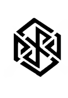
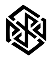
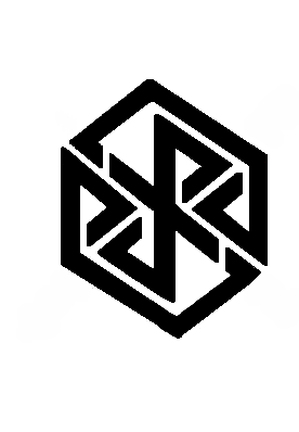
logo idea by comradekingu is logo idea


All the ones so far have the top and bottom corner offset slightly

Also, aren't all 2D projections of cubes hexagons (sometimes with two sides of length 0)?
Yes, but my point is. When you look at 2D projections of a cube, you often will see the cube first. When you look at your revision of the logo, I see no cube whatsoever. All I see is a hexagon.

The Y and R in your version really bother me
 What's wrong with them?

I think they're more readable than when they were merged together.
The only words I can think of to describe how the R looks is "herpaderp". As for the Y, the top part of it is really tiny. (making the bottom of the R really tiny, contributing to its derpiness) Also, the fact that the leg for the R and the leg for the Y don't match up feels really odd when you look at it.

Isn't that a bad thing that you can't read it right off the bat?
Not in the least. Logos exist to be a unique identifier for a brand. As long as it is memorable, and doesn't look like a logo for another brand, then it is correctly serving its purpose.

-God Ginrai
 
Last edited by a moderator:
Established logos work on the already established complexity onto what becomes established. In their developed form they are often mindless. That would not work without the education that goes along with it.

Show me the logo that you think is good on its own accord, and it may be more than the logo you are referencing, you may be forgetting all that "branding" all the connotations, you may not know exactly how well someone else knows how your mind works.

A logo often starts out as a long piece of convoluted text, next to a graphic connotation. Once the graphic is enough, that alone is presented. Cycle the process and you get a more polished version. Foresight is oft sadly lacking, as is evident by these transformations in retrospect.

To me this is systematic ugliness, and that was the best case-scenario...  It is also not the right tune to play along to, it says nothing about insight, it is only disqualifying.

The less of a chance of success by surprise, the better.

Understanding the audience, the material, the process, its all part of the game. And if it is, i can play along. Something that is very comradekingu may not be very common, but at-least i can join the broader mass in realizing this ;)

Likewise, factoring in everyone, for how they are different (read: design by committee), is bound to end up inconclusive, but there is a method to the madness, there is common ground. We are a very homogeneous group, aside from how we all seem to disagree, to the finest of variances, when largely we are of the same opinion.  The very fact that this is a community means we have something in common. Maybe we can part-take in realizing this, tapping into the collective ego that so often monopolized by personal bias. Think about it, as if you are me.  (edit: inception may occur)

Combining something artful with something readable, in a form that is final, isn't easy. As such there is a consideration to be made. (The only known factor is an arbitrary (to the process) word to be worked in, and there is your challenge.) I may take an artistic approach, rather than speculative, but that is not a position of perceived subjectiveness.

As a rationale, rather than making the most out of a subliminal connection, its about emotional attachment for me. Good imagery to me is magic.

What would I want to see in a logo? What do i see in  a logo? What can i do about that?

I know enough about sociology and marketing to know what a cheap design is, i can never unsee that, and i see it everywhere. Its a dual edge sword. Ignorance was blissfully unaware. Combine that with good structural knowledge and welcome to my world, where few things make sense. If im wrong, im none the wiser. The winning move is to play along. Pursuit of knowledge is half the battle.

Now that we have questioned the very premise of even beginning to begin, we can start.

Some limits/compromises are very real, they make the canvas, thats what the canvas is in a sense.

If what one does is pixelart, then your imposed limitation is a matrix of squares. The canvas is set, yet it can be expanded, by implying 3d, by tricking human eyes, etc.

Expanding further, onto a broader horizon yet, is the art.

A logo is all of the above, and whatever other tricks you want to pull out, like fancy symmetry or suchlike.

But saying symmetrical is more better just means your logo will be a circle to a width of your choosing.

I'm not going to explain how it works for me, because if it doesn't for you in the same sense that you become us, it doesn't. Tough but true. Forget egocentricism, forget group mentality. Ego is collective truth.

It is so easy to dismiss something by way of saying it doesn't represent your full pleasing, and it can also be a logical fallacy to delude yourself into thinking the creator is right.

With all of the above established, and understood, it is now narrowed down to a smashing, albeit very theoretical logo.

To help us, there are some restrictions, narrowing down the amount of processing

Logo has to be able to be presented in pure black and white, i can understand wanting to have a perfect geometrical shape outer canvas too, but its not paramount, it is not integral.

I can understand reproducibility from the point of view of having a set shape to start from, however.

Changing what works about the logo is throwing the baby out sans bathwater. It would merely be accidental if that worked, and quite a non plausible event at that.

Its going to be a bit more difficult.

I hope we are all on the same page with this post ;) and that efforts can be made to rectify all the entropy down to a minimum.
 
Last edited by a moderator:
I like 27 and 36, but could they be made more symmetrical so the top and bottom corners are aligned?

This is by far the best logo idea.

It's an ambigram spelling PYRA (and not eYRa or pyrd), it's a cube (referring to the Pandora logo and dragonBOX), and it looks cool and logo-like. Perfect.

Maybe just for fun: could wings and/or a tail be added to make it look like the flying cube logo idea from the other thread? Stylized ambigram-like dragon wings would be very cool on this logo, it would be literally a DragonBox that spells Pyra.
 
Isn't that a bad thing that you can't read it right off the bat?
There's a long history of logos just looking like images and then years later someone going "Oh shit, has THIS been in the logo all this time?"I'm ok with that.
 
Hmm, if ED wants a new logo for Dragonbox I vote for F-Zero's cute design.


I've no idea what I was referring to in my last post, as I think Kingu added more designs after I posted mine. But never mind.


I find Binky's split of the R and Y interesting, but I don't like the extended tail on the A making it another 'PYRD' design in my book.
 
pyraild32.png (32 without)


pyraild32b.png (32 anti-aliasing)

Managed to make a cleaner version with incscape.  Open, select the object, press shift+alt+b, input settings and press ok, now drag the copy thats on top of your object to the side.

The problem is that the R-Y line going from top to bottom is shifted to the right (corresponding to width) with respect to everything else, so everything cant be perfectly parallel. Where would it be best to compensate for that?
 
Last edited by a moderator:
Very nice.  If I had to pick a winner now, it would be comradkingu's logo here.  I'm surprised ED hasn't announced the winner yet.
 
Last edited by a moderator:
Qq5CYp9.jpg


It reads p-y-r-d because of the http://en.wikipedia.org/wiki/X-height

If you look at the top and bottom element its just as non-symmetrical again

Why follow one design language one place, then sin against it somewhere else?

Dont wary the cap width of some of the letters, stick with the same height, dont do glyphs one place and then not somewhere else, thats what readability is.
 
Last edited by a moderator:
Almost all of comradekingu's logo versions have one thing in common: I don't like them, I don't see the cube in them, I can't read them and I end up searching for the hidden Hakenkreuz all the time.

Edit: The last one isn't meant to be an insult, it's just what my mind does when I see the logo, it's very subjective and there is almost no way I can know why (i.e. give information on what would need to be changed to remove that association) - my best guess is that it has something to do with the design being so pointy and angular which I dislike no matter the other associations, it just seems aggressive and unpleasant to me. From there it's not far anymore to Hakenkreuzes which share those associations.

And even without my instinctive dislike of the design, it still looks like a tangled mess to me. It doesn't say anything even if I know what it's supposed to say. It's okay if the message isn't clear to people who don't know it, but if even people who know the message exactly have a hard time figuring out what part is supposed to be what then that crosses the line; it stops being a sophisticated design and starts being a meaningless mess.
 
Last edited by a moderator:
I see the cube, I can read them.  Anyhow, it's a beauty to not see it now but years later you say "Wow!  So that's what it is"  
 
For that to happen the visual nature is of vital importance. If its passable as just an aesthetic visual shape alone, anything else beyond that becomes a bonus.

I think the visuals of a message conveyed captures the mind moreso than most any name, or lettering thereof. And its a lasting impression. Its that connection thats important, not so much how its created.

One is to do with the other, and i don't think the pyra can afford to be mediocre in any sense. Be bold, be different, be good at it. Do what everyone else does well, and then offer something real on top of that.

Edit after t4b edit: I agree with the angles, they should draw to a central point, with that in mind i think the cleanest logo is the one i prefer, over the time ive been able to process it. If i close my eyes thats the one i remember.

Also i envision it to be recognizable to blind people, i can imagine tracing it, what has to do with what i call energy, like fzero did in his animation. You can stop touching just like you can stop seeing, but the abrupt nature of putting a cut where it doesnt belong, I cant unsee.

So more rounded edges, at a size where you can put one finger on the line with the space in between.

Lower entrophy is better for recognition, not letters. Thus sacrificing entropy at the altar of letter comprehension (not readability) is vulgar.

Its the same thing as the dragon heads in the first version here, they only add one element at the cost of one element, connection is dubious. Everything must fit, only then does it make sense.
 
Last edited by a moderator:
I like this one (Bold) but it should have a different cut.
post-2326-0-78254500-1390276933.png


I think the visuals of a message conveyed captures the mind moreso than most any name, or lettering thereof. And its a lasting impression. Its that connection thats important, not so much how its created.
Agreed
 
Last edited by a moderator:
I actually prefer that version of Kingu's logo.

When all the examples were put up originally, that one was my fav.

I like the spacing between the lines being the same thickness as the lines.

...the fact that the lines also contain breaks in, is, perhaps now with recent comments, even more of a good thing.

I like this one most.

I know the solid 1 colour thing is good for some purposes in terms of being a logo, but when not required to be, perhaps colour those 2 lines which are not text so that the text is even more obvious:

2q8wrch.png


25p4sc9.png
 
Last edited by a moderator:
Seeing as how a mod has moved the posts for the arguments, I'll simply repost my request for FZERO that got deleted:

FZERO, can you please create some versions of the colored logos using logo #21?

-God Ginrai
 
Last edited by a moderator:
Back
Top