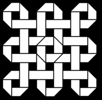
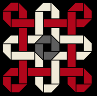
logo idea by comradekingu is logo idea


but the logo is still being designed by community members at his direction, so in a real sense the community is acting as his design team for the logo.
I'll let ED speak for himself on this, but last time I checked with him, I seem to remember he considered the community as a source for where he could get the logo, but certainly not the only one. (just like he is planning to contract a company to make the mold design of the successor, too, and not just asking people here to make it themselves). 

Honestly, if a great logo comes from the community, I'm 100% for it, but so far I haven't seen anything that's really making people say "WOW, nice one" in what has been proposed. If we are serious about a community-based logo then I hope to see much more activity and iteration on the boards. 
 
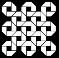
Only two pieces in the last one.  Longpiece and longpiece cut in half.

dragonaid.png


dragonaid4.png
 
Last edited by a moderator:
I think I'd like these better rotated 45 degrees and rounded (either convex or concave).
 
Logos are shaping up quite nicely kingu. I like the highlighted segments within the second version of logo on this page. Current color scheme is good but maybe you could also try a blue/light grey mixture or maybe green tint in place of the grey or red. Other than that I like the way the design is going.
 
With the colours its easier to grasp, in being easy shapes, but also has more depth if you want to look into it.
 
Im hearing a lot of "less complexity". but I am not trying to make a generic logo (like the fontlogo). In doing that you subscribe to the current design trend, which is to make subconscious no detail attention-span overloaded stuff. Arguments for that are cynical in my view, but also i dont think short timespan advertisement brand display is going to be the main target.
 
What is instinctively communicated isn't the finest detail, but rather the visual nature of how the shapes combine, for a variation over how much can be remembered from that initial catch onwards. The argument of being able reconstruct something has to do with HQ, and is a little bit misguided in my opinion. To remember something for how this makes sense, is to grasp its character, not necessarily to understand it fully.
 
Trends change, and as they do, what we have a lot of today will look not only dated, but instead have the opposite effect in not going under the radar, but exposed for what cheap imagery much of it is.
 
Pop culture is not the same as eternal value. Stealing rehashed ideas is the opposite of design, thats following into predetermined patters. One might good at such a thing, but its the art of imitation.
 
 
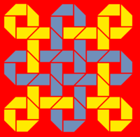
The gray was really to offset the rest, so as not to have the centre as focal attention. If that effect is desired yellow worked very well. There is thought going into most things, like the original palette,

its the dragonaid
 
but with colour i have limited abilities. Need to see it before i can tell, and that means looking in the dark for good options for the most part.
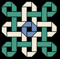
 
dragonaid8pengo.png


The forum software ruins the colours though, and introduces blurriness to make 7KB 6.6...
 
Its more of a general idea rather than an exact science. The thumbnails are more accurate in terms of colour.
 
Last edited by a moderator:
I wonder if how it would look if just that center shape that's blue would be the logo that's put on the case... I mean, it's simple, and I think it looks pretty cool.
 
I absolutely agree that modern trends are to be avoided, but I still feel that it's too busy, and too reliant on colour.
 
Sorry, I don't like the name or the logo.

Node implies something small and stationary and without context. Essentially a null point. Like an empty chair in the middle of a gymnasium.

The device name is DragonBox, so at this point we're discussing the model name. Anything with Dragon in it feels far too repetitive.

The woven logo reminds me of a grade-school construction-paper weaving project. Visually entertaining, but doesn't really jump out as symbolizing anything about this project.
 
You can beat the crap out of a carpet with this logo :)

Beatrug.jpg
 
How about not using a symbolic logo, but instead using the name as a logo?  This means easy to print on the case or wherever ED wants.  This also means less cost to make the logo just use plain an simple letters?
 
There's no such thing as 'just letters'. Font selection, weight, colour, shading, shadows and effects all need considering, just as much as when designing a logo from scratch.


Still, I don't disagree that it might be a good idea, just not on a cost basis.
 
Read firstpost.

Edit: Grench

Node is also the same across the board, its geeky but not in a bad way, it translates nicely to computer device and it begs the question of what greater network (community) it belongs to. Its a device onto itself, but in a greater respect its about the community.
Shenmue

Dragonode.png  Is this what you had in mind?

I have taken care to make something that can be replicated with simple tools (demonstrated by my endavour in the use of likewise gimpskills). its all 90 degree and 45 degree angles.
 
Last edited by a moderator:
Back
Top