Launcher Gui Concept - Fast Loading Simple To Use


DaveC

Internal Development
Joined
Mar 4, 2004
Messages
9,208
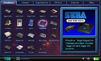
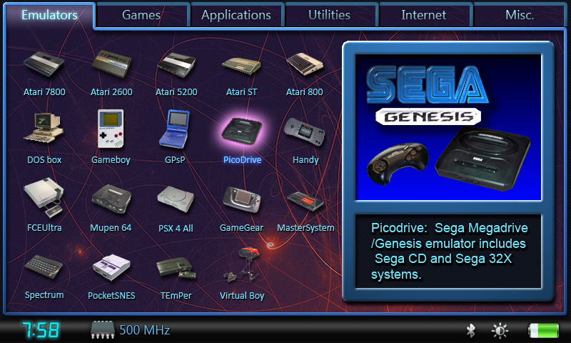
Now that the case design is done I decided to design a simple launcher. I don't pretend to be an artist, so of course it is skinnable including backgrounds. This won't replace others, it is just an alternative. While there are others being concidered I feel that this design is faster to use and has some advantages. It also combines some of the best features of Pmenu with Gmenu2X. It has the description and screenshot like Pmenu, a little "eye candy" doesn't hurt. The difference here is that it has an icon grid for fast navigation. No scrolling through a list one by one. This also gives you a nice view of more of the contents of your card at a glance. The grid system allows fast selection with the D-pad, no need to fumble with the stylus or finger up your brand new screen (of course stylus CAN also be used if you want). You icon is at most 4 taps of the D-pad away per page in the worst case since wrap is supported. It is possible that if you shut down on Emulators for example ONE poke of a stylus could load any app out of 25. If you have more then multiple pages will be available.

D-pad navigation: Use the shoulder buttons (or other configurable ones) to select a tab along the top. Icon panel for that catagory appears where you select your app. D-pad wrap allows you to go to opposite part of screen with one tap. For example if you are all of the way to the right and want something on the left just tap one more tome to the right your cursor appears on the left side of the screen. Press a game button to launch. Gmenu2X users know the drill.

Analog nub navigation: Move the nub the cursor moves across the icons. The faster you move the quicker your cursor moves. You can blast across the screen near your app then let off to easily select your app. Scrollwrap would be disabled in this mode so you don't overshoot your icon. One nub selects tabs across top, the other selects icons. Press game button to launch app.

Touchscreen navigation: Tap the tab you want, tap the icon and go. Arrows appear to go to next/previous page if you have more than 25 icons per catagory.

Oh yeah the bad news: I can't code a byte. This is a concept so if any coder wants to do this I can work with them on it.
menuru.png
 

Attachments

  • menuru.png
    menuru.png
    471.7 KB · Views: 312
It's awesome!
I do like that quite a lot - except the SNES image is not the EUR/AUS console, which looks alot better IMO.
snes9x.png


I'd like to use that - very much! Looks superb!
 

Attachments

  • snes9x.png
    snes9x.png
    1.5 KB · Views: 193
Oh yeah the bad news: I can't code a byte. This is a concept so if any coder wants to do this I can work with them on it.
Well, that sucks, I was getting more hyped the more you were saying. I'd help, but I'm in my first CS class this year, and we're just learning the uttermost basic GUI as is.
 
Yep, totally digging the Gmenu2x vibe. Pmenu could do something very similar if you could just switch the list mode to grid mode. If anyone's interested in coding this, perhaps Cpasjuste's code would be a good starting point. Could be the beginnings of Pmenu2x. ;)
 
Where can I get libpnd , a copy of the pxml spec, and some sample PND files? I'll look into doing this. Should be pretty easy to implement.
One thing though, are the icons in the pnd files going to have colorkey or alpha transparency for sure? you're gonna want to use their icons probably, right? It would suck if some users decided to make their icons be big squares with no transparency, it would really mess up the cleanliness of the UI.
 
lulzfish said:
Only problem is that the clock is on the left and the GBA symbol uses the less cool GBA SP. All the cool kids had Original GBAs. This is a fact.
Nope, the cool kids didn't have a gba at all :D
 
Last edited by a moderator:
hells_dark said:
Well, the panorama UI seems very skinable, maybe it can do something like that :]

I was just about to say the same thing. I think making something like this would be quite easy with panorama. Dflemstr, thoughts?
 
Last edited by a moderator:
B-ZaR said:
hells_dark said:
Well, the panorama UI seems very skinable, maybe it can do something like that :]

I was just about to say the same thing. I think making something like this would be quite easy with panorama. Dflemstr, thoughts?
I'll get right to it, if someone sends me the (background etc) pictures.

*However*, I will not set the icons of the individual emulators. It's the emulator developer's task to set a good icon for his/her emulator, along with a good name etc. Panorama is icon theme aware as well so if you don't like an app's icons, you can just create a new icon theme with replacement icons, and the icons will change system-wide (not just in Panorama).

What I *can* do is that I'll display all applications that have the "Game/Emulator" or "System/Emulator" category in the "Emulators" tab etc (Please refer to the page of all categories). That is easy to accomplish.
 
Last edited by a moderator:
Looks great Dave, simple and straight to the point GUI +1 Approved hehe :)

Man I'm looking forward to some portable SNES,GENESIS,PSX action :D
 
I'm also a big fan of GMenu2X so of course I like this design and the way the Menu is been controlled.
Should work very well onto the Pandora. I would make the fat border of the Info-Window smaller to contain more Text and maybe a smaller Image. I can imagine this window can disappear so the whole screen is filled with Icons (optinal). :)
 
rabidpoobear said:
Where can I get libpnd , a copy of the pxml spec, and some sample PND files? I'll look into doing this. Should be pretty easy to implement.
One thing though, are the icons in the pnd files going to have colorkey or alpha transparency for sure? you're gonna want to use their icons probably, right? It would suck if some users decided to make their icons be big squares with no transparency, it would really mess up the cleanliness of the UI.

libpnd is in the public git (I'm on my phone so can't link it).. Can't be hard to find :)

google for "libpnd hub" to find docs, and it links to the pxml spec

pnd files.. Ca get you some or you can make fake ones with libpnd

I may work on a menu like this as I've been wanting a super minimal one too :)

jeffPhone
 
Last edited by a moderator:
skeezix said:
rabidpoobear said:
Where can I get libpnd , a copy of the pxml spec, and some sample PND files? I'll look into doing this. Should be pretty easy to implement.
One thing though, are the icons in the pnd files going to have colorkey or alpha transparency for sure? you're gonna want to use their icons probably, right? It would suck if some users decided to make their icons be big squares with no transparency, it would really mess up the cleanliness of the UI.

libpnd is in the public git (I'm on my phone so can't link it).. Can't be hard to find :)

google for "libpnd hub" to find docs, and it links to the pxml spec

pnd files.. Ca get you some or you can make fake ones with libpnd

I may work on a menu like this as I've been wanting a super minimal one too :)

jeffPhone

You mention you may consider one "like" this. What don't you like about this one and what would do different?

Did you want the actual graphics still as an example or is this not what you had in mind? I would be interested to know what you thinking of doing.
 
Last edited by a moderator:
Well I know dflemstr can whip out some great code real fast, but I personally like apps a certain way, and so I'll probably be writing my own custom (redundant) apps for a lot of things. I've been planning on writing a menu that did exactly what I wanted, and it just so happens that DaveC's and my ideas are pretty similar. It's quite possible that dflemstr's GUI can be configured to act like I want, though, so it's probably pointless for me to write anything at this point. I might in the future, though, if we can't get any of the other menus quite right.
 
Back
Top