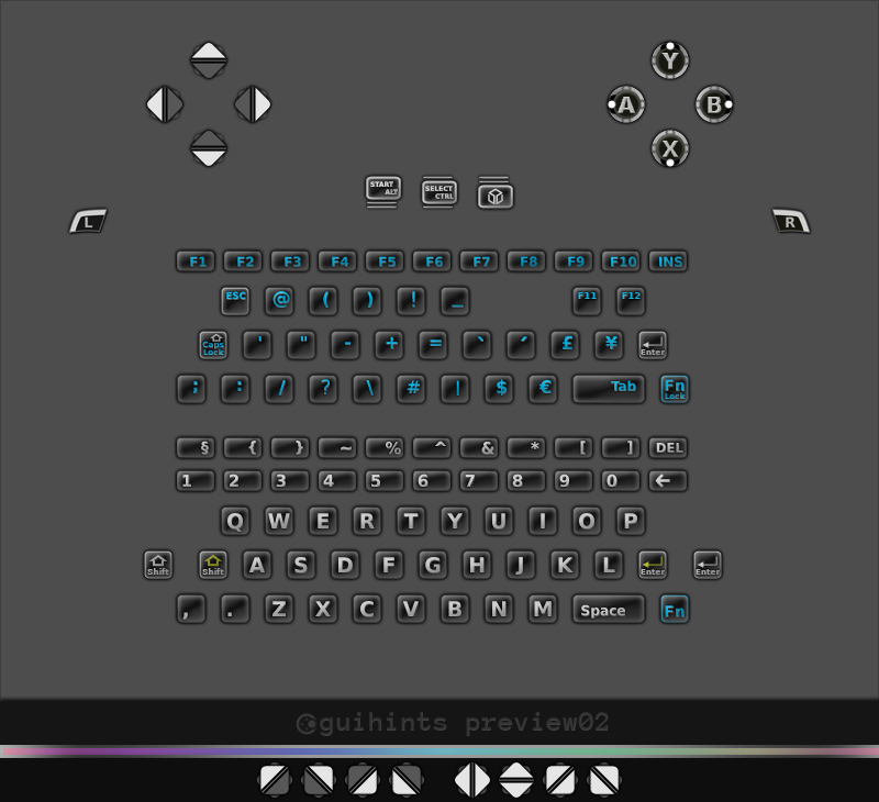
guihints - preview01, 02


Christoph.Krn

Advanced Member
Joined
Mar 17, 2009
Messages
2,119
Location
Germany
guihints-preview02.png


FILE DOWNLOADS:


THREAD UPDATES:

  • 2015-03-28: Because ownership of the gp32x.de domain is in limbo at the time, a backup domain has been deployed. guihints for Pandora - release announcements (via gp32x.de domain) provides access to releases of guihints01 (guihints for Pandora) and, being essentially a hard link to its (currently unavailable) gp32x.de equivalent, will be maintained in the future. Until the ownership of the gp32x.de domain has been secured by a person whom you trust, be wary of downloads via gp32x.de. Just in case, here are the SHA256SUMS of all guihints archives released to date (barring preview versions):
    e9ff2d7dd667083a513fb0871b748cc129df84c9e38445bb622850f04f34fd51 guihints01-0.8.2.0-alpha.zip
    52bc2f4a7c81e87e5d2918da775c734347dc061421e88983ec64d58be061c44e guihints01-0.8.2.0-alpha.src.zip
  • 2013-02-13: This thread is superseded by the thread guihints - device-agnostic discussion, and future news will be published there. The guihints for Pandora are becoming guihints01.
  • 2012-03-15: release of guihints preview02
------------------- ORIGINAL POST BELOW THIS LINE. -------------------Note to moderators: The reason I did not put this thread into "Sound / Bitmaps / Models" is that I do not think it is primarily an image file thread, but rather a usability thread that happens to be all about image files.

------------------------------------------------------------------------
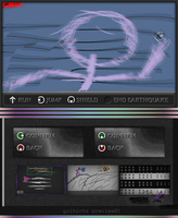
guihints-introduction01.png

* What is this?

'guihints': an attempt at mitigating some usability problems that currently appear to be prevalent in the Pandora's ecosystem, through the use of graphical hints indicating the functions of physical buttons from within the user interface. This document provides access to a preview version (version "preview01") of some guihints as well as supportive information in an attempt to correct potential remaining problems before a final release.

* Problem and solution:

-----Short problem summary: Control schemes (that is, the functions of individual physical gaming keys) often vary across homebrew games ported to or even specifically made for the Pandora. As a result, even though the separate control schemes typically make sense individually, players can become easily confused and/or find themselves at a loss of control as they switch between different games. This problem is most likely to be prevalent whenever a player does not play very frequently (limitations of human memory), frequently plays many different games and/or is accustomed to the layout of other types of controllers (capture error), and/or begins playing a game with a control scheme not well-known to her (overhead from trial-and-error). Previous attempts at mitigating the problem through forms of standardization have failed due to the open nature of the Pandora ecosystem (very shoddy summary of initial analysis).-----

-----Proposed solution: Providing information about mappings of physical buttons to a game's functions from within the graphical user interface potentially has the ability to reduce player confusion by a large degree. Conveying control mapping information through the use of a graphic representation does not exhibit the restriction after which a large percentage of developers is required to participate for a noticeable positive impact on usability to be possible (in control standardization efforts within the Pandora ecosystem, little participation generally appears to be a main inhibitor). Furthermore, when graphical hints that are equal (or bear resemblance) across games are present even in only in a small percentage of games, a raise in general awareness of usability concerns in games where a lack of hints entails usability problems is likely. An additional effect of subsequent improvements in other usability aspects may be possible.-----

guihints take a comparatively sophisticated approach:

  • Created in awareness of at least some of the hallmarks of good icons and bad icons as well as the Pandora screen's pixel density and typical properties.
  • Lack of letters in action button hints (A, Y, B, X) for better natural mapping.
  • Focus on simplicity that reduces interference with a game's atmosphere yet is distinct.
  • Abuse-handling built-in to some degree (can handle some amount of down-scaling, rotation (may change), as well as some distortion).
  • Color-coding can be used to map the functions of action buttons (A, Y, B, X) to game functions, therefore alphanumerical elements can be completely omitted after communication of this mechanic to the player.
* Next steps (and how you can help):
* Step 1:

Tests in real-life environments. This is to check for remaining problems and evaluate the truthness of some usability related metrics, such as which default sizes for guihints to suggest to developers, or what value of brightness to assign to contours and/or highlights. An archive containing guihints in version preview01 is attached to this post, containing several hints for action buttons (A, Y, B, X) (which are most important) and dpad-up (very early version, unlikely to work well in every situation as of yet) to experiment and tinker around with in your software (of course, guihints can also be used in non-games). In case you find one of these hints to look misplaced/intrusive/weird and/or not be easily visible and/or usable in your software, please report. It goes without saying that any other kind of feedback is equally valuable.

* Step 2:

Finalizing guihints for the action buttons (A, Y, B, X); the keys 'Start', 'Select', 'Pandora'; the shoulder buttons; the nubs; as well as the keyboard keys; and creating final sprite sheets. The current goal is to complete the first final version before the end of the Pandora Rebirth Competition (ends March 31st 2012; UTC) for contestants to use in their entries, however this goal may be subject to change since quality takes precedence.

* Step 3:

Creating a guide for developers containing straightforward advice on guihints usage from a usability viewpoint, including cross-game considerations; these will be suggestions only and not mandatory by any means.

* Step 4:

Putting everything on a website for easy access.

(* Step 0: There is a poll in Pandora -> General Talk asking Pandora owners to help determine a suggested minimum size for small guihints: guihints - poll "a-se02" (size evaluation))

--

* Miscellaneous:

* NAQ (Never Asked Questions):

* Why aren't guihints made in a scalable file format, such as SVG?

Because scalable icons are not typically a good thing (at small sizes, having many details does not work very well, whereas at large sizes, having few details does not work very well; this would likely result in scalable guihints not being as easily recognizable at a glance in at least some situations). Additionally, guihints are likely to be displayed at about the same size in different games in either case, therefore suggesting what appears to be a good default size would always appear to be a good idea.

* Why do the image files from preview01 have a size of 40*40 pixels and not, say, 32*32?

The current size of 40*40 pixels was chosen because at that size, if the drop shadow were to be removed, the size of the remaining shadow-less guihints would be 33*33 pixels (32*32 plus some transparency). This means that when guihints (40*40 pixels, as there is no non-shadow version) are displayed alongside more "typical" 32*32 pixel icons, they appear to be about the same size, yet still stand out through the additional surrounding shadow. It goes without saying that an existing current default size of 40*40 pixels does not automatically make discussion about a potentially better default size entirely superfluous.

Bear in mind that guihints scale down quite well. There may later be an additional, much larger version with more details.

* What license is used for guihints?

guihints version preview01 are currently available under the Creative Commons Attribution-ShareAlike 3.0 Unported license. Future versions will most definitely be available under a less restrictive license after some remaining legal questions about license compatibility are cleared. In case no fitting unrestrictive license can be found, guihints will be released into the public domain by the current plan.

* What fonts were used in the image 'guihints-introduction01.png'?

Anonymous Pro in bold and Linux Binolium Capitals in bold.

* Why isn't my question listed here?

Please note that never asking a particular question does not automatically add it to the list of Never Asked Questions. Instead, if something about guihints is unclear, you have to ask your questions which might or might not, alongside their answer, instead be added to a separate list called "Frequently Asked Questions".
* Miscellaneous Miscellaneous:

Text contained within the image 'guihints-introduction01.png': RUN JUMP SHIELD END EARTHQUAKE CONFIRM BACK guihints preview01

Grossly negligent mandatory disclaimer: I am neither a usability expert nor a graphical artist. This post may contain traces of nuts, make you go nuts, or be nuts so important after all.

guihints-preview02.png
 
Last edited:
Wow, read it 2 times and I still don't really get it...


Maybe a short summary would be nice.


How and when will this be displayed and what about apps, that allow remapping of buttons?
 
Wow, read it 2 times and I still don't really get it...


Maybe a short summary would be nice.


How and when will this be displayed and what about apps, that allow remapping of buttons?
These are just graphics. Developers can use them in whatever way they want to tell the user what button will do what. A full set of graphics/sprites is to follow.


edit: "natural mapping", in this context, means that the button that is supposed to be pressed is indicated by a small circle indicating the location of the button, rather than using the respective button's letter.
 
Last edited by a moderator:
I think the idea is that developers can include these icons that tell people which control does which, or the like...


-


Wouldn't it be better to get all the developers using the same controls, rather than the same control explanation system?
 
Last edited by a moderator:
Wouldn't it be better to get all the developers using the same controls, rather than the same control explanation system?
As suggested in the first post at "Short problem summary", this has been tried several times to no avail ( Example: "Standardized Control Hints" ). After all, you can not force every developer to comply.


edit: The primary means of human beings to make sense of the world is vision. Therefore, guihints, if used in a number of games, are likely to increase general awareness of "Why is there no control standard?". The plan is that this may increase usability awareness overall, in effect possibly (hopefully) leading to some kind(s) of de-facto control standard, at least for menus (if not, there will still be hints).
 
Last edited by a moderator:
No, but neither can you force developers to include in-game explanation. If a dev is considering control scheme useability, it might be easier to change jump to 'x' (for the sake of argument) than to build icons into everything.
 
Last edited by a moderator:
No, but neither can you force developers to include in-game explanation. If a dev is considering control scheme useability, it might be easier to change jump to 'x' (for the sake of argument) than to build icons into everything.
Sure, of course you can not force developers to do that. One benefit of using hints is that developers can use the buttons the way they think is best for their applications while still increasing the usability of their games (instead of, you know, leaving their players out in the rain). When I tested a large number of PNDs as I was researching for guihints, I realized that 'PandoraPanic!' and 'Panjoust' (there may be others, but I have not seen any) already have had hints (not these guihints here but others) for a loooong time now, and for a reason.


No one is forced to retrofit hints into games, but there should be some hints available that are supposed to work very well (also from a cross-game viewpoint) for developers to use in new projects. Having hints available doesn't mean that everyone is suddenly forced to stop hoping for developers to change button mappings to a coherent standard.


edit: As long as there is no generally accepted and well-known control scheme standard, every developer has to teach her game's control schemes to the player in one way or another. guihints are supposed to become one of the better ways. Currently, a lot of software for Pandora leaves finding out the control scheme as an exercise for the player, which is way less than ideal.
 
Last edited by a moderator:
Like on any other console?


There is nothing like a standard control sheme for every game. Thats what manuals are for I belive.


Edit: Don't get me wrong, I think this is a nice idea, but how should it be implemented?


As a splashscreen before the game starts or what is the vision?
 
Last edited by a moderator:
Thank you all for asking questions, they help explain what guihints are about and will be useful in future guihints-related things.

Like on any other console?


There is nothing like a standard control sheme for every game. Thats what manuals are for I belive.


Edit: Don't get me wrong, I think this is a nice idea, but how should it be implemented?


As a splashscreen before the game starts or what is the vision?
It appears that there is some moderate confusion as a result of me talking about things that are not typically being discussed here.


guihints are indeed nothing but graphics, similar to those found in nearly all games for other consoles (Example from 'Mario Party 5') - there are no standards or program code. You might wonder where all the effort is going then. Instead of creating the obvious kinds of graphics, comparatively much effort is spent on making these hints do the one thing they are supposed to do, which is to help developers explain control schemes to their users, and do it really well "no matter what". Additional effort goes into increasing the likelihood that even a sparse use of guihints will raise usability across games and in the Pandora ecosystem overall.


Indeed, control schemes can be, and often are, put into manuals. However, it is typically better to make things self-explanatory, which is especially true for video games (unless reduction of accessibility is used as a game mechanic, of course).
 
Last edited by a moderator:
I am glad to see you are still working on this. I am sure that your final version will be a valuable resource for developers who seek graphics to explain their control schemes and I certainly hope that many will adopt standard images once they become available.


A quick question, what exactly are the semantics of the different colours in your images? I.e. what is the difference between the green/red/black versions?
 
At first I though this was yet an other thread that want the dev to standardize one way or an other... (aka yet an other useless thread)


I was wrong, Sound good so far ;)


@Caine, if you look at the attachement, the green are named *ok*, the red *no* and the black are the default ;)
 
I am glad to see you are still working on this. (...)


[...]


A quick question, what exactly are the semantics of the different colours in your images? I.e. what is the difference between the green/red/black versions?
Sorry it took so long, doing something right takes some time and I've got other things to do, too. Your question can be interpreted in at least to ways which I will try to answer both.


One of the most important questions from the world of usability is: "What does the user expect this to do?". Generally, the most typical uses of the colors red and green are to indicate some kind of 'stop' and 'go' signals, respectively, therefore logical uses would indicate some kind of 'back' and 'forward', respectively (like sebt3 said, red and green are called "no" and "ok"). However, there are no strict color assignments. Rather, a developer can teach her user how color coding works in her particular game. For instance, if the main menu has two colored hints, a green one labeled "Confirm" and a red one labeled "Back", then subsequent menus can show only the hints, and labels are no longer needed, even if the buttons used for "Confirm" and "Back" change (this is a bad example). In this sense, colors provide another means to assign a button to a specific meaning. In comparison to using labels, this can be used to save screen space and to be more flexible in explaining controls. (In situations where the button's labels change in quick succession, colors are more easily identified by the user than labels. This is difficult to explain with words, but once you see it it is immediately logical. I might make a visual explanation of this.)


Since it is not out of the question that someone would want to change the hue to get a custom color, the final set will contain more colors than just red and green, likely way more. To try to increase cross-game usability, there will be suggestions on what some of the colors should be used for, however since no one can be forced to follow these suggestions, these suggestions will likely be limited to those colors that would be likely to be used for similar functions even if there were no suggestions at all and I could make this sentence even longer.
 
Last edited by a moderator:
Makes perfect sense. In hindsight, I should have guessed that :p


Looking forward to the other controls. Don't forget the regular keyboard button.
 
I really like this idea and will make sure to put these icons to use whenever I have the need! And I have nothing else to add, except that you might also want to consider icons for diagonal directions on the d-pad. Otherwise, it looks like you're well on track.
 
(...) you might also want to consider icons for diagonal directions on the d-pad.
Indeed diagonal directions are one of the problems that are still waiting to be solved. Several rather obvious ways to display diagonal directions are imaginable, however I am still looking for even better ways.


Thank you for your feedback.
 
Last edited by a moderator:
I forgot to ask, what are the licence with these icons ?


If need to think about that, I'ld recommand CC-by but sure you're free to choose (as long as it's a CC :D )


EDIT: I feel stupid, it's already set to CC-by-sa as said in the zip file
 
Last edited by a moderator:
I forgot to ask, what are the licence with these icons ?


If need to think about that, I'ld recommand CC-by but sure you're free to choose (as long as it's a CC :D )
It's written in the spoiler:

* What license is used for guihints?


guihints version preview01 are currently available under the Creative Commons Attribution-ShareAlike 3.0 Unported license. Future versions will most definitely be available under a less restrictive license after some remaining legal questions about license compatibility are cleared. In case no fitting unrestrictive license can be found, guihints will be released into the public domain by the current plan.
 
Last edited by a moderator:
I am not too convinced of the icons yet, mostly because at first glance they confused me a lot.


It honestly took me a while to realize those were not pictograms of one of the nubs (and now that is burned into my brain and I cannot unsee it).


The biggest reason for this might be the big white ring, but I can't quite put my finger on it yet.


The "natural mapping" approach is a good one and these icons try to do their best to use the only other factor besides labelling for distinction, which is the position.


Yet I feel there should be some indication for a "real mapping", something to clear out all ambiguousness. The N64 used both colour and labelling and while telling a novice player to "Press the A button" does not help them - compared to "Press the blue button" - it still is a nice way for an exact mapping. Also you you don't hear gamers talk about a Mortal Kombat combo in which they pressed "Up Up Left and Blue" instead it is "Up Up Left and A" - using the labels is much easier to talk about later and I think that is another important factor.


Now the Pandora does not have colour-coded buttons, which is a shame, so we are stuck with position and labels and I think the icons should incorporate both as they currently can be confused with the nubs or even the D-Pad (when the set is completed there obviously will be different icons for those, too, but in a real world application you don't have them all on your screen at once so that does not help - only after the user has seen the difference).


This is what I tried to combine in the icons I posed in the previous thread. Those were only quick mock-ups obviously and yours look much more polished and actually useful in a game (look less alien, yet stick out well enough to catch attention and have a distinct style to be recognized).


Still, maybe those two approaches could be combined somehow.


I appreciate your effort and I have not forgotten about the actual implementation of "standardized controls" (which in my eyes is not at all useless, but in an open system it has to allow for customisations and therefore has to be implemented properly which I don't have the time for currently. I will certainly get back to that, however.
 
Last edited by a moderator:
It honestly took me a while to realize those were not pictograms of one of the nubs (and now that is burned into my brain and I cannot unsee it).


The biggest reason for this might be the big white ring, but I can't quite put my finger on it yet.
The first concepts I had actually included additional letters. I had combined button label and location into a single hint in different ways, or used another shape altogether. The labeled hints all created a kind of mess when scaled which caused them to not be as easily recognized. A "solution" can be to put some kinds of labels into default sized action button hints but not into the smaller ones, or to create otherwise specialized smaller hints, but of course finding a less half-baked route is preferable.


With a comparatively large amount of physical controls available, like on the Pandora, a complete set of *typical* hints (including action button hints with labels and no natural mapping) would be unlikely to be very unambiguous unless the hints were comparatively big and full of information. This, however, would of course limit their uses in some kinds of games (and other kinds of software such as some desktop-style applications like package managers) where screen real estate is at a premium and thus hints must be small yet easily identifiable at first glance. Therefore I chose to go the "pich-to-zoom" route: pinch-to-zoom is not at all intuitive unless the user has been taught how it works, but the benefits of pinch-to-zoom are so interesting that many people know about it even if they have never used it yet. Similarly, I put full focus on natural mapping.


Unfortunately, there is no such thing as a benchmark that could be used to reliably tell how well a particular approach to hints would work, unless many resources are used. Therefore it's particularly important to be aware that in the current situation, guihints are being looked at out-of-context (not in games). It's very likely that as soon as guihints are being used in games, and as soon as Alice and Bob have actually experienced that pressing one of the action buttons does the thing that one of the images appeared to map to that button, their brain will condition 'circle' to 'action button' and the confusion appearing in a subset of users from the unusual way that guihints work will at the very least shrink. I think that the benefits of unusual hints (in particular scalability and being easily identifiable at a glance once learned) outweigh that a subset of people may have to learn the function of some hints through trial-and-error, especially since with more typical hints, people also have to learn (labels).


That being said, your experience of not being able to unsee is not a good one, and is relevant to making educated guesses about how to build these hints. Therefore I have attached another image in which the active button (the small white circle indicating a button's location) has a sharper edge than In preview01 where a soft edge indicates a drop shadow. It would be helpful if you gave some feedback on whether this makes your previous experience more unseeable, and I have some further questions:

  • Did you try guihints on a Pandora's screen?
  • Have you looked at the downloaded files, the image 'guihints-introduction01.png', or both?
  • What was the very first thing you've been looking at in these files, and when and how did you realize that the hints indicate action button locations?

game-b_onshadowoff_concept03.png

game-b_label-nolabel_concept03.png
 
Last edited by a moderator:
Random flow of thoughts after looking at the images and skimming through the thread :p :


First, I very much support the idea of having simple, reusable icons for controls. The natural mapping route is also good, as long as the icon appearance is clearly identifiable to a specific set of controls. The big circle in the action button mapping pictures reminds me more of the nubs than buttons. I think only having four circles in a diamond shape is probably more idenfiable. The D-pad chould similarly be just a cross with a highlighted edge. I think that would be more in line with the button idea. The images could be designed to support animation using a neutral position image as a second frame to highlight a control tip. start/select/pandora could be three rounded rectagles on top of each other, with the active one highlighted+scaled (not on top of the others though). Shoulder buttons are quite a bit harder, and I haven't figured a good solution while writing up to this point.
 
Back
Top