Crappiest Launcher You'll Ever See, But Here You Go


Ok I can see where you're coming from Skeezix. :) I just hope newcomers aren't too confused by all the options - but then again, if it's shipping with Pmenu, Netbook launcher & XFCE, that's all most people will ever care about. Gmenu2x fans and efficiency freaks will seek out things like this.
 
I hate Decisions so if we get so many Launchers and Menus, it will get more and more complicated for me to choose. :D

I thought, PMenu was the "light" Alternative for the full Desktop. At least it looks very similar to this Launcher and "the other new one" *forgotthename*
So I guess this Launcher is more light "behind the screen" than PMenu, right? Sounds good. I don't need a Menu system that eat all the hardware-Power of the Pandora so that Apps don't have enough air to breathe.

Well, I hope we will have a few Full finished and matured launchers instead of hundreds of started but never finished beta versions...like I sayed, I hate Decisions. ;)
 
Spot-on Jeff, DaveC

This is exactly the minimalist menu i was hoping for, Great job.

And please, Don`t add any fancy stuff to Mini-Menu, As dflemstr
said, That`s what the other menu`s are for.

Just like PacRom on the GP32 (Only better) Boots Faaaasssstt,
Simple to use, No fancy crap, Just switch on, Click and go.

Thanks again Jeff for a job well done, And DaveC for the great
idea and your persistent haggling (we love you for it :) ) and
unique attention to detail.

Trooper
 
skeezix said:
Its currently all png-files, named in a conf file (and with their position and various options set in conf.) ie: You want a background image? Specify a filename with the right key in the conf, and bam. You want a grid thats 1 column, or 8 columns, just tell it the spacing and padding and scaling sizes for icons, and it'll take care of that. Borders, arrows, etc, all just png-files.

So folks ca customize it 'reasonably', but not as much as cpasjuste's pmenu or fancier menus.

But my goal was to have it start up in .5s (which it does), and then scan for apps, and then do stuff. I can speed up the app-scan by removing the 'moving pandora icon', and some stuff), but I'm not worried about it until I've got about 1000 pnd files to do stress testing :)

jeff
That is nice and fast sounding. I think the battery indicator is pretty useful though. The blinking light only tells you when the battery is near dead right? Something before that would be nice.

Does or will this support cursor wrap? This is for example when you are on the right most column and you want to go to the left most column you can just press right one more time and the cursor will pop up on the left (same for up and down). This is a good feature as it can cut down the d-pad taps dramatically. In this example it would cut the taps down from 4 to 1.

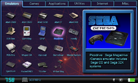
When looking at my original image (below) I noticed the bottom bar is not present at all and the frame on the right is no longer divided into a picture and a description. Also I noticed the active tab has a line under it when it should open up to the icon grid. Yes I know that means another tab image (active and non active) instead of one with the bar on the bottom always but I think it would look much better. The line under the tab should be part of the tab graphics itself not the panel under it, that should have no line along the top. Do you think in the future these will be added? It is nice work in such a short amount of time though, just hopefully these things are possible in the future. As you know I will help with the graphics when you wish. I will use this as it allows more on screen items that you can get to faster than in Pmenu (too much scolling with TS) and XFCE is cumbersome as you need the touchscreen always and have to do all kinds of window manipulation to get to stuff.

Text only? I still think this would be faster than selecting through a text list one by one, plus it would be really ugly.

menuru.png
 

Attachments

  • menuru.png
    menuru.png
    471.7 KB · Views: 110
Last edited by a moderator:
Nice looking launcher. Is the code available?

Also on a related note I plan on setting up runit-init to see if I can improve my boot up time.
 
Trey..

Code is crappy since I rushed it, but should be solid :) for ease I stuffed it into libpnd source tree but may carve it out later. I gpl'd it.

Jeff
 
skeezix said:
I left that space at bottom.. Probably clock and date and battery level for now. Not much time left :)

jeff
Ok hopefully you/we can continue enhancing in future.

One thing though that I mentioned is that grey border you made encloses the whole bottom panel. That is not right. The top of this should be open at the top so you can draw this part of the border as part of the TAB graphics. Notice that line under the "ALL" tab? It should be open under there. It kind of spoils the whole tab thing as it now looks like another inactive tab. That should not be a big deal right? Just remove that line and add to the tab.
 
Last edited by a moderator:
skeezix said:
I left that space at bottom.. Probably clock and date and battery level for now. Not much time left :)

jeff
Those would indeed be very useful, if they don't take up too much CPU power. Battery power, especially (though I suppose someone could just write a quick app to check battery power...).

There's something I don't understand... is this 0.5 sec start from when you turn the Pandora on? Or do you still have to start the full desktop first (wait ~1 min was it?) and then switch to this?

This reminds me of YAFL for the GP32, which I'm a big fan of. I'll probably be using this more than the "full desktop" launcher.
 
Last edited by a moderator:
Esn said:
There's something I don't understand... is this 0.5 sec start from when you turn the Pandora on? Or do you still have to start the full desktop first (wait ~1 min was it?) and then switch to this?
You would still have to boot Linux, but this application doesn't depend on any windowing system or even X, so it should be fairly fast.
 
Last edited by a moderator:
Depends how it's set up.. I did some fiddling on aminimal setup (kernel, libs, menu, that's it ) but kernel does take awhile etc but not bad :)

here though we'll likely have it as a non-x option or maybe x and non-x boh. You can run it however of course but default packaging is by ED :) it's rudmentary, sucks in it's artwork near instant then goes into app scan which is pretty quick. Only time sink is icon caching and preview deferred loads


jeffphonetired
 
And yes I've done tabbed ui's before, I know how to render 'em :) time and all that :) i'll keep at it even after release :)

jeff
 
skeezix said:
And yes I've done tabbed ui's before, I know how to render 'em :) time and all that :) i'll keep at it even after release :)

jeff


Ok cool.

How will external icon files be handled if I wanted to make different art for an app's icon ?

Also how can I make the icons slightly smaller but keep the launcher from scaling them up ( scaling icon pixel art would look hideous, and I may want to make smaller for aesthetics) ? Will there be an option in a config file such as NOSCALE or something to that effect?
 
Last edited by a moderator:
Skeezix, nice work. Is it finger friendly?
The text option sound interesting.

If you add a clock make it binary. We are all geeks after all. :)
 
Amigo Bandito Crujiente said:
If you could upload a .rar of the .png files, I'd be glad to make them a bit more eye-friendly.
Careful now - not too much bloat please. Can't have essential binary clocks *AND* pretty graphic.
It just a case of priorities. Oh look at the time it's 10111:010000 already.
 
Last edited by a moderator:
Back
Top