@Eight Bit I like the little things. For example that effort to find words to make it align perfectly: 

Or the way the image was created as half, then mirrored, then modified to remove the symmetry. The "x" instead of superscript "tm"
Really like the hands, but there's something off about the middlefinger, not sure. The skullhead is a bit too small, but it makes sense to have it in a dark circle. I miss the red eyes when the electricity "jumped" and a highlight effect on the helmet, maybe even the shoulders, or a glowing sprite at the hands. The light effect from under (orange/brown) is very well done.
Sound has some nice sweeps and crescendos, quite mellow. I like it.
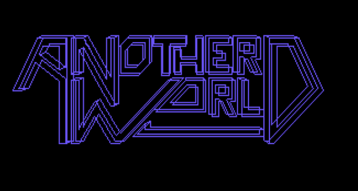
Good font (all 3 of them)


