Black Borders, Bezels, And Other Emusings.

Your display preference

  • Scale to full screen

    Votes: 0 0.0%
  • Black bars

    Votes: 0 0.0%
  • Fancy bezel

    Votes: 0 0.0%
  • Don't care really

    Votes: 0 0.0%

  • Total voters
    0

If the scaled picture can fill most of the screen without screwing the aspect ratio, that's good. If, on the other hand, the scaled picture would leave considerable portion of the screen unused, I'd pick the strech option.
 
Scale to use either the full screen height or the full screen width while keeping the correct aspect ratio (both will be very rarely possible since the Pandora has a 5:3-format).

So no fullscreen stretch, but no original resolution, either. And no bezels.

Just black bars on the left or right for 4:3-formats and black bars on top and bottom for 16:9-formats...
 
I would like to see scaled with the original aspect ratio, using black bars on the sides. Although, it seems like the devs could provide options for unscaled, scaled and fit to screen.
 
I'm not voting, because none of the options really fit.

Scale up as far as possible while keeping the pixels exact (2x, 3x...), then black space for the rest of it.

Although, if there's too much black space, I'd consider having it full-screen (while still keeping the aspect ratio the same, so with black bars on the side).
 
Scaled to fit screen but with correct aspect ratio i.e. black bars... but put emulator controls in the black bars. i.e. frame rate limiter switch, frame skip setting, load and save state buttons. On the fly touch screen controls would be good, save having to dive in to a myriad of menus to find the right setting and then go back to the game to see if it did enough of what you wanted, if you get what I mean.
 
What liquidphantom said. However, it should be user-preference.
 
I totally agree with Whitebat's example, stretched to fit is just wrong to look at your mind sees a problem when you look at it and it nags at you the entire time. proportionaly scaled to fit the screen even if you have to put black borders in is far better.

Unless an emmulator has a way of filling in the black areas of the 16:9 view with the actuall game graphics. If you look at the videos of Capcom vs Marvel for PS3 and 360 this is exactly what they've done. the game is still 4:3, you characters dont actually move into the extra space, but you can atleast see it rather than having black borders.
 
always correct aspect ratio, and the following options:

Original size
2x
3x
(etc up to screen res)
fit to height
fit to width
full screen

the fit to height / fit to width would either have black bars (if the target dimension is narrower than the screen dimension), or crop the image (if the target dimension is bigger than the screen dimension). this would work for some games where stuff at the top and bottom of the screen is just filler, some side scrollers, racers etc.
 
I will quote a post I made some time ago to show some more scaling options.

I prefer integer scaling mantaining aspect ratio, and wouldn't mind overscaling the 480 pixels height (zooming) if no relevant on-screen information is lost.

CoMiKe posted on Aug 20 2008 at 07:07 PM said:
I little bored as of now, so here are some ideas about aspect ratio:
ridge640ce7.th.png
Rendering aspect ratio: 4:3
Rendering resolution: 640x480
Shown aspect ratio: 4:3
Shown resolution: 640x480 with bands

ridge640menunn3.th.png
Rendering aspect ratio: 4:3
Rendering resolution: 640x480
Shown aspect ratio: 4:3
Shown resolution: 640x480 with emulator menu on the left.

ridge720qu5.th.png
Rendering aspect ratio: 4:3
Rendering resolution: 720x540
Shown aspect ratio: 3:2
Shown resolution: 720x480 zoomed with bands.

ridge800jk3.th.png
Rendering aspect ratio: 4:3
Rendering resolution: 800x600
Shown aspect ratio: 5:3
Shown resolution: 800x480 zoomed.

ridge720stretchef0.th.png
Rendering aspect ratio: 3:2
Rendering resolution: 720x480
Shown aspect ratio: 3:2
Shown resolution: 720x480 stretched with bands.

ridge800stretchtv7.th.png
Rendering aspect ratio: 5:3
Rendering resolution: 800x480
Shown aspect ratio: 5:3
Shown resolution: 800x480 stretched.

I really like the 3:2 720x480 non-stretched mode (third image). It mantains the correct aspect ratio, uses almost the entire screen and doesn't lose to much screen on the top/bottom.

The 720x480 stretched mode (the second last image) is also a good compromise if you need to see the entire screen without excesively distorting the image.

EDIT: Images replaced by thumbnails to save bandwidth.
 
Last edited by a moderator:
3D games are definitely more forgiving. I think I'll be happy to scale/filter/crop PSX games for fullscreen action. For the older stuff though, integer scaling only.

I'm going to make some bezels anyway, which should please the other 3 people who think it's a good idea. :p I'll aim for something even more subtle than the GBC bezel I tweaked earlier. I suspect most people who voted for black bars, won't mind a very subtle greyscale bezel.

And next time I start a bezel thread, I'm going to call it THE BEZEL THREAD. I think we've racked up 3 or 4 on-topic posts so far. -_-
 
Gruso posted on May 31 2009 at 10:21 AM said:
This is the kind of approach I like. Makes use of black space, but doesn't draw your eyes away from the gameplay area:
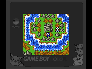
11rrui8.png
This is really nice: for pixel art games integer scaling is the way to go, ideally with the ability to keep it in windowed mode for people who are using the "desktop" WM/environment and the following full screen modes (in order of preference)

1) a good subtle bezel like the one above
2) black borders
3) a not so good bezel

I wonder how feasible would be to add a (standard compliant) tray area in the free space, and whether it would work.

Consoles that were primary 3d could use noninteger proportional stretch with black bands.
 
Last edited by a moderator:
it depends on the original resolution for me. Things like gameboy will be TINY on the pandora, so scaling it at least x2 is probably needed. Gameboy has this special case where you can just use the super game boy border (if available), other than that I'll probably either use a black border (or perhaps white to save energy? No, that's a stupid idea) or fit to screen, or both.
 
Scaled, keeping aspect ratio.

Integer scaling where it won't cause borders to be excessively large, with filtered scaling for anything else.

Stuff like CPS1 and 2 have non-square pixels, and work well at non-4:3 aspect ratios (see the CPS1 and 2 emulators on PSP).

Scaling 2x or 3x integer also gives the opportunity to overlay fake scanlines and pseudo-shadowmask effects (for systems that were meant to be seen on a CRT). 3x is better for this.

Bezel surrounds can go take a flying leap. I've never liked them on any system - SGB, MAME, DS, those arcade compilation releases.
 
EDIT: Haha, I totally missed the "non" part of "non-4:3"! Do pardon me, evidently I was having a stupid moment. :lol: I quite agree, though - they still look good when not viewed as designed. :)
 
Last edited by a moderator:
I want my bezel to be flashing colours, maybe moving stripes and patterns. Makes games harder when you have a headache.
 
Back
Top