Website - Basic Ideas


EvilDragon

Administrator
Staff member
Joined
Mar 4, 2003
Messages
29,986
Age
47
Location
Ingolstadt
Here are a few ideas I have about the website.
It's divided into technical / functional / design ideas.
If you got any better ideas or additions, let me know :)

1. Technical
 

  • Website should work with a wide range of browsers and resolutions
  • Website should not need too much CPU power - preferably using server-side with a cache instead of tons of scripts that run on the target device
  • Flexible: Easy to add new functions into the existing systems (Plugins/Hooks?). i.e. easily add new pages where users can submit videos, review links, etc. without having to hack around in the existing code.
  • Multilanguage (probably using a database). Prestashop is a good example here: The original pages have English text but a special tag that this is text that can be translated. In the backoffice, you can translate the full text and all menu items into any language (even retranslate them into the same language), without changing the internal code
  • One account for all features (i.e. forum, repo, wiki, etc.). IPB has a detailed explanation how to bridge the authentication, so we should probably do that.
  • User rights management: Enable / disable plugins / hooks / menu items based on groups (so that developers can work on new features and test them live while they are still hidden from the normal user). Similar to how Joomla works.

2. Functional

Basically, the website I imagine is a one-stop-site where both new users can find information about what it's all about as well as a site where existing users can quickly find everything they need (manual, firmware updates, community links, tutorials, image gallery, video gallery, etc.)

The basic framework should consist of a frontoffice and backoffice.

The backoffice will be used to enter / edit texts and translations, enable / disable menu items and functions for certain groups, etc.

Latest files, latest threats, official news, etc. should all be included on the page (either using an RSS feed or the API of IPB  / the repo).

Every single function that IPB offers can be used in external websites as well (there's also extensive documentation).

3. Design

The design should be clean, simply and not overloaded, only simple and clean animations, nothing fancy.

I think the colors we currently are using on http://www.pyra-handheld.com/ are pretty neat, but some webdesigner can probably improve them.

I guess it's best to define the colors in a CSS, so they can all be tweaked at once if need be.

I like tabbed designs to quickly switch between different pages, but feel free to let me know your ideas as well.

One menu with a 1-level submenu should be enough, right?

Well, that's my idea. Pretty huge, I guess.

If it's too complicated coding wise, let me know what you think we should change. I'm happy doing compromises.

If you think a Joomla installation or similar with custom created plugins would work better here, okay.

What do you think?
 
I agree that multi-language options are beneficial.  We have to reachout to ALL the geeks and weirdos that like this shit from across the globe.  I'm kidding....(coughes up a lung)....heea?  Baking Soda?  No!  He's talking on the phone...he's selling a computer.  Oh, you don't know....
 
Agree with ED.

For translations transifex can be used. The translation system on the wiki can be used too, maybe. Depends on what happens after the upgrade of mediawiki.

Would be interesting and cool if that could be used for a website too, as it reduces duplication of work, and is a good platform for collaboration. It currently fails too hard, mostly everywhere.

In general i would say less words, more pictures, and less complicated pictures at that.

These are the strong points i think its worthwile to focus on:
Content:
http://boards.openpandora.org/topic/16295-novena-crowdfunded-open-hardware-laptop-freedom-devices-marketing/page-2#entry336120
 
Last edited by a moderator:
Sounds like a reasonable framework to me (by the way, I assume you mean 'threads' when you say 'threats' there). All that remains now is to implement it and to make it pretty.


I'm a little at a loss to see what out of your proposal requires logging in, so what IPB login integration gets you. But if there are good reasons to make the effort to integrate it in, I'm certainly not against it. Just seems a bit cart before horse saying you want it without saying why, that's all.


FWIW, I'd personally appreciate it if it degraded nicely on devices without scripts, and doing stuff server side certainly helps with that. Personally I turn them off for performance reasons. IPB degrades quite nicely, other than a newline related bug on new posts. Drop down menus stop working, but everything's still accessible via a slightly more circuitous route.
 
Speaking from my own skill set and experience I'd say a lot of it depends on the time frame you have in mind for the website going live.

I've never built my own CMS before and if one of the other developers is experienced in that and feels comfortable in leading such a project and his/her ability to get it done in time that would have my big preferation as I'd learn new stuff.

If time frame is an issue my suggestion would be to use WordPress as most of the stuff under 1 and 2 in ED's post works out of the box or is relatively easily implemented. I have built a starter theme with all Bootstrap 3 stuff integrated and activated. So it would be installing Wordpress, activating the theme and straight to coding the design. Reason I mention WordPress is because that's the only CMS I've worked with so please don't take that as gospel.

Concerning design, if we go repsonsive the designer(s) will have to take into account what happens to the design on tablet, phone, horizontal and portrait. 
 
In general i would say less words, more pictures, and less complicated pictures at that.

Clarity of language is definitely important, however, I don't think fewer words is always the best way to achieve that.

When Ideas can be expressed using words, they should be. Language should be concise but without turning into a long rambling sentence (which can be hard to read (especially when it has many nested structures, even if done correctly, (which can be hard))) which doesn't really seem to be going anywhere but uses many long and cumbersome classical circumlocutions even though a simple English phrase would suffice, as in most cases it would, and would be able to drastically enhance the efficacy of the data communication undertaken.

Very short is puzzling.

Also consider that complicated pictures all over the place may seriously decrease performance (especially loading times) compared to text

----

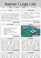
I suggest that the main page of the website should contain preview boxes of the content of other the pages. This could:

  1. Provide an good (and up-to-date)  overview of the project without the need for frequent, manual updates
  2. Replace a conventional menu as a way to quickly find information
Boxes could be folded up into their header bars for very small screens, and resized or sorted into different numbers of columns.

(example does not attempt to look nice, or even have correct spelling!)

screenshot5.png
 
Last edited by a moderator:
Speaking from my own skill set and experience I'd say a lot of it depends on the time frame you have in mind for the website going live.
No real timeframe, but probably early 2015, I guess? 

I've never built my own CMS before and if one of the other developers is experienced in that and feels comfortable in leading such a project and his/her ability to get it done in time that would have my big preferation as I'd learn new stuff.
Well, milkshake might be able to help, the repo is also kind of a CMS :)  

I'm a little at a loss to see what out of your proposal requires logging in, so what IPB login integration gets you. But if there are good reasons to make the effort to integrate it in, I'm certainly not against it. Just seems a bit cart before horse saying you want it without saying why, that's all.
Right now, we've got the repo, the Wiki and the boards.

My goal is to have one website with one login for all of those - so bridging them together for the login data with one main website.

If we can keep the header of the main website with the menus and have a headerless wiki, repo and boards running below it with one login account, it would be tightly integrated.

Also, if the main website allows user galleries or videos, a login would be needed there as well.
 
I do have one suggestion... Don't make the "Latest News" the main focus of the front page.

One thing I really dislike on many project pages that I've come across (especially ones based on a blog style CMS) is that they tend to assume that you already know what the project is all about, and only care about the latest changes. I've found however that without a existing frame of reference there is very little value to the latest news, as you don't have a basis to understand what it means or why you should care.

- Neelix
 
Right now, we've got the repo, the Wiki and the boards.

My goal is to have one website with one login for all of those - so bridging them together for the login data with one main website.
I think a good place to start with these is to provide a way for users to associate their accounts on each system with each other. That way when an integrated login solution is introduced, most of those associations will already be in place. It would also allow for better integration between the systems even before an integrated login solution is implemented.

- Neelix
 
Some first thoughts:

Joomla is very bloated, so it's not an option. If we are going to go for an existing CMS I would go for either Drupal or Wordpress.

The first thing to define, however, is WHAT features the site is going to have, and WHY. I guess we are sticking with this forums, don't know if we are doing so with the repo, or the wiki.

That will help decide if we go for a ready-made CMS, to pick which one or if we go for a custom one.

I'm usually against using frameworks such as bootstrap, but I can acommodate to it.

Designwise, I agree with neelix, we should't assume everybody knows what the Pyra is. The frontpage should be aimed at newcomers, selling the pyras main features. In the same fashion as Pandora's website.

BTW I don't get what the user photo and video galleries are meant to be for. Like user's galleries?
 
Last edited by a moderator:
If a lot of people with programming knowledge are working on the site, I would not recommend using Joomla, because it tries to hide most things away from you to make it noob-friendly (which it isn't, because the crappy WYSIWYG editor blows up your layout all the time and you have to manually fix it).
I would recommend using a very lightweight CMS. I've recently used Wordpress and i like it, altough the API is a bit weird. But i'm not sure if it isn't a bit to specifically made for Blogs to use it for a normal website properly.
 
Some first thoughts:Joomla is very bloated, so it's not an option. If we are going to go for an existing CMS I would go for either Drupal or Wordpress.The first thing to define, however, is WHAT features the site is going to have, and WHY. I guess we are sticking with this forums, don't know if we are doing so with the repo, or the wiki.That will help decide if we go for a ready-made CMS, to pick which one or if we go for a custom one.I'm usually against using frameworks such as bootstrap, but I can acommodate to it.Designwise, I agree with neelix, we should't assume everybody knows what the Pyra is. The frontpage should be aimed at newcomers, selling the pyras main features. In the same fashion as Pandora's website.BTW I don't get what the user photo and video galleries are meant to be for. Like user's galleries?
With the time frame being beginning 2015 I'd be fine with not using Bootstrap or any other responsive framework and building our own. Would be a good learning experience.
 
Last edited by a moderator:
The frontpage should be aimed at newcomers, selling the pyras main features. In the same fashion as Pandora's website.
I'm not sure about this.

I think the main page should:

  1. Provide quick access to various pyra-related web resources
  2. Give an overview of the project's aims and achievements
The Pyra is obscure and expensive. It is not at all an impulse buy.

I think customers will probably want to do thorough research in the Pyra, its strengths and weaknesses before buying, and will be put off by a "Pyra is the most bestest thing ever since sliced bread" page.
 
When Ideas can be expressed using words, they should be. Language should be concise but without turning into a long rambling sentence (which can be hard to read (especially when it has many nested structures, even if done correctly, (which can be hard))) which doesn't really seem to be going anywhere but uses many long and cumbersome classical circumlocutions even though a simple English phrase would suffice, as in most cases it would, and would be able to drastically enhance the efficacy of the data communication undertaken.


Very short is puzzling.
Kingu? Is that you? ;)

Also consider that complicated pictures all over the place may seriously decrease performance (especially loading times) compared to text


----


I suggest that the main page of the website should contain preview boxes of the content of other the pages. This could:

  • Provide an good (and up-to-date)  overview of the project without the need for frequent, manual updates
  • Replace a conventional menu as a way to quickly find information
Boxes could be folded up into their header bars for very small screens, and resized or sorted into different numbers of columns.


(example does not attempt to look nice, or even have correct spelling!)

attachicon.gif
screenshot5.png
I would suggest we should bear in mind that most devices these days to view web pages be they smartphones, tablets, tvs or computers have widescreen screens, so building a portrait website is a very retro concept, although I take your suggestion that it should reformat depending on width.


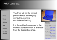
The most modern way to present that sort of info is using cutouts, and overlays (drop down menus etc.). Here's a slightly wonky and deliberately black and white demo I made of an idea:

pyrawebh.png

Maybe that picture could only scale out like that if you mouse over it with scripts enabled.  Also, not sure we need home (just click on the logo), news and gallery in that menu, so perhaps that left menu boxout could be tucked somewhere else entirely.
 
Last edited by a moderator:
Hehe, it could have been, i get verbose when i try to make a point more clear, dont think im all that redundant though.  Nice example of why short is best.

Its not obscure unless we make it, it is not expencive. It should be an impulse buy, but also one you can rationalize.

An image with the pyra and mouseover to see specs is a whole lot better than walls of text. You basically dont need to say it has a keyboard, or that it is pocketable if the picture has a sense of scale.

"The pyra is both a extremely portable mini laptop (handheld) for gaming , has Quality Audio, is a fine Photography (dual SD and software) tool and is FOSS (anti spying, pro freedom, community device.)"

A supersimple site that has a dynamic image of a pandora that changes with focus on each of these points.

Mini laptop  -                              image of desktop OS and tour of core functionality

Gaming handheld     -                picutres of gaming controls, explanation of emulation and some feature games

Quality audio player-                 Info about soundstage, picture of soundplayer. How to operate the controls when its in your pocket

Photography aide-                    Focus on the dual SD-cards, with image viewer, darktable,

FOSS/openhardware device     Basic explanation and education.

Quality/Environmental  affair     A rundown of why the pyra is long lasting, and doenst have ac-dc adaptor shipped, rohs etc etc

Think about it, you present the pyra, its a "insert short thing here"  to different people its different things, and the pyra can be quite a lot. If we do well on each point, thats a whole market!
 
Last edited by a moderator:
I have always wanted to use cakephp to build a website, also if you want to speed up the responsive designing side bootstrap is a good idea since its done for you and is lightweight.

I'd love to use angular js too :)
 
Back
Top