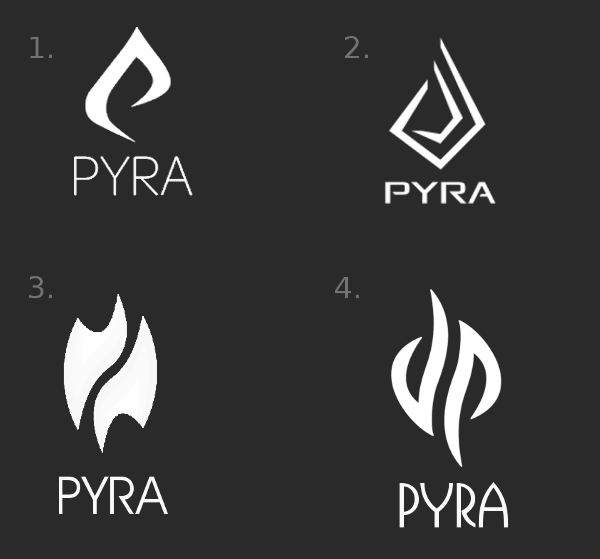
The Pyra-Logo


Good choice. It was a long birth with the Pyra logo but finaly it's born. :D

Some tweaking maybe to define every curve pixel-perfect for having an reproducable Logo that has always the same form, but besides from this, it's finished. :)
 
The original was crap, a banal tribal tattoo which was loved by many because it was insipid and because of the cool! overused dp trick.
Also, may I  draw you attention to forum rule #4 -calling people's (mine or anyone else's) work "crap, banal and insipid" is not conducive to a friendly or constructive discussion.
Okay, maybe the word "crap"  is offensive and that wasn't my intention at all but banal and insipid compared to the new one is what I wanted to point out and I think that it's constructive. Thanks to it we end up with this one but #1 was just like the Pandora logo: not ugly but insipid.
 
Last edited by a moderator:
I apologise for blowing my own trumpet here, but can I point out that the logo we actually voted on (#1) was entirely my work.


Faeminx added some little flicks - and they do improve it - but I drew the original version:
Oh of course! I certainly wouldn't presume to take credit for the core logo... I'm just glad to have been able to help in tweaking it in a way that appeals to Ed.


Well done for coming up with it - I love the concept (obviously). ;)
Congratulations to both of you.
 
_wb_ I fixed it for you ;) .

Here's a sketch of how it can look on the lid:

Some guy getting an epileptic shock because he's in a bad position and is forced to watch the back of your discharging Pyra while you get a lot notifications.
flame_notif.gif
 
Last edited by a moderator:
Well done binky and _wb_ :)

It wasn't my preference in the poll, I went for the more angular one, but seems this one did lead the polls by quite a bit whenever I checked in.

I'll too get used to it I'm sure and once it's seen on the actual device, it will be like it was always meant to be.

I look forward to ED posting up a nice photo of a lid with this logo on it once it's been off to the manufactures ... eh ED ... hint, hint :)
 
I had a look at http://www.1001fonts.com/

and went through the first 200 pages of 647.... I can't go further as I've run out of time and will be trading at a festival for the next week... so can't even resume this task, which is a pity. (well maybe I can, but no promises)

I've selected a few fonts that have potential. Keep in mind, that if the font isn't perfect, it can still be used as a starting point and elements can be redrawn. I can do this quite easily - even at the festival.

This is the only font that is free only for personal use (the rest are free for commercial use):

http://www.1001fonts.com/vni-font.html

Commercial:

http://www.1001fonts.com/holitter-gothic-font.html

http://www.1001fonts.com/hyperbola-font.html

** http://www.1001fonts.com/etharnig-font.html

http://www.1001fonts.com/philosopher-font.html

** http://www.1001fonts.com/wind-sans-serif-font.html

http://www.1001fonts.com/snc-script-font.html

** http://www.1001fonts.com/garton-font.html

http://www.1001fonts.com/wizzta-font.html

** Are my favorites.

I made my choices by entering the text 'Pyra' and holding an image of the logo next to the resulting output to see how well the font and logo gelled with each other.
 
Is the font from the Logo in poll 1 contestant #2 unavailable?

post-1-0-87295200-1395971110.png
 
Like Saber's idea.
That's kind of what I was going with with my suggestion on the first page:

Wfz6Fhc.png


http://www.1001fonts.com/good-times-font.html

While it's got the disconnected loop of the P (that I was looking for), it doesn't end in a diagonal like the original, and the midline is rather low.  The original bitmap, for reference:

8oxIA7K.png


It reminds me of the old Pioneer logo, which featured a similar open P loop with a slant and general shape.

Going through the ones on fonts1001, I found this one:

49yzFhJ.jpg


http://www.shyfoundry.com/fonts/shareware/sfvipersqu.html

However, that's another one without any stresses - it's slab sans, with the horizontal and vertical (and diagonal) lines being the same width. It's also not free for commercial use, but the costs don't seem extortionate - not that they have a package for product materials use).

This is the only one I could find with horizontal stress and a disconnected P loop:

dGdgWUU.png


http://www.1001fonts.com/reality-hyper-font.html

It's not available in regular though, and is a bit overcomplex for my tastes.  And we lose the slanted P loop end again.

Overall I think I'm still happy with my original choice.  It's a bit more open than the original bitmap, admittedly, but the A is spot on and most features are present.
 
Indeed, that Philosopher Font looks nice :)

I created an SVG Version of the Logo, and also made my own attempt with pretty clean and simple fonts (though I think I like philosopher better).

The SVG file (inkscape) is attached as ZIP. Feel free to use it to modify and play around with it :)

Here's a color attempt:

DPPyra.png

DPPyra2.png

Complete.svg.zip
 

Attachments

  • Complete.svg.zip
    3 KB · Views: 330
Yeah that philosopher font was made for the Pyra logo, this last one is awesome. Nice color choice, I like the way it tend to orange.
 
Last edited by a moderator:
Indeed, that Philosopher Font looks nice :)

I created an SVG Version of the Logo, and also made my own attempt with pretty clean and simple fonts (though I think I like philosopher better).

The SVG file (inkscape) is attached as ZIP. Feel free to use it to modify and play around with it :)

Here's a color attempt:

attachicon.gif
DPPyra.png

attachicon.gif
DPPyra2.png
Looks pretty nice. I don't really think the Philosopher font is a good idea. I think that logo would go much better with a sans-serif font.

I particularly like the Goodtimes font that Levi suggested.

-God Ginrai
 
Last edited by a moderator:
Maybe it would make sense to actually use the P from the logo for the text? Just so that whenever you just have it written somewhere without the logo, there's still part of the logo in it. It would help building the connection between the logo, the name and the product.
 
Back
Top