Replacement Interface


parag0n posted on Feb 24 2006 at 06:45 PM said:
DaveC:

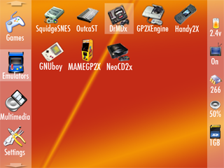
gp2xmenu2.png


I fully agree with the making a standard XML format usable across all the different menus, something like that can only be good ^_^

I love this menu style. I'd prefer the right hand bar to be on the bottom though. Lets keep it nice and simple though - we want the menu system to be as small as possible to make load times the shortest possible. If people want animated background, sound effects and music (ala PSP) then fine, but keep them in seperate modules so people that are not interested in them don't have to load the additional code and data everytime the menu system starts up.

Also, rather than just caching the next and previous, use the idle time wisely. Eg. When the user isn't doing anythng, load icons in the background for the other categories - don't want for the user to actually move to these categories before loading them.
 
Last edited by a moderator:
Vimacs posted on Feb 24 2006 at 02:01 PM said:
i would like something simple like pacrom, but with the option to direckt launch supported formats (txt, audio, video, maybe roms)

I think that's a good idea - and I think a super minimalist text only launcher should be made, and it would be great if it read in it’s input from the same menu.xml file that the “full featured” menu used. However, I think that needs to be a completely different program then a more full featured menu program that could actually be used to compel people to buy the GP2X.
 
Last edited by a moderator:
Squidge posted on Feb 24 2006 at 07:14 PM said:
I love this menu style. I'd prefer the right hand bar to be on the bottom though.

A couple of people have said that, so:

gp2xmenu3.png


I like how this has turned out actuelly, it gives more space for useful information near the icon.
 
Last edited by a moderator:
parag0n posted on Feb 24 2006 at 02:35 PM said:
Squidge posted on Feb 24 2006 at 07:14 PM said:
I love this menu style. I'd prefer the right hand bar to be on the bottom though.

A couple of people have said that, so:

gp2xmenu3.png


I like how this has turned out actuelly, it gives more space for useful information near the icon.
That looks damn near perfect. However, I'd like an "info" button (perhaps Select) that shows you the same info that was in the first mock up, such as a screenshot of DrMD and who made it, what it does, etcetera. It would be there for 1st-time users of that program, and it would add a little substance to the whole interface, without bogging it down in the slightest.
 
Last edited by a moderator:
DaveC posted on Feb 24 2006 at 06:41 PM said:
One thing to remember here too. This launcher should be fairly lean. If it gets too overly complex with oodles of effects, pictures, music, and big code it will take that much longer to boot. I know if I just want a quick blast of MAME I am not going to want to sit and wait while it loads all kinds of large pictures, and feature code, etc just to get to my favorite program. K.I.S.S rule really important here. We need to keep perspective. This is a game and media player, not a PC or PDA.
Loading images and things from the nand/sd will take a minimal time at most. Effects won't make it take any longer to boot, it'll just make a more ambient feeling to using the gp2x
 
Last edited by a moderator:
parag0n posted on Feb 24 2006 at 07:35 PM said:
Squidge posted on Feb 24 2006 at 07:14 PM said:
I love this menu style. I'd prefer the right hand bar to be on the bottom though.

A couple of people have said that, so:

gp2xmenu3.png


I like how this has turned out actuelly, it gives more space for useful information near the icon.


Yes, getting better.

The catagory icons should be a bit smaller to get more on screen though I think.

I kind of think my original concept of the catagory bar at the top would still be better though. It would give more catagories at once that way.

Maybe try one like that Parag0n.

Keep the status bar at bottom, put the catagories at the top and see how that looks.
 
Last edited by a moderator:
chris_r posted on Feb 24 2006 at 07:45 PM said:
DaveC posted on Feb 24 2006 at 06:41 PM said:
One thing to remember here too.  This launcher should be fairly lean.  If it gets too overly complex with oodles of effects, pictures, music, and big code it will take that much longer to boot.  I know if I just want a quick blast of MAME I am not going to want to sit and wait while it loads all kinds of large pictures, and feature code, etc just to get to my favorite program.  K.I.S.S rule really important here.  We need to keep perspective.  This is a game and media player, not a PC or PDA.
Loading images and things from the nand/sd will take a minimal time at most. Effects won't make it take any longer to boot, it'll just make a more ambient feeling to using the gp2x


The idea here is that you are not going to just sit there admiring the interface. You will be using it to just get to what app you want. Yes loading all of that data would add up in boot times. You also have to load all of the code that handles those effects too don't forget.
 
Last edited by a moderator:
rokdcasbah posted on Feb 24 2006 at 07:40 AM said:

I really like this desgin simple and clean, love the icons.

parag0n posted on Feb 24 2006 at 07:35 PM said:

But I also realy like this one as well now the status bar is at the bottom it looks much better.

But at the end of the day I would be happy to use either of these solutions they both look great. :)
 
Last edited by a moderator:
DaveC posted on Feb 24 2006 at 02:53 PM said:
chris_r posted on Feb 24 2006 at 07:45 PM said:
DaveC posted on Feb 24 2006 at 06:41 PM said:
One thing to remember here too. This launcher should be fairly lean. If it gets too overly complex with oodles of effects, pictures, music, and big code it will take that much longer to boot. I know if I just want a quick blast of MAME I am not going to want to sit and wait while it loads all kinds of large pictures, and feature code, etc just to get to my favorite program. K.I.S.S rule really important here. We need to keep perspective. This is a game and media player, not a PC or PDA.
Loading images and things from the nand/sd will take a minimal time at most. Effects won't make it take any longer to boot, it'll just make a more ambient feeling to using the gp2x


The idea here is that you are not going to just sit there admiring the interface. You will be using it to just get to what app you want. Yes loading all of that data would add up in boot times. You also have to load all of the code that handles those effects too don't forget.

It's a balancing act - and I think it should be up to the end user where that balance is set, one size doesn't fit all. As long as the effects are modules to the menu it wouldn't slow things down a bit for people who didn't want them.
 
Last edited by a moderator:
DaveC posted on Feb 24 2006 at 07:53 PM said:
The idea here is that you are not going to just sit there admiring the interface. You will be using it to just get to what app you want. Yes loading all of that data would add up in boot times. You also have to load all of the code that handles those effects too don't forget.
So you might not sit there admiring the interface but it's nice to have the little things that make the user interface seem more fluid. Take for example on the psp interface how the menus slide into position. It doesn't seem like much but it makes for a much more fluid menu. And I don't see how adding any code would drastically affect the boot time.

Take for example the current gp2xmenu is about 309kb.* The time it takes to load is from when the green screen switches off and the menu appears. That loading time is hardly noticable. Now add onto it just a few kb for the sliding effect, will those few kb** majorly effect the boot time?

32x32 pngs are about 1kb so loading icons and backgrounds etc. is no problem at all

*This doesn't include all backgrounds and icons which are also loaded in this time
**don't know an actual value but I doubt it would be anything high like 100kb extra just for the extra effect.
 
Last edited by a moderator:
Is it only i that want something like this?
all5sq.png


_________________
Stick = arrowkeys (left opens folder in the explorer, right parent folder) or mouse
A = left click/enter
X = backspace (backs to patertfolder)
y = selects View (alt+v on a computer) or GP2X-button (windowsbutton)
B = right click
L = jumps 10 (or 13?) files up
R = jumps 10 (or 13?) files down
Select = toggles between arrowkeys and mouse function
Start = ????

or something like that.
 
Wow, it seems that a lot of people like to spend more time admiring the menus than actually playing games :p

The original one is crap, yes, but I've forgotten it's little inadequacies by the time I've fired up MAME or ScummVM :)
 
This is the interface that I (and I mean "I") would like to have, just cuz I like to have small fonts.

interfacetebb9vw.gif


Don't critique it, I know that not everyone would be able to read the fonts. Just showing off what I'd like :p
 
This was something I was playing with a while ago when I was wanting a better gp2x menu. I too was thinking along the lines of a form of XML

What I was thinking of various controls (buttons, images, browsers, tabs) on various screens, with the ability to move between them, making a full interface and offering lots of customizability

For example, say you had this code defining a games screen:

Code:
<style>

	<general>
  font = "arial"
  fontsize = 10
	</general>

	<toolbar>
  width = 22
  height = 20
  y = 213
	</toolbar>

	<topbar>
  image = "topbar.png"
  width = 320
  height = 18
  x = 0
  y = 0
	</topbar>

	<toptab>
  y = 3
	</toptab>

	<toptabselected>
  y = 5
  layer = 2
	</toptab>

	<pagebackground>
  width = 320
  height = 240
	</pagebackground>

	<mainbrowse>
  rows = 3
  columns = 4
  width = 314
  height = 182
  x = 2
  y = 26
  <item>
  	type = thumbnail
  	width = 63
  	height = 47
  	iconsize = 32
  	background = "itemback.png"
  	x = 10
  	y = 2
  	action.x = "RUN"
  	fontstyle = "bold"
  </item>
	</mainbrowse>

	<mainbrowse2 extends="mainbrowse">
  rows = 3
  columns = 4
  row1=Name,ItemName
  row2=Type,ItemType
  row3=CPU Speed,ItemCPUSpeed
  row4=Played,ItemPlayed
  <item>
  	type = list
  	width = 297
  	height = 13
  	iconsize = 0
  	action.x = "RUN"
  	fontstyle = "normal"
  </item>
	</mainbrowse2>	

	<battery>
  x = 52
  y = 218
  batteryfull = "bat1.png"
  batterymidum = "bat2.png"
  batteryempty = "bat3.png"
	</battery>

	<cpu>
  x = 260
  y = 219
	</cpu>

	<tvmode>
  x = 165
  y = 217
  onimage = "tvon.png"
  offimage = "tvoff.png"
	</tvmode>

</style>

<screen name="games">
	<tabbar style="topbar">
  <tab name="videos"	x=1	image="videos.png"	action.X="GOTOSCREEN(Videos)"	style="toptab">
  <tab name="games"	x=61	image="games.png"	action.X="GOTOSCREEN(Games)"	style="toptabselected">
  <tab name="music"	x=121	image="music.png"	action.X="GOTOSCREEN(Music)"	style="toptab">
  <tab name="photos"	x=181	image="photos.png"	action.X="GOTOSCREEN(Photos)"	style="toptab">
  <tab name="settings"	x=237	image="settings.png"	action.X="GOTOSCREEN(Settings)"	style="toptab">
	</tabbar>

	<image style="pagebackground"	image="gamesbackground.png">

	<filebrowser name="mainbrowse"	style="mainbrowse"	directory="$config.gamesdir">

	<group name="toolbar1" style="toolbar" visible="true">
  <button image="t1.png"	action.X="mainbrowse.BACK">
  <button image="t2.png"	action.X="mainbrowse.FORWARD">
  <button image="t3.png"	action.X="mainbrowse.UPDIR">
  <button image="t4.png"	action.X="mainbrowse.NEW">
  <button image="t5.png"	action.X="mainbrowse.PROPERTIES">
  <button image="t6.png"	action.X="mainbrowse.DELETE">
  <button image="t7.png"	action.X="mainbrowse.COPY">
  <button image="t8.png"	action.X="mainbrowse.CUT">
  <button image="t9.png"	action.X="mainbrowse.PASTE">
  <button image="t10.png"	action.X="mainbrowse.NEWFOLDER">
  <button image="t11.png"	action.X="mainbrowse.SEARCH">
  <button image="t12.png"	action.X="mainbrowse.FOLDEROPTIONS">
  <button image="t13.png"	action.X="OPTIONS">
	</group>
	<group name="toolbar2" style="toolbar" visible="false">
  <image image="battery.png" x=5 y=213 height=20 width=81>
  <image image="tvmode.png" x=110 y=213 height=20 width=91>
  <image image="cpu.png" x=219 y=213 height=20 width=91>
  <widget type="battery" style="battery">
  <widget type="tvmode" style="tvmode">
  <widget type="cpuspeed" style="cpu">
	</group>

</screen>

This could produce a result like this:


Now, if a button were to make toolbar2 visible and toolbar1 invisible, and change the style of the filebrowser to filebrowse2, it would look like this (demonstrating the customizability and flexibility)


With a little playing around, it could then be possible to turn it into a completely different interface to the one at the start, and the format could allow a lot of different options


As I said, just posting it in case it's useful to anyone. Ideally, that's what I would prefer. Everyone has different ideas, so a flexible format, that can allow people to have the interface they want and allow for wide skinning opurtunities I think would be great.
 
I like either of the 'C' designs (Dave or Thor). Its simple, gives you quick access to what you want. and is customizable to some degree.

Hanz's is neat too, i'm just more of a get to what I want and go kinda guy than an ohhhh ahhhh. However, for an Ohhhh ahhhhh, its pretty well conceived and navigible.
 
ThorC posted on Feb 24 2006 at 08:17 PM said:
This was something I was playing with a while ago when I was wanting a better gp2x menu. I too was thinking along the lines of a form of XML

What I was thinking of various controls (buttons, images, browsers, tabs) on various screens, with the ability to move between them, making a full interface and offering lots of customizability

For example, say you had this code defining a games screen:

As I said, just posting it in case it's useful to anyone. Ideally, that's what I would prefer. Everyone has different ideas, so a flexible format, that can allow people to have the interface they want and allow for wide skinning opurtunities I think would be great.

Cool, one thing I would look at is allowing the icons to be smaller and have more of them. I can see eventually having LOTS of apps. Looks nice though.
 
Last edited by a moderator:
Back
Top