Replacement Interface


parag0n posted on Feb 24 2006 at 11:10 AM said:
gp2xmenu.png


Is my latest

The gui would be configurable fully. It wouldn't auto-scan for new emulators unless told to rebuild its menu (which would probably be in the settigns menu), and software wouldn't need to be renamed, a simple text file in the same folder as the .gpe with the same name would work for sorting out what catagory to put the folder under and the information and screenshot displayed with it.


Dont worry about devs not making things easy to navigate, most devs would have things in sane folders anyway, as it gets impossible to manage a project if you have too many things in it's root folder!


That rocks on soooo many levels. :)
 
Last edited by a moderator:
to each his own...i personally don't like browsing directories on my gp2x as there's usually only one file in each directory that i'm interested in, and it takes me far too many moves to get there. as i said before, i have a lot of shortcuts set up on mine, so i'd really be most interested in a sleeker version of that.

but i can also see where people would rather have better directory browsing since it gives more control. however i'm a big neat freak and with all of these apps that want their own folder under root, i think keeping my sd card tidy is never gonna happen... so barring that, i'd like to ditch the file browser completely if possible.

edit: rife with typographical errors
 
parag0n posted on Feb 24 2006 at 04:10 AM said:
The gui would be configurable fully. It wouldn't auto-scan for new emulators unless told to rebuild its menu (which would probably be in the settigns menu), and software wouldn't need to be renamed, a simple text file in the same folder as the .gpe with the same name would work for sorting out what catagory to put the folder under and the information and screenshot displayed with it.


Dont worry about devs not making things easy to navigate, most devs would have things in sane folders anyway, as it gets impossible to manage a project if you have too many things in it's root folder!

About the software renaming, I totally realized that after I typed it, but hey, it's history now, and it's 3:00 in the morning where I am...

But until this is fleshed out, (defining what 'configurable fully' means, what different modes will look like, how this is all possible code-wise) I'm one for sticking with the directory tree. If there's an alternate mode that basically looks just like DaveC's proposal, hey, I have nothing to complain about.
 
Last edited by a moderator:
Basicaly something along the lines of YAFL would be nice.

EDIT: bah. I hate hiting reply whilst being on the first page

I rather like DaveCs mockup, as it reminds me of Yafl. Yet I think the launcher should allow you to scan for gpes and gpus on the SD and then show you only those files. and you should be able to put them into their subcategorys.

paragons idea is alsvo very nice, and as long as it could be made for working similar to yafl and would be skinable, I am all for it. love the selection interface (bars)
 
Are we all going to have to hand modify each one of the emulators' file extensions to make sure it doesn't get bumped in with homebrew?
No you could have a filter which says that the files have to be in "/mnt/sd/Homebrew/" and then you could have another filter that says that the files will only be show if there file extension is ".gpe", unless of cours you want to see all files inside the folder in which case don't use that filter.
Will devs have to add some peice of code to their emu to distinguish it from homebrew?
No.
Even if you did change the file extension - there is no reason it shouldn't work. You could probably make a program to batch change the extensions if you wanted. I however think that a better way is using the standard extension .gpe, no extra code, and folders.
I agree with you on the idea of a bootloader, we need something like mr_spivs firmware but for the GP2X.
And hanz, it's not your idea in particular, from the start I didn't enjoy seeing the absence of a directory tree and some competent way of navigating through the folders rather than circumventing them.
I agree a filemanager is needed. I suggested having it load in the main panel, and then the cut copy and paste going into what right now stores the DRMDx description. I think an autoboot function would be a necessary part of any firmware, so you could go straight into a file manager if you would like.
Edit; sorry, I didn't see you added a bunch as I was writing my novel of complaints -_- I do like the idea of having several different configurations, but those need to be fleshed out more.
I will flesh it out if someone is up for writing it.

Horscht said:
paragons idea is alsvo very nice, and as long as it could be made for working similar to yafl and would be skinable, I am all for it. love the selection interface (bars)
But that used to be my idea.
cryingsmiley.gif
 
Last edited by a moderator:
You know, i'm actuelly tempted to have a go at writing it.

Hanz: grab me in IRC sometime and we'll chat it over.
 
If you add to the cut copy and paste the ability for the filemanager to run apps from their folders, and have that be present at start-up and do it in a competent way, I'm all for it. Your idea has peices from all suggestions listed, and I'd contribute to the brainstorm ;) but it's time for me to check out. Perhaps tomorrow.

Skál, og cheers.

parag0n said:
You know, i'm actuelly tempted to have a go at writing it.

If we're writing it, this should be the second addition to the community firmware. Faster bootup and a more competent (by some) UI? That's a bloody good start for making good use of the source. Why submit this idea to GPH to do when we can do it ourselves? Interesting. Compile our efforts.
 
Last edited by a moderator:
One thing that missing from almost all of the programs on GP2x at the moment: Consistent button configuration.

Every program uses a different configuration, which would be ok if there were at least instructions somewhere visible. A small text "(Select) -> Help", which would pop-up a small screen describing the buttons would be incredibly useful.

Naturally, the best solution were a self-evident button configuration, but self-evident is unfortunately dependent on the user ;)

I've been sketching a new UI for the last week, but now that I read this thread, I realise most (if not all) of my ideas are already mentioned here. I personally am all for a sleek PSP-style UI (for impressing people and for a quick game) with an easy-access file browser (for real work).

The idea of having a configurable, separate UI -program with fallback to the built-in menu is brilliant.
 
These mock-ups all look really nice. However I woul much prefer to just have a file browser and open things from within that, having the GP2X know what to do with each file (.avi opens video player, .txt opens text reader etc.), rather than choosing from the menu which type of file I would like to open.
 
Mikey242 posted on Feb 24 2006 at 01:08 PM said:
(.avi opens video player, .txt opens text reader etc.), rather than choosing from the menu which type of file I would like to open.
Should be easy to do. Thankfully. :p
 
Last edited by a moderator:
Nickmon posted on Feb 24 2006 at 12:22 PM said:
Now if that could be skin able as well...

It will be :ph34r:

Development is starting this weekend on our version of it :D
 
Last edited by a moderator:
Mr.Jabberwocky posted on Feb 24 2006 at 12:32 PM said:
Lets face it - what it needs is to replace linux with a port of slubman's firmware.

You're nuts. The fact that it runs Linux will attract more users+dev's to the gp2x and speed up add-on development. You're probably stuck with the idea that Linux is inherently slow and bloated, and that it only serves those GPL-issues...
 
Last edited by a moderator:
All these design ideas are all very nice. Though, I like the crossbar idea best - it's very pretty.

What I would prefer, however, is a way so we could use our own menus, should we so wish. Like, before the menu loads it could check a folder like /mnt/sd/menu/ or something, and else load the default one. Could be good for commercial games, too, as they'd load directly up instead of you having to trawl through the menu to get at them. =P

I thought of a menu based around a circle, rather than all these lists. You hold the joystick in the direction of the option you wish to select, and it lights up/changes the image of the corresponding option. Then you'd press a button to confirm your choice. The diagonal bias wouldn't change anything, as it's not time sensitive or anything (as was said before, not bad for media players =P). The actual program selection would be done with lists, though. Or maybe a scaled 'ring' type menu, with all the options set in a circle (think Tomb Raider. =P) You'd navigate with left/right or the L/R buttons, and up/down would flip everything to the other side. That way you'd only really need to turn the menu a maximum of 180 degrees. Looks nice, but isn't really that ergonomic.

The most important thing in my opinion is customisation. And choice. Why not be able to change the menu as easily as changing the desktop theme?
 
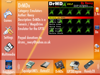
gp2xmenu1.png


This is the latest, I've added more icons to the right hand side, so it now shows the volume and the size or free space on your SC card.

also, a few more minor tweaks, fixing bits where the sizes weren't quite right, and showing the "selected icon grow" feature similar to osx's bottom bar, the selected icon will be enlarged to eb bigger than the default icons :)
 
Guyfawkes posted on Feb 24 2006 at 09:30 AM said:
I like Hanz™ idea, it looks like a nice and simple design and fairly quick to use. It reminds me of the PSP interface which is pretty good itself with the vertical and horizontal navigation.


Yeah but it is just plain ugly. Not the skin but it is just a list of text. Icons are much nicer. scrolling through a list is tedious and time consuming, I HATE that in the curent menu.

Do we REALLY need to have a big picture of the program you are running taking up half of the screen? That seems to be a HUGE waste of space, I think that is a terrible idea. After you see that a few times you will get sick of seeing it all of the time, and wish you had more room to put icons for faster navigation.
 
Last edited by a moderator:
parag0n posted on Feb 24 2006 at 02:44 PM said:
gp2xmenu1.png


This is the latest, I've added more icons to the right hand side, so it now shows the volume and the size or free space on your SC card.

also, a few more minor tweaks, fixing bits where the sizes weren't quite right, and showing the "selected icon grow" feature similar to osx's bottom bar, the selected icon will be enlarged to eb bigger than the default icons :)


Still why do we need a huge image taking up most of the screen? I don't know why everyone likes that. Don't you think that will get old after awhile? Don't you think after the first few times you will know that the author of DrMD is Reesy, and that DrMD is a megadrive emu? That seems to me an inefficient use of screen area. That area could be put to better use I think.

If you have alot of apps you will have to sit there and scroll through a bunch of icons to get to the one you want. You only have 5 items at a time you can look through.

With the Idea that I had you can have 20 at once and get to them much faster because you can use all directions on the stick to get there.
 
Last edited by a moderator:
Why i like the 2 bar design:

Its interesting; more likely to pull people to the 2x, if you give someone a go and the menu is interesting.

You can tell what you're running; Unlike some, i dont go around remebering icons so i can run what i want, and finding an icon in a grid of 20 can be difficult, even if you know its there!

The image is purely an optional faeture, if you dont like it, you can always turn it off.

you have to understand that that is a *Mockup*, those aren't the final icon sizes, and they probably will get smaller, but with fast-navigation options (L / R moving a page at a time) its almost as efficient as the grid anyway.
 
Back
Top