Pandora wiki open for business. You can help.


comradekingu

Glowing ember
Joined
Apr 15, 2011
Messages
5,107
Website
portfolio.anotheragency.no
Recent changes to wiki (atom link)


Rationale: Placement follows a natural progression, either by merit, process or pageview. Everything is given an equal chance.


The idea is to find info fast, have consistent info. Its not meant to be organic like it was, its more directed towards logic. No nested menus, instead page-names that make sense, without unnecessary redirects or re-spelling. It is a KISS principle that shines as its taken to its core. It is a work in progress, and if it looks messy, its because it is. Thus its easier to see the problems. The work has gone into cleaning, not so much visual aspects. Help wanted. no advanced or developers sections, instead autohide the advanced and development.


I will try to add more design paradigms here. Its not so easy to remember or point out the things that are just working. Ask if something is unclear, we have a method to our madness.


I and everyone else eat our own dogfood on this page and others, so should you. If its broken, fix it! The right way.

                   Pagelove: Some pages are mangled together, especially the ToC in some cases needs work.

Hit the feedback button.

excellent points were made. Duplication and maintainability:There is no need to do again what a repo has already done, for example.


Consensus seems to be that we treat all users equal,

  • New mediawiki version  Edit: We have been updated from 1.19 to 1.21, things work, big thanks to ED!
http://www.mediawiki.org/wiki/Release_notes/1.21#MediaWiki_1.21.2  that is what we have now.


1.22 is nearly done (ETA going stable late 2013) and wikipedia uses it now, so I hope we can get that.


with the more new user friendly and less scary wysiwyg editor

and some extentions too.

Translations: When everything is "set in stone" we can begin translating things. Make sure to state what language (other than English) you command, if you want to help. (German wiki being merged into the english one, and these extentions will make it managable to do translations.)


List of people that can translate:

comradekingu - NORWEGIAN, SWEDISH, DANISH, SPANISH (GERMAN) General fixing

KodeIn              FRENCH

Gaeryc              FINNISH

Andri12             ICELANDIC

Nat1192            SPANISH

EXTRAS

http://www.mediawiki.org/wiki/Manual:Gallery_of_user_styles

huge lefhand sidepanel...

Favicon  


needs conversion and uploading http://boards.openpandora.org/topic/14536-we-have-a-new-wiki-main-page/page-3#entry283379


$wgFavicon needs to be changed in DefaultSettings.php if the favicon isnt where the browser looks for it (root folder)
  • Other ideas: Braaaaains, things that arent yet thought of.
HALL OF FAME:

Wally  Suggesting bulletpoints etc. Additional fanfare for doing it. I applaude. Working on user guide.

F-Zero: Suggested a icon set. Made a superb icon set. Also helpful tips. Made superduper favicons.

sebt3 remained us that resolution is at a premium and that unicode utf-8 support isnt good on defunct OS-es-


Esn and thatgui: Raised critical questions.

F_slim: -||-

B-Zar: Participated in irc discussion.

ED:  -||-.


Binky: suggested wiki advisory title change

Levi: intro to pnd page. Revised wiki advisory title change

Lolla provided a table layout, and collapsible elements work!

HALL OF FLAME:
 
Last edited by a moderator:
What do you mean by 'autohide the categories' on the newmain-page?

Do you mean have them collapsed on page load, and the user have to click the heading to expand the content?

If so, that can be done fairly easy with jquery libraries.

Have to admit, I very [very] rarely even check the Pandora Wiki, as I don't yet own a Pandora I don't have much requirement to go digging there for info/help yet
 
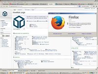
I'll just let this here...

wiki.JPG
 
Last edited by a moderator:
Also, for icons I often use Glyphicons, the Halflings ones, the .PNG format which are freebie

see http://glyphicons.com

Those are nice, again not sure if that's what you meaning or if suitable for your use
 
Svg takes to the pandora wiki in a very bad way in my experience. Those mostly cover what utf-8 does now, and .svg support is also "fancy", so it will fail. Individual suggestions for the categories are needed, how does one depict "firmware" for example. Maybe we could do different colour headings for each?
 
Last edited by a moderator:
Previous discussion about the new wiki was going on here, if anyone's interested. I won't repeat my concerns in this new thread unless Kingu would prefer that I do that.

Although I will say about the points system: the points seem like a way to encourage people who say what you want to hear.
 
Last edited by a moderator:
Svg takes to the pandora wiki in a very bad way in my experience. Those mostly cover what utf-8 does now, and .svg support is also "fancy", so it will fail. Individual suggestions for the categories are needed, how does one depict "firmware" for example. Maybe we could do different colour headings for each?
Why exactly do we need Icons ?
 
To hinder the "wall of text" effect. I guess thats to the fullest since we cant autohide/collapse anything. Take for example a subwaymap, or an ikea instruction manual, very little text. Icons and pictograms are better since the process of grasping information is more intuitive that way.  Thats how we read too, we notice the shape of the first and the last part of a word, along with context.

Edit: the points system is for constructive feedback that results in things getting better. If you fix a broken link, thats a point.
 
Last edited by a moderator:
You are still not responding to quite a lot of questions, at least not past the point of "It is better this way".
 
I asked this question several pages back in the other thread, but I don't think I ever received an answer to it:

Are you going to be updating this new front page every time anybody creates a new article in the Pandorawiki? My concern is future-proofing this design. If you at some point lose interest, it could get outdated very quickly and it will be difficult to maintain. The advantage of the current front page (other than the obvious cosmetic benefit) is that it only has the most important wikilinks on it and is thus future-proof. In this, it is similar to other wikis on the internet.

You are still not responding to quite a lot of questions, at least not past the point of "It is better this way".
Yes, and I must say that this encourages people to stop interacting with you and just "get out of your way" and let you do your thing. Which is a nice effect, but it won't last forever... let it go on long enough, and some may feel that a fork of the entire wiki is the simplest solution. I'm not suggesting this yet.
 
Last edited by a moderator:
To hinder the "wall of text" effect. I guess thats to the fullest since we cant autohide/collapse anything. Take for example a subwaymap, or an ikea instruction manual, very little text. Icons and pictograms are better since the process of grasping information is more intuitive that way.  Thats how we read too, we notice the shape of the first and the last part of a word, along with context.

Edit: the points system is for constructive feedback that results in things getting better. If you fix a broken link, thats a point.
Do we really need to engage in a discussion that you can't compare a wiki, a subway map and construction manual, or can we agree that this is just pure nonsense ?

If you put a wall of text on a page, plastering it with icons won't solve anything - you just poorly mask the real problem => its just too much information on one page. Either try to reduce the content of the page or make two versions a "light" version for newbies and a "heavy" one for the grunts.
 
We are sort of doing both, the overhead you see "is what it is" All icons are removed, we are looking for images to depict the categories, since thats where we want to draw attention first.

Discussion is taking place on IRC btw, you are all invited.

Edit: the comparison i was trying to make was through mental mapping. Not content. Its the pictograms that are the same.

I wont get into explaining the theory in detail, but it isnt bullshit. Information flow is also the reason the current page fails. Pictograms used the right way is one way to solve some of that.
 
Last edited by a moderator:
@ comradekingu : could you summarise what you see as the desired purpose(s) of the Pandora wiki?


That would help a lot with suggestions.
 
Don't know if what i suggest was already suggested in the other thread. I've stopped reading when the discussion about Slackware changes started. So here are my 2 cent.

The main page is way too crowded and the misalignment of all those subcategory boxes just hurt my eyes. I'd only show the green parts and probably some short introductory sentence to each of them (You'll get deeper info about ... blabla) and thats it. Move the bullet lists to their own sub pages. And what's the deal with those strange bullet icons (besides that some don't show up correctly in firefox, like in sebt3s screenshot)?

The lists themselves are ok, at least you get a quick overview what pages are there.
 
Last edited by a moderator:
Mr_Loon:

See firstpost for a rationale.

Crow:

Press F5, done. What you are suggesting is the consensus. I would fix it myself, exactly like that, if i could figure out how.

Edit: Those are utf-8 icons, explained in firstpost.
 
Last edited by a moderator:
I asked this question several pages back in the other thread, but I don't think I ever received an answer to it:


Are you going to be updating this new front page every time anybody creates a new article in the Pandorawiki? My concern is future-proofing this design. If you at some point lose interest, it could get outdated very quickly and it will be difficult to maintain. The advantage of the current front page (other than the obvious cosmetic benefit) is that it only has the most important wikilinks on it and is thus future-proof. In this, it is similar to other wikis on the internet.

You are still not responding to quite a lot of questions, at least not past the point of "It is better this way".
Yes, and I must say that this encourages people to stop interacting with you and just "get out of your way" and let you do your thing.
The page is to make sense of all the different stuff on the wiki, thats how it originally was. In essence very little need for maintainability has been created, me and wally (for the most part) have removed huge need for manpower, and tried to direct into fruitfull endavours. (Sometimes we fail, sometimes we dont.) Nobody seemed to care when it was just not getting done. I explained my intent, which was largely counterproductive, and as you can see, it was removed before you complained about it just now.

I like newmain-page for reasons in firstpost. if you think its merits align themselves with any adjective, tell me why.

Could you not use quotation "" chars when its something i havent said. I would like this thread to stay on topic, use PM if it falls into an ad hominem category.
 
I think with some slight layout-changes (to avoid side-scrolling) this would be a great overview-page. However, as a frontpage I find it rather uninviting. Especially people who are new to the project will feel intimidated by the amount of information and decide that this is too specialised already and leave.

The benefit of the current main page is that it gives a very nice overview what the project is about, a short list of topics where to start if you're a user or a developer and links to the other languages. It kind of takes you by the hand and sais: look, here's a good place to start reading if you want to know something about user or developer-related topics.

So here is my suggestion:

I would prefer to bring back the "Users" and "Developers" boxes from the current page, or replace it with a "Where to get started" box, that lists some topics for people who are new or unfamiliar with the project, also to the Games page or another often visited main page of a subsection.

Also a picture of a Pandora and a general description is needed. I strongly suggest to also put up a friendly welcome-message. That would be very inviting for newcomers.

Below that would be the perfect place for the information you have on the newmain page now. But I would suggest to just show the captions, and have the boxes collapsed (so when clicking on it, the box with all the topics would expand). Alternatively you could link to a subpage with all the subtopics to that category, this should greatly enhance the readability. I think it is also worthwhile to have the page like it is now (just with fixed icons etc., maybe different background-colors of the boxes? and maybe all boxes underneath each other to avoid side-scrolling) to really have everything on one page. But this is only usefull for people who are more into the project, and would be discouraging for newcomers as first page, so it should be an extra page. Definately with a link to it on the main page.

One big issue (which was already mentioned): the wiki should be well readable on a Pandora-screen. You won't get away entirely without side-scrolling I guess, but keeping this in mind will automatically result in a reduced main page. Sometimes less is more.
 
Last edited by a moderator:
I think from a visual point of view, collapsed content on load would look nicer, if planning on having that many links on front page.

Also agree should not need to scroll across is viewing on a Pandora.

Some little icons if you wanted them, till something better is done, just quick thing in PS

2d82m1l.png
 
In essence very little need for maintainability has been created
Elaborate a bit more on this, please. How is the new front page easier to maintain than the old one, considering it will need to be edited every time a new page is created?
Its not meant to be organic like it was, its more directed towards logic.
Whose logic? That's the whole crux of the matter, isn't it... perhaps the fundamental disagreement between us is that my idea of a wiki means pluralism. Different things make sense to different people, and if you force them to do things your way, they'll just stop editing and it's not a wiki any more, but a personal website.
Our disagreement on this point is probably why we seem to be talking past each other so much.

Perhaps what you really want is to make, not a wiki, but a personal Pandora-related site (based on the info in the wiki) that will be exactly as you want it.

Could you not use quotation "" chars when its something i havent said. I would like this thread to stay on topic, use PM if it falls into an ad hominem category.
Sorry, that was unintentional, honest! I didn't mean to ascribe those words to you, I meant those to be generic "air quotes". I'll be more careful in the future.
 
Last edited by a moderator:
Back
Top