Pandora Wiki Cleanup in progress


I know, I know, I just couldn't resist to post about my feelings :)

Do you have a ToDo list for things that stillt need work?
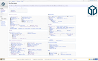
 
You are looking at it. There is a todo list thats quite ancient, but its just general wiki things to do. Take a look at http://pandorawiki.org/NewMain_page and scratch your itch.

Some of the pnd categories are now gone.


Edit: removed the pageviews, tried some manual layout. Do the arrows work? might do  ←→ also if its something that goes both way.

The borders are ugly.
 
Last edited by a moderator:
This post can be considered a one thousand and twenty four word list of points for improvement to the page.

screenshot1.png

Rendered using Iceweasel 3.5
 
(see attached image)

Rendered using Windows 7 64bit running Firefox 23.0.1

I think it still looks horrible and I don't think a refactoring of the categories/pageheaders will fix this.

It is a very functional layout, but I think we don't need to put all this information on the front-page and completely forget about aesthetics.

'NewMain page - Pandora Wiki' - pandorawiki_org_NewMain_page.png
 
Guise, its 2013, get utf-8 support. Ty for the screenshots though.

I think we can all see the current frontpage, so lets take it from there.

Nothing has been done for aesthetics yet. The markup is as scant as possible.

Any ideas for colour-scheme ? Categories are greentext now because  >not best wikidesign 2013
 
Last edited by a moderator:
I'll try to keep a bit silent, since I've already added a lot of hot air to this discussion, but: comradekingu, I can't really see where you're going with this? Is there an underlying thought that I'm missing? And yes, I see the page in UTF-8, that is not the problem...

Perhaps you can explain why this would be a good idea? Because to me, at the moment if I were asked about improvements, I'd say "let's start off with going back to the previous main page". I don't get the idea of the little UTF-8 icons, or why this page is forcing side-scrolling when my window isn't big enough, or the random indentation, or the apparent love for big boxes with walls of text in them.

I simply don't get it, at all. What is the point that I'm missing?
 
Looking at http://pandorawiki.org/NewMain_page , it seems that it is impossible to view it at the resolution of a Pandora screen (800px width) without scrolling the page sideways.

Could this be fixed, please?

Also, am I correct in assuming that your proposed new front page lists every single article on the wiki? It IS a little cluttered. Perhaps the HideableNotes template could be used and all of those links can be collapsed by default, with only the main categories (HARDWARE DOCUMENTATION, FIRMWARE etc.) visible. Similar to some of the comments on the software lists.

Kingu, do you plan to update the front page every time anybody creates a new article on the Pandorawiki?

I simply don't get it, at all. What is the point that I'm missing?
I'm as baffled as you are, really, but I guess the point is that Kingu has the time, energy and will to work on this, as well as administrative powers, so his vision is likely to prevail. I unfortunately do not have much time since I'm in the final stages of work on my graduate thesis, so I have to mostly leave him to it and hope that it turns out okay in the end. I also hope that he (or Wally) will try not to piss off editors in the future by unilaterally making major changes to actively-maintained pages.
But if anybody has really serious concerns about something or other that happened (i.e. a wrongfully-deleted page), you can send me a PM through this forum.

However, I do heavily disagree with Kingu about the value of redirects - I believe that they hurt no-one because they are almost always invisible, and are very useful for user-friendliness and avoiding dead links. My views on this are fully in line with established practice on Wikipedia.

Once this frenzy of work is all done, I would like to go back to all of the deleted pages which were deleted because their contents were moved into omnibus articles, undelete them and change them all into redirects to those particular sections on the new omnibus pages. This has the benefit of preserving the edit history (which I think is VERY important for a wiki to keep; deleting pages prevents anyone except admins from seeing it) as well as catching any stray broken links due to the deleted pages.

---

Also, Kingu, are you using the number of views that a page gets as a rationale for whether to delete it or not? Please confirm or deny this.

---

That was a fun read. It always get interesting when partisans of "open stuff" don't seem to like the way wikis work :)
What Kingu's doing currently isn't really the way wikis usually work - his working method is unapologetically autocratic; rearranging everything because of personal feelings and in such a way that almost nobody can easily undo it (actually deleting moved pages instead of leaving redirects prevents any non-admin users from undoing the changes or even seeing what was changed).
 
Last edited by a moderator:
NewMain_page looks like someone puked on my screen. Completely useless if you ask me.

However, I would suggest that a number of templates are made that can be embedded on the main page.

Also note that we have semantic mediawiki, so you can easily query for a list of pages within a category.

One thing I'd like to work on (if I ever have time), is to make sure pages are in at least one (preferably more) categories.

This makes it much easier to get a good overview of categories and cross-sections between them.
 
Autohide in each category is a good idea,  And it makes for less "wall-of-text". That way its easier to decipher what the actual categories are. I guess it goes well with saving screen real-estate too.

If you check out the deletion log you can see where the info moved to, and why it was deleted if its gone.

Semantic wiki is great for having for example the same (updated) info in the top of each hardware component, and then assembled in a "hardware" page if you want a full overview.

What categories do we need?

I guess noise drowned out much of the rationale of this thread:

Translations, redirects, nested menus, nondescriptive categories, outdated info, needless complexity, redundant info (non semantic), directory based pagenames, duplicates, pages that do the same thing twice, the list goes on and on

Low viewcount isnt good, it should be as high as possible. Some things have high viewcount because the pagename is non-descriptive and it gets clicks because you need to do that to see whats in there. Some have low viewcount, and are supberb, like notaz SDL and GFX stuff, that has 65 and 150 views, most of which are me and wally i think. So in a sense this is an equal opportunity thing. General category of most interest takes priority top left spot though.

And then we will have to see what happens. I for example i dont think android will keep having 600 and RISCOS has tenfold that. If i could put myself into the heads of a proposed user better i would. I ask for the feedback because you use this thing, you know where the shoe fits. Viewcount is something to grasp things by, not a value that translates directly into anything much.

Edit: I do not rearrange things based on personal feelings. Rather i explain my rationale. As such, the way redirects work, on wikipedia, an authority on the matter, is that redirects which are inconsistent, flawed, or otherwise wrong deleted or fixed. In that we arent wikipedia, with their structure to maintain, we can afford to have almost no redirects. On a similar note we can no afford to be sloppy. Thats the kind of stuff that can be undone without asking. All deletions are explained, if you want to second guess my deletions at least. On the whole, are you complaining about missing information, or the nature of which things are done? I can see one following the other, but would love to hear factual complains about the former.
 
Last edited by a moderator:
If you check out the deletion log you can see where the info moved to, and why it was deleted if its gone.
But only admins can see the edit history of the deleted pages. It hides the authorship of the text. It also makes it impossible for users to check whether the text was transferred faithfully to the new omnibus page or if something was missed.
P.S. Thanks for the replies to the other questions, too.
 
Last edited by a moderator:
Some feedback on the proposed new page:

- The UTF-8 icons are a neat trick and probably took some effort to add, but I don't really like them: they don't really help in the navigation process, many of them are meaningless until you start to look for a meaning, not all browsers and fonts support this, and it does not look very esthetically pleasing to me.

- The page is too wide, you need a layout that does not force two columns if the window width is not enough.

- I don't like monospace fonts for websites; they are good for coding and ASCII art, but I don't see why you would use them here. It looks like the page was written on an old typewriter.

- It's nice to have a "cheat sheet" style page like this which has direct links to all or nearly all wiki pages, but I don't think the main page should be like that. For the main page I would start with a gentle introductory text, and only have direct links to the main categories of information and some of the most important pages. The "cheat sheet" page is very useful as a reference index for somewhat advanced users of the wiki, but it is way too intimidating to be used as the main page.
 
yes I'll just say that that NewMain page is imo horrid. way too much text, monospace is a bit weird, and way too wide...
 
Monospace came as per default.  Wikitable collapsible or {{hidden}} i cant get to work.

The majority of the work has gone into making categories, removing stuff and making sense of things.

If someone wants to have a go at making a sleek UI out of my approach or wants a page of their own, go for it. Ill create NewFrontPage2 upon request if you want to show your vision if its that different from mine.
 
Last edited by a moderator:
Ive been doing some thinking here. I have come to the conclusion that having arbritrary (which is in some times the case) utf-8 icons, only provides the benefit of making a new mental mapping between text and image. Making the sorting process quicker since images are more recognizable.

I think instead images could be used, it doesnt clutter up the source, if you host it on the wiki or use a shortening service, and it hooks into already recognized imagery. Logos for software and such.

They are also not limited to one colour.

Now this would be an unholy mess and/or we need scaling, which is another problem. Could do vector .svg images, but then people are going to not be able to see them with their pre-eurasian war browsers.

How about 16x16 icons?
 
Last edited by a moderator:
You're on your own here, Kingu. I think it's fair to say that nobody else thinks this is a good idea. But at the same time, nobody else wants to work on this.

Also, from a casual scroll around the Wiki... it's very frustrating to me the way you've combined different pages by just tacking them on to each other, with no thought at all about integration, with TOCs in the middle of a page, categories listed not at the bottom like they should be but in the middle, and basically ending up with longer articles that have incoherent layouts.

I guess what I want to ask is, is this convenient for YOU? Personally as a reader, I wouldn't want the TOC to be somewhere in the middle of a page below many other non-listed sections, and as an editor I wouldn't want the categories to be listed somewhere randomly in the middle of the page rather than at the bottom as is the common standard on every wiki in existence.

But for yourself, does any of that hinder your use of the wiki as an editor or as a reader? I guess it doesn't, but I can't understand why. Do you actually use the Pandorawiki, not as an admin/organizer, but as a user?

----

EDIT: Okay, I'm going to put out an ultimatum here concerning redirects. I'm sick of seeing all the red-links on various pages of the Pandorawiki because you didn't bother to check if anything was linking to them before you deleted the redirects (this is one of the most basic editing rules, and ignoring it was egregious). Unless a good reason is given why I should not, I will undelete the deleted redirects soon so that there are no more missing wikilinks on the wiki (and also for the reason I gave in my previous post).

As a user, this is the sort of stuff that really frustrates me.
 
Last edited by a moderator:
You're on your own here, Kingu.
I would like to point out that wally made lots of effort.
I think it's fair to say that nobody else thinks this is a good idea.
In all fairness, what is "this".
it's very frustrating to me the way you've combined different pages by just tacking them on to each other
Good, fix it. There is a method to things, and to get a sense of order that had to be done. It is not a permanent solution, but one to get some sense of overview.
I wouldn't want the TOC to be somewhere in the middle of a page below many other non-listed sections
Easily fixed.
I wouldn't want the categories to be listed somewhere randomly in the middle of the page rather than at the bottom as is the common standard on every wiki in existence.
Good, standards are good. I suppose this is also a rather easy fix, but as of now, we haven't agreed upon the categories, they make little sense. The less uncyclopedia the better.
Does any of that hinder your use of the wiki as an editor or as a reader? Do you actually use the Pandorawiki, not as an admin/organizer, but as a user?
Yes, and yes. As of right now it isnt an organic mess of broken logic. It isnt so vast that my approach is unfeasible, and so long as it works, it shines. Ive scratched most of my itch, now you do your part.
I'm sick of seeing all the red-links on various pages of the Pandorawiki
Let the hatred flow through you. Everything proceeds as i have foreseen. On a srs note: If we are down to this im glad, that is a minor inconvenience. It is also easily fixed for anyone, if you can read this, you can take care of the problem. Edit the wiki today!
because you didn't bother to check if anything was linking to them before you deleted the redirects (this is one of the most basic editing rules, and ignoring it was egregious).
I did.
Unless a good reason is given why I should not, I will undelete the deleted redirects soon so that there are no more missing wikilinks on the wiki (and also for the reason I gave in my previous post).
If you discuss that with the other mods and parttake in the effort, as i did, go ahead. I suppose that is the most counterproductive way of "fixing" it. That will reinstate, duplications, duplicated pages, spelling errors, wrong naming conventions, and pretty most every other break in good practice you could think of. Instead i suggest linking to the proper categories, in the proper way. Or, in the case that is unfeasible, make new categories or discuss why the ones we have no dont make sense.
As a user, this is the sort of stuff that really frustrates me.
I guess all my explanations were lost in the flamewar. Since its not needed now to have it "closed" I think a new thread should be made stating the wiki is now open for business, again explaining what has been done and why.
 
Last edited by a moderator:
Monospace came as per default.  Wikitable collapsible or {{hidden}} i cant get to work.

The majority of the work has gone into making categories, removing stuff and making sense of things.

If someone wants to have a go at making a sleek UI out of my approach or wants a page of their own, go for it. Ill create NewFrontPage2 upon request if you want to show your vision if its that different from mine.
Why all this?

If you don't have any real intent on working with user feedback (other than "if you don't like it, fix it yourself") why change that site in the first place / request user feedback ?

As a user, I deem your approach on making a user friendly "launchpad" into the wiki has failed dramatically - use the old one and fix the links that would be broken due to your restructering - otherwise all the work you invested is useless as most people will rather avoid using the wiki directly. They probably will just post their question in the forums and get redirected to the appropriate page in the wiki directly by more experienced users.

Edit: exchanged "reinstate" to "use"
 
Last edited by a moderator:
I'm not talking about categories, I'm talking about redirects. I already mentioned how your policy of deleting the old page when you combine pages (instead of leaving the old article in place as a redirect to the new article) makes it impossible for anybody except an admin to see the authorship history or to verify that the pages were accurately combined by you. For an open-source project like a wiki, this is an essential feature if you care about trust and transparency.

The only rationale I've heard in this thread for deleting redirects is because it makes the All Pages page look cleaner, ignoring the fact that there's a "hide redirects" checkbox there that would produce the same effect. Other than that single page, redirects on a wiki are completely invisible (they are not present in categories or anything else) and it serves no purpose to delete them, even if the redirect is only there because of a common misspelling.

There is no such thing as messiness if the mess is completely invisible. Things like frequent red links on the wiki, though - that's a very visible mess and very frustrating for a user.

(if you say that you do check before you delete them - okay, maybe it was Wally, or maybe you didn't do a good job; I don't know)

I don't want to have an edit war between two admins, Kingu, which is why I've been trying to get your side of the story before I do anything. You've answered some of my questions, but you've been consistently avoiding the points in paragraphs one and two of this post, so I don't know where you stand. That's why I haven't "taken care of the problem" like you suggest, because I try to come to an agreement before I make major changes.
 
Last edited by a moderator:
thatgui
It is a work in progress. I made it, other people edited it. I wanted constructive feedback, sorry if that wasnt clear.

The latter is an assumption on your part, in practice some pages that are worthless got plenty viewcount, and others got none while being good. I have argued why my system is better, and if you arent about to do the same, or make a system of your own, your input has no meaning. If you think all that has been going on can be summed up by breaking links, then you are mistaken. Understanding the difference isnt in what you see, it is largely in what you dont.

Who said it was user friendly? Ill be the first to admit my page is nearly 100% dogmatic. I dont care to fix what i didnt break, the way i see it, if you helped create the problem you can help create the solution. The front page i never cared for, it seems you do. Right off the top of my head there arent any more half-way translated sections, that makes sense. Where can you help out? The forum is _full_ of stuff its now easy to find on the wiki. Whereas before it was just there. If we take your approach, atleast now its easier for experienced users to find things for others.

Esn
Do your part and ask for admin rights. The other admins arent taking offence, they helped doing it. I could be wrong, but for case of argument, lets say im not. I did for the most part make edits saying where content came from when merged. Can you point me to the actual problem?

I will repeat myself,( and i cant say that i by this cover it all, read my replies in this thread for further analyzis.) Redirects were anything from duplications, misguided logic, bad naming conventions, misspelling, errors, etc etc. And if you are me, you take it one step further and ask yourself if we need any, and if so, is it because the real names dont make sense. Then proceed to change said naming.

Henceforth your proposition doesnt question anything.

Maybe wally did something, maybe it was me, maybe it was someone else. You not understanding what has been done, is a problem im trying to direct, it wasnt in my list of priorities as i did it. I found it evident that given the state of things, it wouldnt even be questioned, and that people would be happy for me doing it. You may ask others about their rationale, but i can defend my point also for them. We are not infallable, and to be honest, you dont hear about what isn't missing, that doesnt mean its gone.

Your quotation "" was relevant to anyone being able to fix the resulting breakage, it doesnt make much sense out of context, since what you proposed wasnt my way of fixing it the right way according to myself.
 
Last edited by a moderator:
Back
Top