Pandora Gui Concept I Made


Joppu said:
I meant it would be ackward TO ME to switch between two different apps without "windowed" GUI (Yeah I plan to use Pandora for more than just gaming). Or maybe i have just used Windows too much...
Something like the compiz scale plugin might help with that.

Sphinxter said:
for that reason alone X would be wasted, not to mention how many actually usable X apps will fit in 128 megs with no swap is damn few.
There are lots of reasons to use kdrive though. At least because there's a lot of the code already written.
 
Last edited by a moderator:
Even when you're multitasking, a tabbed interface is easier to deal with. You would still technically need a window manager (I think), but the windows would all be full screen. You could swap between fullscreen windows by holding X and hitting L1/R1. One of the window options would always be the UI so you could open something else.

This would get sticky if you have several memory-intensive programs open at once and try to open something new. We would need a swap file for sure. Similarly, some games / emulators will probably need all available resources, so there would have to be a way for a launched program to tell the system to close everything else and put the GUI to sleep. This would also prevent an accidental X+L1/R1 button combo tabbing you out of a game.

I don't know who is actually working on the UI, but I hope they're reading this thread :D
 
excellent gui chad. It would be more flowing to do it sequentially. tab>coverflow>list. this can work for music, video (with all the different players) as well as the games. A command line could maybe fly down and be used with maybe a R2 click?
 
chad78 said:
Apple? I thought I was stealing more from Sony - as in the GUI for the PSP. But I guess they did steal the coverflow thing from Apple. :)

As far as not using Firefox from this menu, on a PSP you get the web browser the same way you get to a game or a song. Or using a Nokia N8X0 - it's not that different, really. I mean, why does it matter how you get to the program, as long as you get there. And, another comparison, the (Default) Easy mode of the Eee PC. (Now, I used a Game System, a pocketable Internet device, and a clamshell UPMC in my comparison - the Pandora is all three, so hopefully you can see how each function would work with a similar interface.)

That said, I really do think a simple grid of icons would be better in some situations - which is why I added the options icon on this latest version, so you can switch between Coverflow, Grid, and List.

Here's a bottom tabbed version, for easy tappin' [thanks Sinbad] (in Coverflow). And, btw, I added a "Home" tab [Thanks Chip], and a Pandora Tab - so your native games will be separate from your Emus.
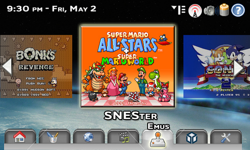
2460239206_3d0fe531c9.jpg

Click For Big!

Sphinxter said:
Try to open and use 2 windows at once on a 4.3 inch display, that 7 inch eee display is not even enough real estate to make two apps usable, be a complete waste, the screen is just too small. One app at a time taking up all available space is really the only usable configuration, for that reason alone X would be wasted, not to mention how many actually usable X apps will fit in 128 megs with no swap is damn few.
Palm pilots have done multi-tasking with more than one app/window open on the same screen using a much smaller screen and much less powerful devices - for decades.

There would be a reason to have an RSS reader open and a text editor open at the same time - even on a small screen - or a media player and a web browser - or a media player and a game.


Using a pilot every day, (not wondering how you've had one for two decades when they've barely existed for only one), and have never seen a second window other than an ok prompt or one line find dialog and those take up a quite a bit of of the screen too. How do you switch between multiple windows, I must have missed the task switcher, never seen more than one app running on mine. May swap them out, but only one is alive.
 
Last edited by a moderator:
Sphinxter said:
Using a pilot every day, (not wondering how you've had one for two decades when they've barely existed for only one), and have never seen a second window other than an ok prompt or one line find dialog and those take up a quite a bit of of the screen too. How do you switch between multiple windows, I must have missed the task switcher, never seen more than one app running on mine. May swap them out, but only one is alive.
I'm sorry - you are right. I was thinking of the Apple Newton - particularly this article about it. Which came out 15 years ago - or one and a half decades. :)
 
Last edited by a moderator:
the important thing is that devs allow command line parameters. for instance, with an emulator, you cannot have a main menu that lets you pick individual roms to play if the emu does not let you pass the name of the rom from the shell to the program.

you can see this on the gp2x with gmenu...it has a nice rom browser, with the option for box art or screenshots or whatever you'd like. but you can't use it everywhere because many emus are done in what i'll call "windows style (have their own menu)" vs "unix style" (do one thing & rely on the shell for the rest).

just thought i'd point that out as early as possible :D
 
Arialia said:
you don't see a lot of programs in one time ....
That's just the launcher. When an app is started, it occupies the entire screen (or almost).
 
Last edited by a moderator:
Thanks for all the comments, guys. This is really fun!

And to the DEVs - I've got all the layered Photoshop layers for this stuff, if you want it.

Here’s the “Home” Screen I was talking about, inspired, pretty directly, by the Maemo “Internet Tablet OS 2008” distro of Linux of the Nokia N8x0 series.

2459577471_6e5d898dc8.jpg

Click for big

As you can see, I changed the background, like the user should be able to.

The boxes become “solid” when selected. (The Search box is selected now.) This draws focus to the selected item.

The Pandora Logo in the bottom right would, if you click on it, take you to the Pandora homepage (assuming you are online). So, for now that would be http://www.openpandora.org/

The Search box has a drop down menu, just like the Firefox search box, hence the little down arrow. The current icon - the Pandora icon - searches your Pandora - the onboard storage, as well as any flash cards or USB drives that are attached, (assuming they’ve been indexed). It would just be a name search - not a content search. So think Windows “Search” box from 98 - not Mac OS X Safari, or Google Desktop. You could select Google, Yahoo, Live, ThePirateBay, whatever search engines you install. But again, those only work while online - so it defaults to Pandora search, (maybe you can pick the default search). ***ATTENTION CRAIGX --- THIS IS HOW YOU MONETIZE PANDORA BEYOND HARDWARE SALES --- GET GOOGLE TO SPONSOR YOUR PANDORA SEARCHES - MAKE GOOGLE PANDORA’S HOME PAGE***

The Weather automatically updates whenever you are online. I forgot to add the “Currently” info, but you get the idea. You type in the zip code (for US - postal code, city & country, etc - for other countries), and it tells you the weather.

The News Reader can be set to whatever RSS/Atom/Podcast feeds you want - again, automatically updates when online.

Other potential widgets - media player, internet radio, tic tac toe, calculator, contacts, calendar, email, etc.

Arialia said:
i've test this kind of navigation with the Spinal's Menu for DS .... and i like the look but it is not very practical : you don't see a lot of programs in one time ....


Yes, and especially on the DS's small screen - that would be a problem. I am going to do another mock-up (probably not today - I'm a bit Photoshopped out at this point) that has a grid of smaller icons - and one with a list of programs. that's what the E looking icon next to the WiFi icon is for - to switch between modes.

Modes are "Slider" - the one I kept showing with the Emulators - Grid and List.

The movement of "Slider" isn't like Coverflow - it is more like the Dock and like the Spinal Menu. The icons are just centered horizontally - and they grow, become solid, and fully colored as they approach the center. And, of course, shrink, fade to greyscale, and lose occupancy as they go off the sides.
 
Last edited by a moderator:
rokdcasbah said:
you can see this on the gp2x with gmenu...it has a nice rom browser, with the option for box art or screenshots or whatever you'd like. but you can't use it everywhere because many emus are done in what i'll call "windows style (have their own menu)" vs "unix style" (do one thing & rely on the shell for the rest).
Thanks for that - it is good to know what can and can't be done.

My thought process on the screenshots I put up was - well, what better way to pick an emulator than by a game screenshot? I didn't really think where the screen shot would come from. If the screen shot won't work, or won't work automatically - you could give the user control of what picture to represent it (which makes more work for the user) - or just default to whatever logo the devs of the emu came up with.

I'd personally like to see the title screen / cover art to my most recently played game - or the most popular / my favorite from that console (That's what I picked for the TG-16 / SNES / and Genesis - my favs.) Well, Super Mario RPG is really my favorite - but All-Stars is easier to play on a portable, and more "iconic" to the console.
 
Last edited by a moderator:
Nice work Chad, this is the kind of interface the Pandora team should aim for, powerful and tailored for use on a handheld! The base for this has been well set by GMenu2X, perhaps it would be a good idea to build on top of it, like adding the front page with frequently used apps, weather, etc. :)
 
i personally think widgets on a handheld is kind of overkill. besides that, rss news & weather is becoming like clocks, there's no escape.

but i these discussions always end up dividing people into two camps..."clutter is bad" and "zomfg i need all my icons in one screen or i'll die". i think you can tell where my biases are.
 
rokdcasbah said:
but i these discussions always end up dividing people into two camps..."clutter is bad" and "zomfg i need all my icons in one screen or i'll die". i think you can tell where my biases are.
Good configuration tools and nice plugin apis usually solve that problem gracefully. Plus, you can always just make your own.
 
Last edited by a moderator:
Chad, I absolutely love your gui concept (your last version). Love it, love it, love it! It's easy-to-use, professional looking, visually appealing, and self-explanatory. I really hope the design team will consider it.

Thanks for your time and effort.
 
^ Seconded
Seriously, I read through this post, and your gui concepts have been stunning. rokdcasbah, I understand your concern, but in this concept, the widgets are all on the home tab. Don't want to see the widgets, don't click on the home tab.
 
Really impressed with your concepts Chad! I hope the GUI Dev Team take a look at your designs if they are in need of some inspiration!
 
WHY DOES EVERYONE HATE EVERYTHING I DRAW. I always make my images for like an hour and then what I get: "your concepts fail :D ". Nice, constructive criticism. I'll make another better concept with tabs (as it seems all of you love them so much). I don't get it. Why does everyone want some kind of dumbed-down UI? I'd rather make my own shortcuts and folders the way I want.
 
Back