WarmFluffyUK
The Big Wad Bolf.
Just in case I scanned it with Sophos Antivirus and that didn't find anything, so it's clean  .
.
Squidge said:I was just going to say I've got a dedicated gif unpacker for the first Pandora logo (dedicated meaning it probably won't open any other gifs, as its limited to 16 colors and assumes a great lot).
Would a SVG subset be feasible? It would make the images very small and easy to change.


yosh64 said:hey
I just wanted to mention that I much prefer the font, spacing and such of the logo on the pandora website compared to in flatmush's logo, what do others think?
Hmm, the perspective of the cube next to the capitals with such close spacing just don't work for me :\. Ohh, and the the curved ends on the cube really put the perspective off wack, sorry if I sound harsh but this is what I see :\. So if you want the curves, please put them in perspective
. Anyhows besides this I think you have done well
.
But yea, I think the logo on the pandora website is fine.
edit

I done a quick edit to try and fix the perspective of the curved ends of the cube and also added a bit more spacing. Anyhows I hope you don't mind. Hmm, something still doesn't look right about the cube to me, I might look into it more.
another edit

Here is the pandora logo from the website that I have converted into 2 colors. Hmm, the cube looks a little small or something, but I dunno.
and another

I thought I'd extract the logo from Eolair's animation so you can compare or whatever, I also hope ya don't mind, hehe.
cyas
[END QUOTE]
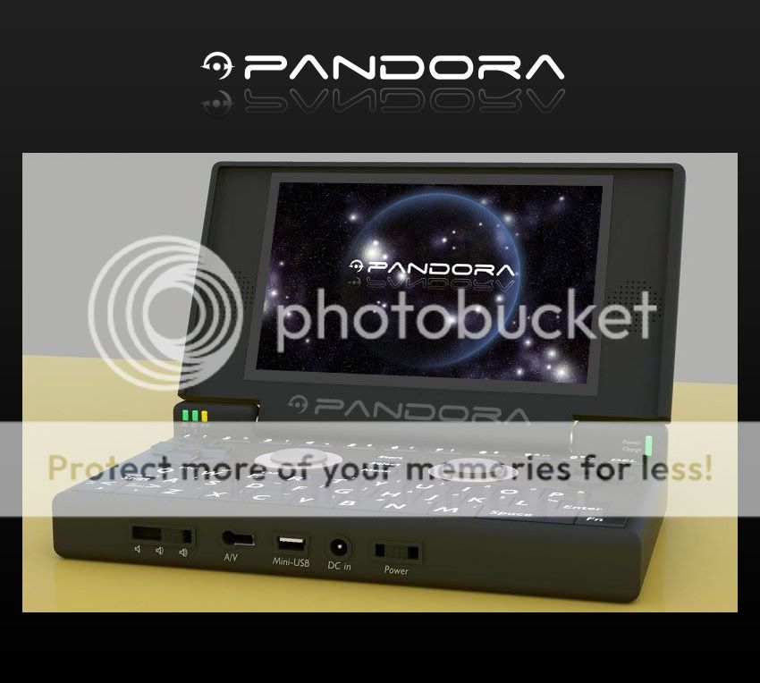
Personally, I think the Pandora font on the website is flat and, well.... boring. I much prefer Eolair's Font stylings. If need be the stylised Moon image(although I must admit it looks extremly cool) could be fitted out and replaced with the pandora logo cube. I think his fonts look "fresh" and "flashy", reek with style, and say this is something completely new; and completely badass. Just "pandora" with the minimal font looks slightly amateurish (no offence meant)h34r: . I was looking through the pandora renderings in his sig and that font across the lower bezel of the screen and even across the cover are quite evocative.


I remember back in March when he won the logo poll here on the forum for the design.Here
I'd like to see his designs used however modified.
Just my 2 cents.

