sam fisher
Well-Known Member
The newest one, but I don't know if its for sure what we will have.
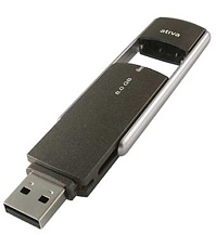
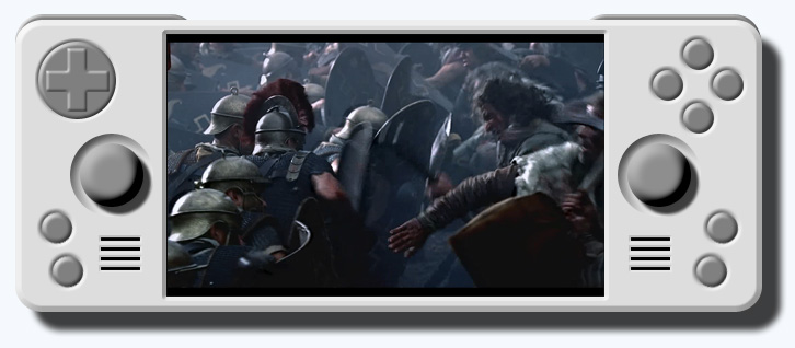
Something like this maybe?God Ginrai said:Anyways, Eolair, do you think you could try to make an image of the Retrograde using the dark gray color of this flash drive?

I think that would be a really nice color for the handheld, but I'd like to see what it looks like on your design, because it's not so easy to imagine a color on a handheld, especially one we have no pictures of atm. ^_^;
-God Ginrai

Eolair said:Something like this maybe?God Ginrai said:Anyways, Eolair, do you think you could try to make an image of the Retrograde using the dark gray color of this flash drive?

I think that would be a really nice color for the handheld, but I'd like to see what it looks like on your design, because it's not so easy to imagine a color on a handheld, especially one we have no pictures of atm. ^_^;
-God Ginrai

Larger image
That's looks awesome! ^_^ Also, don't listen to what Alex says, those extra two buttons make me very happy. (seeing as how I want the best control scheme to be able to play Ocarina of Time and other N64 games) It would be great if the handheld had six easy to reach buttons aside from the 2 shoulders, like your design shows. ^_^
-God Ginrai
I have a friend who owns such a laptop, and, yes, it can easily be a fingerprint magnet.cappuchok said:The recent HP Pavilion entertainment laptops use this sort of body design. It looks really cool while still remaining simple and elegant. I'm sure it's a real fingerprint magnet, though...
Orkie said:Umm... no. Write protect the bootloader chip and it is unbrickable - could be done on the GP2X too I guess.cappuchok said:Some chips can boot from SD media via a bootloader which still leaves the device vulnerable to bricking if the bootloader is corrupted.
What if we had a bootloader that wasn't write-protected, but wouldn't ever need to be upgraded except in the case of bugs? Then we'd have main boot software that's upgraded more frequently... or is that what the GP2X does already?
Agreed, we don't need that many buttons.Alex. said:^ looks great, except for the face buttons, which are way too many to be intuitive anymore. This isn't an arcade board, it's a handheld...
All that is disclosed in this very threadapgunner said:ok so when is this device gonna be out to bye and who is making it?
We're thinking most likely Spring 2008. craigix and perhaps a few others around here are definitely helping with the design of the product, but beyond that there's no individual company we can point to.apgunner said:ok so when is this device gonna be out to bye and who is making it?
I agree, Eolair's latest example is looking very close to how I'd like to see the final product turn out. Some constructive criticism might be in order though, relating to the size and placement of the right action button group. While I do like the thought of 6 action buttons on the right (the "proper" layout for Genesis and many arcade platforms), I also think that four of them need to be in a diamond shape slightly separated from the remaining two buttons (Saitek solved this by making the remaining two buttons smaller and place them both at the right side of the "PSX/N64-C buttons", not one on each side as you've drawn - I think that pressing the wrong button by mistake could be easy on such a layout.X-Code said:Sexy picture Eolair, considering button positions and the reflex movements of a player's thumb, I would daresay that they are very well placed B)
javaJake said:Methinks we need a codename for this project.
sixela said:Agreed.
codename: MOFO2x
*Leans back* This is going to be fun to watch.sam fisher said:The code name is the "Craiginator" and Craig has stated multiple times that it is already named, just as the design is almost done and dusted. He just won't reveal the facts until the time is right.
The two bottom buttons need to be raised above the right stick for that design to work.mavsman4457 said:It seems a bit silly that the name has been decided upon but not released. Oh well. And I think it would be nice to have no system buttons on the bottom of the screen or try to make the space above and below the screen minimal. Someone presented a design like this a little bit ago but I don't want to find it now. I'm not sure if it could be done but it looked really nice. It was kind of rectangular.
Edit: Aha!

Don't you guys like the way that looks? Maybe someone could play with that, change the color, the button positions a little bit, the shoulder buttons, etc.

