Release Oolite: Legible font project


FWIW, my screenshots are cropped but not shrunk.  Click on them to see the full resolution version (the board scales it down for show since it's too wide for most people's browsers).

Hmm, so if you did design a ~8x8 font scaled up to 64x64 the worst that could happen if your pixel line happened to span a row or column when scaled down and placed is that you get a row of two 50% pixels, but most of the time you'd get a 75% line and a 25% line or better.  You've looked at the rendering in detail - is that no better than the current situation already?
 
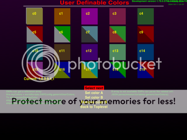
Hi i'm not sureif this help with regards to the font colour, but OXPConfig gives various options as to colours


 haven't tried to alter this, so i'm not sure if i'em way off the mark, but i'l give it a try, anyway the other colour change screen for font in OXPConifg is:


I haven't fully read the thread up to date so i may be going off on a tangent here :(
 
my screenshots are cropped but not shrunk
Sorry, my bad, you're right.

design a ~8x8 font scaled up to 64x64
That is the next test. To my mind, it can get no better than a crude square glyph on an 8x8 matrix, legibility-wise. A stroke weight slightly slimmer than 1/8 I think will improve proper (sharp) rendering chances :p .


One reason all fonts until now get so blurry (other than the inherent rasterizing randomness) is they still waste a lot of those puny final 8x8 pixels: starting from the top down on a glyph, we have:

1. Buffer empty space on the default font.

2. Upper diacritics

3. Cap height / ascender & x-height

4. Descender / lower diacritics

5. Buffer empty space on the default font.

If you subtract all that, you get probably at most 5 pixels for final x-height, no matter what (existing) font you use. That's not good enough when the strokes render blurry. For a lower case "e" all three horizontal strokes can (and often do) render blurry, leaving no separation between them. It seems thus that a minimum of 2 "final pixels" is needed between strokes. 1+2+1+2+1=7. Meaning that a font that renders legibly is entirely possible. It may not be pretty, but it will work.

So what I'll do is eliminate as much as possible of that wasted space. Minimal buffer space (1/64 px). Short ascenders & descenders, no diacritics (or heavily subdued), for an as large as possible x-height. This is key. When even lowercase legibility is a problem, eliminating diacritics is a small sacrifice. My final goal is making a font that is pretty enough on a larger scale, yet works properly when shrunk down. I have the font drawn in pencil already. Getting it into design software and refining it needs more time. But next in line for testing is a crude pixel font.
 
Last edited by a moderator:
TBH one of the reasons I reckon the fonts are hard to read against the starfield background is because pretty much all of the final pixels are ~50% max brightness, cos they all contain a significant amount of blank space.

I'm not sure how much more testing you can realistically do.  I get the feeling we're approaching the point where we need code to switch out a smaller bitmap if the font size gets too small.

Although I should point out that I've never found the galactic chart too much of a problem. I can read ~30% of the stars as is, no problem, and more if I start to learn the names, and I never really need to be able to read the labels in the galactic chart anyway.  If I'm looking for a particular star, I just type the name in.  If I'm trying to work out how to get to a place, I bring up the ANA and look at which way the line is going, then switch to the local view and select the star in the direction and distance of the first hop - it's rarely difficult to translate from one to the other.
 
Hi i'm not sureif this help with regards to the font colour, but OXPConfig gives various options as to colours

<snipped out screenshots>

I haven't fully read the thread up to date so i may be going off on a tangent here :(
This may have possibilities, but OXPConfig will need updating to work with the legible-font OXP.  Nothing major, I suspect, but OXPConfig can only mess with OXPs it has permission and configuration settings for.  Some collaboration with the OXPConfig authors will be required.

(And that's assuming it will work with that screen.. it may be that the font colour settings are only for mission screens)
 
Re-posting a small exchange between myself and cim, from the Oolite boards..

Going by the current state of affairs in the Pandora forum's Oolite: Legible font project thread, a proper solution will probably require a collaborative effort between edgepixel, ptitSeb, and the Oolite devs.
Probably. In the meantime, if the small font on the Pandora is a problem, given that the game has to be patched a little for the Pandora anyway, why not make the ANA text size a bit bigger?

Here's a little patch against current 1.80 which ups the font size to size 12 from size 8. Looks okay on my screen - still just about readable with the default Helvetica font at only 400 pixels wide. There's a bit more overlap between names on particular routes, but it's not too bad.
Hopefully this will help considerably.
 
Last edited by a moderator:
Ok, I'll compile a new release soon with that code :) ,

I'll also look around if I can change the color, as it looks like it's near by.
 
Heh.. hopefully, edgepixel won't then need to have his tests run through once more.. or start over with his design work.. ;)
 
Last edited by a moderator:
The yellow is in the code. I can change the color. But:

1. What color? the Orange mentionned earlier?

2, Line and fonts curently use the same color. Shall I change only the font?

3. Should I change the cyan also or not? (and if yes, the line too?).
 
Here is a test version. *EDIT* Grab build 09 for the same version.

The file as to be decompress with xz (but first rename the ".zip" extension to ".xz") and the resulting oolite file be put on appdata/oolite/oolite.app/

(you will need to create oolite.app folder).

That way, you can test a new executable without downloading a full PND.

I'll do a proper PND when tests are finished (you will then have to remove oolite.app folder)
 
Last edited by a moderator:
why not make the ANA text size a bit bigger?
Well yeah, I was thinking about that. But I assumed it's not so easy to do, otherwise someone should already have done it, am I right? :) )

I mean all those people struggling with the small font -- the first thing to do is to code it bigger, if it's not that difficult anyway... 

I can change the color. But:
Basically, the colors I suggested are from Elite: Dangerous. That's what I'd like to see in Oolite. In Oolite PC I mean, 'cause that's what I can play.

The ship display uses mostly orange, the station menus have brown, cyan, light gray. I don't care much for that brown, so I proposed the other two. On the other hand, I'm nostalgic over the look of Frontier, and that one had white menu text. Let me think a bit what colors would go nicely where, if you can change all menus. On first thought, I'd say cyan everywhere, but there may be situations where you'd still need some color differentiation.

Is changing the color easy enough for every user? Can it be done with a text editor?

Another thing that bugged me was how thick the line under each screen title is. No need for it to be that thick. A thin one will do just fine. Also, the screen title is a bit bigger than ideal. A normal size all-uppercase is all the screen title needs for emphasis.
 
The oolite version I put in the previous post has bigger font (it's easy once you know where to look. Thanks Diziet and a dev in oolite forum, I now know where to look).

Also, ANA text should be written with the orange & cyan you suggested, but not the line (still pure yellow & cyan).

The color are not configurable, you need to recompile.

For now my code is "Pandora only", but once I have submited the Pandora code upstream, you can ask for this particular modif to be made for everyone...
 
I assumed it's not so easy to do, otherwise someone should already have done it, am I right? :) )
I mean all those people struggling with the small font -- the first thing to do is to code it bigger, if it's not that difficult anyway... 
Well, ummm.. until ptitSeb managed to port Oolite to the Pandora a few weeks ago, it had never really been an issue, as even for someone playing at 800x600, they at least had a full-size monitor to read it off of.. and ptitSeb is still learning his way around the Oolite source, which currently has almost 250,000 lines of code. :blink:

As he said:

(it's easy once you know where to look.)
 
Last edited by a moderator:
I have no idea how this particular game works, but generally render engine allow you to specify mipmap levels for textures (including fonts). It will then select which mipmap level to use based on the size being rendered (and use parameters). With bilinear filtering it'll snap between the different levels as the font gets bigger/smaller, with trilinear it'll blend between them (smoother transition, more blur in general).

I don't know whether oolite allows you to provide mipmapped font, and whether this could help at all with making a nice font that works big and small.
I'm not sure, as the port use glshim, and I had to force automipmap for this one (to fix the white texture that appeared on some screen it the first builds).

For those who want to test but don't want to mess with individual files (and are not afraid of a new 114Mo download), here is an updated Oolite.pnd.
 
Sorry ive not been about to test this, however one issue i would like to raise (as it could be something to do with font size etc) are mfd's (multi Function Displays) these give information in a box in genrally the top corners of the screen such as:


There are a growing number of mfd's that really do immerse the player into the ooniverse, however for some reason, ive tried to add them (as normal oxps) to Pandora oolite, but because of either screen sixe or font size theyre never shown :(

One example of an mfd is the Manifest MFD which shows your current cargo etc, (this is just an example). Unfortunately for some reason they do not show on the the Pandora, has anyone else found this? There are a number of HUD oxp's that allow mfd's to be displayed, i've updated my HUD oxp (the numericHUD OXP to make sure i've got the most current, allowing the mfd's to be shown...

I've downloaded the new PND, and i think its a great improvement for the map screen :)


Thankyou PtitSeb, Edge, Dizzie etc who are making this so much better for Pandora users :)
 
Last edited by a moderator:
Need to apologise.. as the mfd i was using as benchmark was the manifest mfd, which ive now found for some reason doesnt work with the pandora (i havent tried it on PC etc) but using the useful mfd's OXP ive found that it works fine on any HUD. So ive thrown a red herring in there... Sorry :(
 
Need to apologise.. as the mfd i was using as benchmark was the manifest mfd, which ive now found for some reason doesnt work with the pandora (i havent tried it on PC etc) but using the useful mfd's OXP ive found that it works fine on any HUD. So ive thrown a red herring in there... Sorry :(
Ok, so it works fine :)

About latest pnd, shall I put it on the repo as-is or are there other places where I should enlarge font and/or change colors ?
 
About latest pnd, shall I put it on the repo as-is or are there other places where I should enlarge font and/or change colors ?
I've been testing/playing for the last few hour, and i think its a big improvement :) and i can't think of how it could be improved more than what you've done, I've tried it with the standard HUD and various HUDs, the Numeric HUD seems to be the clearest, but going through them all, i think its definately worthy of putting on the repo as a BIG improvement :)

edit: not wanting to get side tracked :( the improvement im talking about refers to the ANA and map screens :) the numericHUD was refering to the mfd's. ... so yes.. the map screens are a BIG improvement and i think the colour is brilliant :) it makes it clearer and ... unique
 
Last edited by a moderator:
Ok. I'll upload the pnd tomorrow to the repo, along with the diff of the Pandora version (that I'll also send directly to another_commander).

I still think a font specialy designed for low res would be good, but I guess it will be in the form of an OXZ...
 
Back
Top