Release Oolite: Legible font project


edgepixel

Still Fresh
Joined
Jun 18, 2014
Messages
11
Hi. User Diziet Sma presented me with a challenge on the Oolite forum: The difficulty of designing a font for Oolite on Pandora that is legible on the galaxy map.


Being a graphic designer and a bit of a typography nut (and finding tinkering with Oolite a pleasant distraction lately) I think I can tackle this issue. First thing I'll need is running some tests, to see exactly what happens to the font texture when displayed on Pandora Oolite.


This is where you come in.


Since I don't own a Pandora, I'll need one of you to download the "Font-Debugging-Pandora" oxp, run it on your Pandora machine (it's supposed to look weird, don't worry, your little machine is fine :) ) and upload maximum size & quality screenshots to this thread. What I need exactly, is having the name of the system "Riedquat" (it's near Lave, but you know that, right? :) ) displayed with the debugging font, in all the text sizes Oolite for Pandora uses (I think it's bigger on the short range map, and smaller on the long-range map, when Riedquat is the destination/search result, blah blah).


Then, depending on the results of your findings, I'll see what can be done... font-design-wise. Even if I think the solution should really come from coding.


>>> DOWNLOAD <<< (Font-Debugging-Pandora.oxp)


Hi Edge,

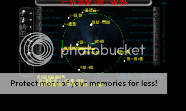
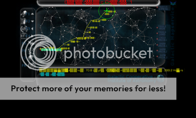
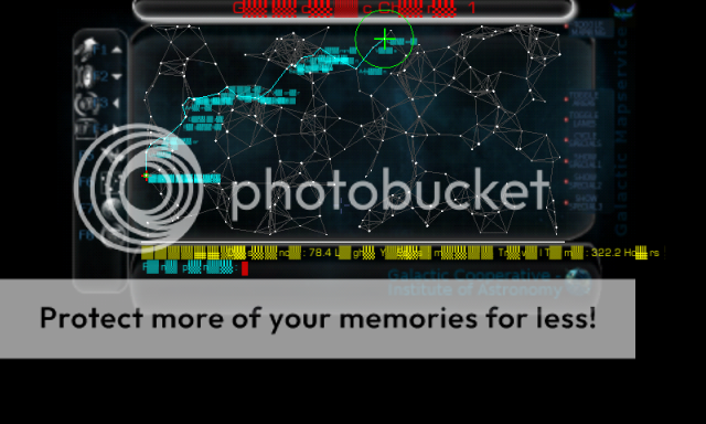
Hopefully this will help, this is the short range chart with Riedequat highlighted


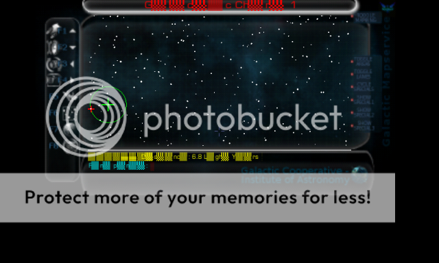
This is the long range chart with it highlighted


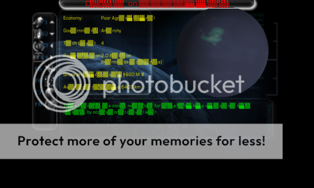
And this is the planetary info screen F7 with Riedquat info


hope this helps, aything else pease shout :)
 
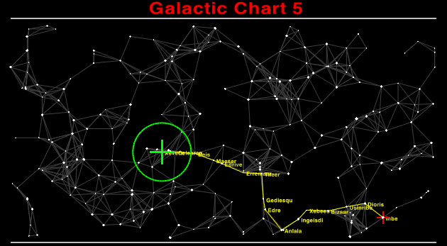
And here it is with the name displayed in the galactic chart by searching for it:

5T2Bbuh.png


In my opinion a font that's reasonably bold (so that it's lines don't disappear to nothing when shrunk) with fairly open loops/shrunken risers and descenders, so that looped letters can be seen easily (risers and descenders are still pretty easy to spot shrunk) are what would help.
 
I think the system name displayed as a search result might be the same size as the systems names when using the Advanced Navigational Array; Is there an A.N.A. on the Pandora Oolite?

ANA_display2.png
 
Last edited by a moderator:
In my opinion a font that's reasonably bold ... with fairly open loops/shrunken risers and descenders ... are what would help.
Yes, you are correct; it's what I had in mind, plus a few more tricks.
 
These are shots from the ANA with Riedequat shown


and


A bit blurred.... :( hope it helps
 
Alright.
 
Time for another test. Ignore the spacing, it's crap right now. The idea is to test the legibility of individual letter-shapes.

The problem is that the smallest type size the game displays is approximately 8x8 pixels, shrinking it a lot from the source file's 64x64. A lot of info gets discarded. Even if an 8x8 pixel font is used, scaled upwards to 64x64 in the source file, the final 8x8 squares displayed are not pixel-perfect, and will be blurry no matter what. A solution may be possible, but first let's see how the test font looks. (search for some systems on the long-range chart. Some Adv. Nav. is good too.)
 
>> DOWNLOAD <<
 
Last edited by a moderator:
Here you are:

oAb6uHb.png


i2RgWF4.png


I wonder if making the Pandora render the galactic map to full widescreen might not help space out the planets a bit better.
 
Last edited by a moderator:
OK.

Just as I suspected, this display problem needs a font that is custom-designed. Merely tinkering with an existing font isn't good enough, there's just too few pixels available.

Designing something that is legible on such a small scale though, won't make for a pretty font when viewed in a bigger size. A fascinating design challenge :) )

Thanks everyone, I will keep you posted.

How about making every letter in SMALL CAPs or something like that? On small screens at the same font size, capital letters (sans serif style) are way more readable, I think. 

Just my opinion as well, but the yellow used in Oolite for the text is a very poor choice. I wish they'd change the colors to something else, and avoid the super dark background for something lighter on the eyes, like dark deep grey or something. 
 
Hi. User Diziet Sma presented me with a challenge on the Oolite forum: The difficulty of designing a font for Oolite on Pandora that is legible on the galaxy map.


Being a graphic designer and a bit of a typography nut (and finding tinkering with Oolite a pleasant distraction lately) I think I can tackle this issue.
I just wanted to pass along my thanks to you, edgepixel, for being willing to take this project on..  they have a great little community here, and the Oolite port has caused quite a bit of excitement, some even suggesting that it may well become the must-have game for the platform.  It would be quite sad if all these new Oolite players ruined their eyesight squinting at those tiny letters, so anything you can do to help improve things is very much appreciated!

Right on, Commander!
 
Last edited by a moderator:
I just wanted to pass along my thanks to you, edgepixel, for being willing to take this project on..  they have a great little community here, and the Oolite port has caused quite a bit of excitement, some even suggesting that it may well become the must-have game for the platform.  It would be quite sad if all these new Oolite players ruined their eyesight squinting at those tiny letters, so anything you can do to help improve things is very much appreciated!

Right on, Commander!
Big Thumbs up from me! :)
 
How about making every letter in SMALL CAPS or something like that?
No need for small caps. A larger x-height will achieve the same effect. My plan is to also have larger counters and letter-spacing, along with rather square forms, to compensate as much as possible the low-resolution and unpredictable rasterizing.

I wish they'd change the colors to something else
Indeed, does anybody know if the text color can be changed by messing with the game code? Which files are responsible for displaying text, and can they be modified?
 
Now that I'm thinking... did any of you try the other font I made for Oolite? The "Dangerous" (actually Dosis) has many of the qualities OCR A has (which was mentioned to display better on the Pandora than the default), and should look probably at least as "good" as OCR A.
 
Last edited by a moderator:
I wish they'd change the colors to something else
Indeed, does anybody know if the text color can be changed by messing with the game code? Which files are responsible for displaying text, and can they be modified?
I'll take a look. In the eventuality I found a way to change the color, what color should I put?
 
Last edited by a moderator:
Well, um... I think any of these would look nice:


Cyan #1fd7df - RGB 31 215 223

Orange #fd9905 - RGB 253 153 5

Gray #a3a7aa - RGB 163 167 170


But if you find a way to change the color, it would be better to post the method, so anyone could change it to their own preference.
 
Last edited by a moderator:
If I remember which one OCR A was, that's the one which was a bit too fine when scaled down, and pretty much turned to mush when scaled. I've just tried this (new to me) font of yours, and it works rather better than OCR A - it's bold enough, and perhaps is slightly better than the default font. I like the look of it too - it's got a hint of Futura, which is always fun. I wonder about making the loops more circular than oval, although that might make it too much like Futura - certainly having wider letters wouldn't hurt on Pandora (it already looks smaller and more condensed than the default font).

I'd be cautious of widening the inter-letter gap too much. I rely on word shapes quite a lot to recognise some of the more obscured words on the galactic chart, and too big a gaps can disturb that. I don't really understand how the Pandora is scaling text in such a way to reduce resolution but also increase softness at the same time. I suspect if the Pandora was able to use multiple scales of font graphics though, and select the one closest to the size it wants might help though. FYI, here's a couple of screenshots of your font in action:

FIRrHQz.png


Personally I find unobscured planet names like Solaed, Israra and Beerqu quite easy to read there, but one obscured by grey lines I'd have to learn what they were first.
 
If I remember which one OCR A was, that's the one which was a bit too fine when scaled down, and pretty much turned to mush when scaled.
That was the one I asked a couple of people to briefly test, but then pulled, as there are licensing issues with the OXP it was extracted from.  I have since located a free (as in speech) version of OCR-A Extended, which I've provided the link for to edgepixel.
 
Last edited by a moderator:
I don't really understand how the Pandora is scaling text in such a way to reduce resolution but also increase softness
On some previous screenshots (yours are smaller-sized) I saw some names appear rather clear while some get blurry. This indicates to me there is no fine-tuning of font display; Pandora Oolite merely scales down the "normal" Oolite screen; the letters may appear blurrier or clearer depending on where they happen to be located on the screen (and thus on the pixel grid) -- it's a lucky draw, basically. A letter might get lucky and find its strokes fitting perfectly over the pixel grid at some instance, resulting in a sharper image, while at another instance it might straddle awkwardly over the border between two pixels, getting one or more of it's strokes blurry; when it's got only ~8x8 pixels to work with, the fail can be quite dramatic.
The best solution here is making the display code work with pixels (and have a low-res pixel font for it), and not percents, as it seems to be doing now. On my side of the problem, yeah, I can design a font that makes the best of the situation, but it can only go so much towards solving the problem.

I'd be cautious of widening the inter-letter gap too much
Don't worry, spacing will be fine. Readability is my goal too.
 
Last edited by a moderator:
Back
Top