New and Improved Case Color Poll

What color do you want your Pyra case to be?

  • I don't care

    Votes: 6 4.4%
  • Black

    Votes: 38 27.7%
  • Dark Grey

    Votes: 23 16.8%
  • Off-White or Beige

    Votes: 5 3.6%
  • White

    Votes: 1 0.7%
  • Dark Red

    Votes: 30 21.9%
  • Dark Blue

    Votes: 4 2.9%
  • Dark Purple

    Votes: 5 3.6%
  • Clear

    Votes: 24 17.5%
  • Other

    Votes: 1 0.7%

  • Total voters
    137

That gun metal grey render was actually pretty nice looking...
 
Off-white/beige would be a blast. Just remembered Asmo's Pandora mockups <3
 
Matte black or a medium to dark gunship grey for me, everything else looks subpar or outright hideous; how anyone could fall in love with that awful red color scheme as advertised on the front page is utterly beyond me. Pointless to vote without definitive renders, or actual case color samples, though.
 
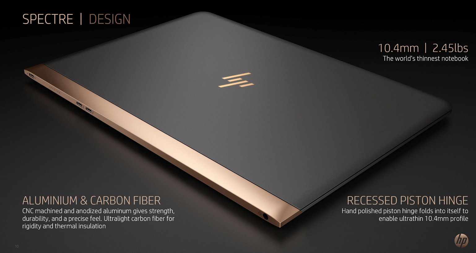
Matte black/dark grey is also a very good base for combining with some metal colours, maybe polished Steeel, Chrome, Brass or how about Copper? HP recently announced their new "Spectre" Notebook, what a Design-Porn! o_O

pic3.jpg


http://www.notebookcheck.net/HP-Spectre-13-Flagship-Notebook-and-new-logo-announced.162626.0.html
10.4 mm thin...
 
Matte black/dark grey is also a very good base for combining with some metal colours, maybe polished Steeel, Chrome, Brass or how about Copper? HP recently announced their new "Spectre" Notebook, what a Design-Porn! o_O
Wow, that is really nice looking. Those are two of my favorite colors (or a favorite color and metal, I guess). I will take a look at it some more, although I won't be buying one most likely.

I think ED said the logo plate will be aluminum. I don't know what it would look like with a black/dark grey case, uncolored aluminum, and the white logo when unlit, or colored logo when lit. It might be too many color changes in such a small space when everything else is the same color. Best way to avoid this is just go with a full metal case.:D;) I think I would prefer the logo plate not to be colored because I prefer the look of metal, but I don't know that it will actually look good. On a clear case it would probably look fine. Maybe not so great on dark red. It would be nice to have more information about that.
 
I saw a render where that HP logo on the lid was glowing different colors. It's a neat trick with the metal-look when off. What would Dragon Box Pyra DBP look like in a similar 'font' to the HP no horizontal line approach?

||
||||||
|

I'm not sure if I like HP's new vertical line only logo, but it makes an interesting mind game to try to read it.
 
If you want a fair result, you've gotta ask everyone for something like his/her favourite diffuse colour, specular colour and shine-through colour each RGBA coded and then present the arithmic average. And maybe the same for an additive like sparkly particles together with a value for how much of it should be put in and what size they should have.

Besides that, what happened to safety orange? Iff ED goes one colour only, that's what it should be. :)
 
I was expecting a better showing for clear, but I guess the people have spoken. Only pathetic dorks like myself like it maybe.

It should be black. It will please the most people and be the least offensive.
 
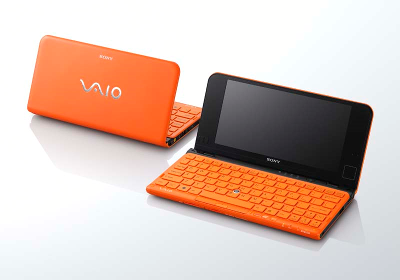
Matte black PLUS safety orange, like this sexy thing:
vaiop3a1qsj.png
 
Did anyone ever create a render of a "Hitchhikers Guide to the Galaxy" Pyra? I know there was one of the Pandora.

And my attempt at ascii art in my previous post got eaten by the boards removing any leading spaces on all lines.
 
And my attempt at ascii art in my previous post got eaten by the boards removing any leading spaces on all lines.

Just place you ascii art between [code ] and [/code ] (without blanks in the tags) and it would be fine.
 
Back
Top