You are using an out of date browser. It may not display this or other websites correctly.
You should upgrade or use an alternative browser.
You should upgrade or use an alternative browser.
logo idea by comradekingu is logo idea
- Thread starter comradekingu
- Start date
http://boards.openpandora.org/topic/14915-finding-a-proper-name-and-logo//URL]I'm sticking this here as I'm not sure where else to put it… :blink:
c ya
- Rick
Last edited by a moderator:
comradekingu
Glowing ember
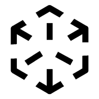
View attachment 8535
Im learning more about arcminutes, dpi and optics. I dont know if this is quite there, but its a lot better. The deadline is looming ever closer.
Im learning more about arcminutes, dpi and optics. I dont know if this is quite there, but its a lot better. The deadline is looming ever closer.
Last edited by a moderator:
comradekingu
Glowing ember

After this i sort of ran out of steam and will to live.
Here is the logo as it was meant to be, its not much of a suprise now, nor is it totally perfect, but view it on a totally black background and maybe you will see what i do.
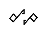
View attachment 8791
It matches with the Dragonbox logo i had in mind, but thats perhaps just how my mind wants it. Thanks to the continued creative support of Erico and a design pm from pengo i knocked back into gear and revisited old paths.
I think it looks Really Pleasant.
Following current events, its halfway between the design i had in me that i couldnt do, a pm, and what i originally drew. Only 15 drawings/mockups of this one. Took as per usual 10 times longer to do in gimp, and changed along the way.

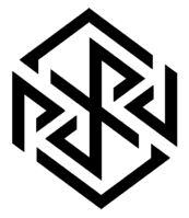
View attachment 8792
Its rough, a bit too thick based on what i drew, which was more 16:10. But im trying to forcibly stay simple, and rounded the corners outwards to try and make it more pallatable for people.
It also doesnt have the flipover trick whereby a fatter column can appear straight by slanting just enough to start where the top one ends.
View attachment 8793
This is the mistake, but maybe when its drawn out like this they should (both) point towards the corner rather than the top.
Last edited by a moderator:
God Ginrai
Godmaster
I love that top one.After this i sort of ran out of steam and will to live.
-God Ginrai
comradekingu
Glowing ember
I don't, so stop liking what i dont like  Need some feedback on the bottom one though.
Edit: I dont like it because its too obvious, it didnt do anything beyond that. I think the lines need to be longer or something.
When my mind rests its because the wheels are turning and its all in the same direction, every little detail, and the grand scheme of things. I can move on from it rather than it capturing me. It turns on, but its much too quick a boredom.
For me its the equivalent to mindless stuff that wants your attention. One could always add more detail, all of which make sense. For me thats somehow easier, but im trying to do more with less.
(I know what i mean)
Edit: I think i know what it is now, its _almost_ aestetically pleasing, but the outside is rounded and the inside elements arent. I think maybe if they were it would not be such a dead giveaway.
Edit2: I thought about it, and it really takes attention, which i suppose is why it looks good next to the other two. Its a cheap sale, but logos compete on attention first and foremost. So then i looked at it from a distance, which in my lo-fi world means going farther from my monitor rather than zooming. And then it did have something extra.
Last edited by a moderator:
God Ginrai
Godmaster
comradekingu
Glowing ember
If you do the middle line black, and experiment with two grays outwards i think you are onto something. Similarly i think people who will blame you for making a nazi design are not onto something.
Try doing some flames along the grid pattern, use it as a stencil to guide the organic flames. You have made an easter egg, i dont know if the dp was intentional, but i came upon it by accident. A bit on the obscure side given the setting we are in.
Try doing some flames along the grid pattern, use it as a stencil to guide the organic flames. You have made an easter egg, i dont know if the dp was intentional, but i came upon it by accident. A bit on the obscure side given the setting we are in.
Last edited by a moderator:
God Ginrai
Godmaster
So you are suggesting 2 shades of gray and black? stem of d and p black, rounded edge of d and p dark gray, rest of the checkerboard light gray? I'll see what I can come up with based on that.If you do the middle line black, and experiment with two grays outwards i think you are onto something. Similarly i think people who will blame you for making a nazi design are not onto something.
The dp was intentional. I'm glad you noticed it.Try doing some flames along the grid pattern, use it as a stencil to guide the organic flames. You have made an easter egg, i dont know if the dp was intentional, but i came upon it by accident. A bit on the obscure side given the setting we are in.
-God Ginrai
God Ginrai
Godmaster
deadofmind
Member
- Joined
- Mar 15, 2014
- Messages
- 99
comradekingu, just wondering how you feel about this modification of the ambigram PYRA you made.After this i sort of ran out of steam and will to live.
Here is the logo as it was meant to be, its not much of a suprise now, nor is it totally perfect, but view it on a totally black background and maybe you will see what i do.
It matches with the Dragonbox logo i had in mind, but thats perhaps just how my mind wants it. Thanks to the continued creative support of Erico and a design pm from pengo i knocked back into gear and revisited old paths.
I think it looks Really Pleasant.
Following current events, its halfway between the design i had in me that i couldnt do, a pm, and what i originally drew. Only 15 drawings/mockups of this one. Took as per usual 10 times longer to do in gimp, and changed along the way.
Its rough, a bit too thick based on what i drew, which was more 16:10. But im trying to forcibly stay simple, and rounded the corners outwards to try and make it more pallatable for people.
It also doesnt have the flipover trick whereby a fatter column can appear straight by slanting just enough to start where the top one ends.
This is the mistake, but maybe when its drawn out like this they should (both) point towards the corner rather than the top.

EDIT: Or perhaps the one in my signature.
Last edited by a moderator:
God Ginrai
Godmaster
The way you cut off the P and A makes the A look like a D, IMHO. This is why I kept a slight bend in #G21 that I posted earlier in this topic.
-God Ginrai
-God Ginrai
deadofmind
Member
- Joined
- Mar 15, 2014
- Messages
- 99
Now that I look at it, you're right, so I guess once you add that bend to it, this version has already been presented hasn't it. Oh well, I guess since EvilDragon didn't choose the pyra ambigram it doesn't matter.
It's too bad, I thought it was one of the best. It would look pretty dang slick one the lid all lit up and such.
EDIT: Congrats, you have 1234 posts at this time ^_^
It's too bad, I thought it was one of the best. It would look pretty dang slick one the lid all lit up and such.
EDIT: Congrats, you have 1234 posts at this time ^_^
Last edited by a moderator:
comradekingu
Glowing ember
Its not my favourite cut, but on the lid it doesnt transfer light, so you end up with YR. Its not my fav because the YR looks different from the P and the a.
I thought about doing lenses in the elevated clear material, but thats too advanced. I like colouring over cuts since the flow of things is disrupted with cuts.
I thought about doing lenses in the elevated clear material, but thats too advanced. I like colouring over cuts since the flow of things is disrupted with cuts.
Last edited by a moderator:
God Ginrai
Godmaster
It actually looks good. Too bad the theme isn't Japan.So, I wasn't confident in my ability to draw flame, so instead, I free-handed the Kanji for Fire in the off-squares.
Let me know what you think:
-God Ginrai
God Ginrai
Godmaster
It doesn't have to be. That can be a nice tidbit for those who notice. For example, Roku, is a US company. However, it's name is a reference to the Japanese word for "six".It actually looks good. Too bad the theme isn't Japan.
-God Ginrai
Last edited by a moderator:


