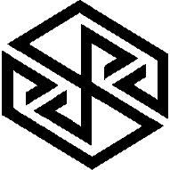
logo idea by comradekingu is logo idea


I was referring to most of the logo ideas that look like a cube like in post 215 and 208.  Maybe I'm mistaken, but I seem to remember ED saying he wanted to differentiate from the Pandora.  Anyway not to matter, I'm sure he'll choose whatever he thinks appropriate from the different choices in this thread.
 
Last edited by a moderator:
Here is another attempt to make a comradekingu-style logo:

pyralogo.png


Source .dia file in the attachment in case you want to make variations on it.

pyralogo.dia.zip
 

Attachments

  • pyralogo.dia.zip
    977 bytes · Views: 172
I was referring to most of the logo ideas that look like a cube like in post 215 and 208. Maybe I'm mistaken, but I seem to remember ED saying he wanted to differentiate from the Pandora. Anyway not to matter, I'm sure he'll choose whatever he thinks appropriate from the different choices in this thread.
Well I've been pushing the cube because I seem to remember ED saying he wanted a logo that was reminiscent of the Pandora one.


I.e.


A) ED wants to differentiate the device from the Pandora.


But


B) ED also wants the name and logo to be reminiscent of the Pandora.


So that people will be able to see that this is a successor, but will also see this is a new device by a new company.


I thought that's what we've been doing for months - trying to get the balance right.
 
Here is another attempt to make a comradekingu-style logo:

pyralogo.png


Source .dia file in the attachment in case you want to make variations on it.
Not bad. Looks more like a cube.
 
Here is another attempt to make a comradekingu-style logo:

pyralogo.png


Source .dia file in the attachment in case you want to make variations on it.
Not bad. Those lines are very squiggly, so I don't know how I feel about them just yet. But you seem to get a lot of things right.

EDIT: On second thought. I just noticed that the symbol that we had pages of arguments about is present in that logo..... T_T

-God Ginrai
 
Last edited by a moderator:
pyraild37.png  A

Here is a version that tries to be confined also to an outside confinement. I think it looks a bit squashed. Its not playing with an idea anymore, its trying to adhere to something it by nature isnt.

pyraild35.png  B This is the little bit too tall version again, I figure its to do with the Z whitespace not being square.
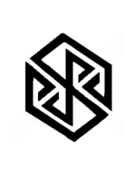


pyraild27.png pre-C  This is the hand-drawn one.


(edit:2  either ive done some cheating on the hand drawn one or something is up, becaus the "too tall" one is almost perfectly square, it should have been the tiniest bit taller actually, which is to do with me missing the bottom and top line with just a bit when drawing it in.)

(edit:3 here is one scaled by hand to what i think looks best, curiously that is exactly halfway between squashed and too tall)

pyraild35scaled.png C

I could still eat pixles away from the horizontal lines to account for kubistic stretching, but still, what do the ratios look like to other people?

(what is "linear stretch", "sinc" and what is "none" in gimp?) I take it i chose the wrong one, linear would be what i wanted and the others are interpollation options?

Edit: A doubleturn in that open region is where things start to get messy, your options are either tangled, closing the loops fully, or even more unpleasant, at that point, unless you do want to end up with a swastika, which is another dicipline, just lengthening the same line is still one variation and some cuts away from what we dont want. Adjusting to make sense of something one can plausibly see is very different from making up something with the available constructs to do so when its not there to begin with.
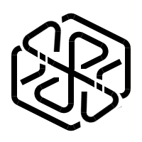
wbpyralogo.png


A 8 triangle design is possible, but it doesnt explain the excess triangles in a good way, nor solving the problem we set out to improve, boxiness. Im sure it could turn into something, meeting at interesting and pleasant visuals, but p-y-r-a or octagonal i think is relinquished at that point.


And then you are back to trying the same thing with different line width, or doing away with elements, which leads to this
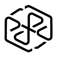
wbpyralogo2.png

that doesnt explain that middle line. And then you are onto trying to put the side triangles to work to do away with it, which is what im exploring now.
 
Last edited by a moderator:
  
EDIT: On second thought. I just noticed that the symbol that we had pages of arguments about is present in that logo..... T_T

-God Ginrai
Didn't you say, only if you trying to see it? Maybe add two different shades of red to both sides.

Maybe add a tail and wings to this one. lol
 
Last edited by a moderator:
EDIT: On second thought. I just noticed that the symbol that we had pages of arguments about is present in that logo..... T_T

-God Ginrai
Didn't you say, only if you trying to see it? Maybe add two different shades of red to both sides.
Maybe add a tail and wings to this one. lol
Trust me, I wouldn't touch that bee's nest if it wasn't blatantly obvious in that one. -_- If you look at the center of _wb_'s logo, tho whole symbol is in there, just tilted. :(

-God Ginrai
 
Trust me, I wouldn't touch that bee's nest if it wasn't blatantly obvious in that one. -_- If you look at the center of _wb_'s logo, tho whole symbol is in there, just tilted. :(

-God Ginrai
Hmm... Maybe add a space in the middle? Idk
 
I did, and and a pm would have achieved the same to that effect. This thread is my gallery thread, where instead of occupying the other thread, and slowing it down, we discuss in a unified manner, ending up with a consensus design based on my ideas. You may start a thread of your own, and i will be happy to help, as i did in the general logo thread.

In trying to refine the latest logo, the question to answer here is, which one of the variations from the top of http://boards.openpandora.org/topic/14923-logo-idea-by-comradekingu-is-logo-idea/page-12#entry309830 did you like, A B pre-C or C, possibly also why. Other suggestions also very welcome. Rounding it off slightly is something that will be done when a good ratio is found. Too tall and pointy makes it look too agressive, which is what has been established so far.

Three votes for C thus far (myself included)

Anything else, please move to http://boards.openpandora.org/topic/14915-finding-a-proper-name-and-logo/?view=getnewpost/URL]

where unrelated designs belong.
 
Last edited by a moderator:
Did you see my logo idea?

pyra_logo_1.png
Also a nice idea. Just try to make it a little bit more "edgy" ans styled. It's still to "organic" for my taste and the font is not that great. Maybe try to do it more abstract, technical but still recognizable as flame? ^^
 
Back
Top