You are using an out of date browser. It may not display this or other websites correctly.
You should upgrade or use an alternative browser.
You should upgrade or use an alternative browser.
Beauty competition.
- Thread starter EvilDragon
- Start date
javaJake
Jacob Godserv
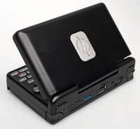
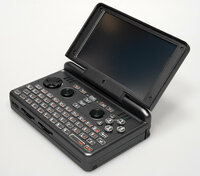
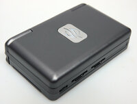
I could go either way on this one! The black fits what my eyes expect to see on a daily basis, but this is no ordinary piece of hardware, so the chrome color wouldn't feel out of place... Hmmm!
daveshah
Well-Known Member
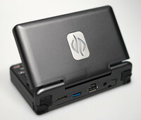
Dark chrome looks incredible!
Bosbeetle
Terminally lost
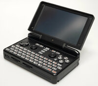
In the open position you see soms lines on the lid, they don't show in the closed position. Do you see them in regular lichting ED?
Both coatings look gorgeous
Both coatings look gorgeous
elvissteinjr
Very Active Member
Both are nice, but the dark chrome one looks more interesting, especially with the DPAD and nubs being darker (and the keyboard, though not really well visible in that lighting), creating a slight contrast.
ClockworkCoder
Chaotic Neutral
That brushed aluminium look is sexy!
Want... Now...
Want... Now...
Eight Bit
Hardcore Member
Pretty!
Shame about the shrink marks shining through but pretty none-the less.
I'm unsure which I prefer...
*ponder* *ponder*
Shame about the shrink marks shining through but pretty none-the less.
I'm unsure which I prefer...
*ponder* *ponder*
They look booth pretty good, but I think I would like the Dark Crome a bit more ^^
But I wouldn’t mind if it’s gets Black..
Whit best regards, Matthias
But I wouldn’t mind if it’s gets Black..
Whit best regards, Matthias
ible
professional vim user
both look great! but i think i prefer the black.
D32_bobjob
Don't take me to serious!
- Joined
- May 2, 2016
- Messages
- 35
- Age
- 44
Dark Chrome looks the best to me, but black is not bad either ...
daveshah
Well-Known Member
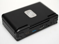
I think the logo plate actually looks better with the dark chrome, as it gives the whole thing a more 'metallic' feeling.
I think the logo plate actually looks better with the dark chrome, as it gives the whole thing a more 'metallic' feeling.
Same here.
The logo looks trash on black housing.
Unfortunately the black is not mate enough for me.
It's too shiny.
Looks nearly as cheap on the photo like a black Pandora.
I'd go for the chrome one and sell some unpainted black housings later if people want those.
BTW: I do not like the Photos.
The light is so shiny and I can not imagine how they look in real life.
How dark is the chrome version?
How glossy is the black version?
Could you maybe take some quick and dirty pictures with your phone with both versions side by side on a wooden table with moderate lighting?
I would like to get some ore realistic impressions
directive0
Very Active Member
It's hard for me. I usually hate fake metal plastics. It feels disengenious.
So I should be just all about flat black. But I cannot deny dark chrome is kinda special.
Very conflicted.
So I should be just all about flat black. But I cannot deny dark chrome is kinda special.
Very conflicted.
Post automatically merged:
Yeah still team clear over here too. But if it must be one of these options I can live with that'm down with itI like black a lot better actually, it's less flashy. On the other hand I'd also go for a transparent Pyra, so maybe don't trust my aesthetic judgement
I like black a lot better actually, it's less flashy. On the other hand I'd also go for a transparent Pyra, so maybe don't trust my aesthetic judgement
I also like the less flashy version.
But on that pictures I can't tell which one is the one.
I'd say mate black is the way to go.
But on the picture that black does not look good (to be honest, chromium neither).
The bright reflections and the white background are killing it for me.
I go play some Darksiders Genesis now.
At least that's all dark stuff one even darker background
ClockworkCoder
Chaotic Neutral
Actually there looks like there's a smudged fingerprint or something on the first black photo.
As mentioned previously, the logo stands out a little too much against the black case.
I do like the other one much more though - it looks different enough to be special, without being garish or overly flashy.
Looking forward to some videos - seeing how the sheen works when there is movement involved will make a huge difference to the perception.
netlinker
Active Member
For me, actually both would be ok, too. I'm finding the chrome a bit more stylish tough. So I'd vote for the Chrome one.
If it rubs off after some years of use, I might just get a new case and be happy .
.
Dark Chrome would also perfectly fit my line of Fujitsu laptops ...
If it rubs off after some years of use, I might just get a new case and be happy
Post automatically merged:
Dark Chrome would also perfectly fit my line of Fujitsu laptops ...
NetBLOKS
Finally on-board
They both look absolutely awesome, at first I thought these were rendered pictures!
Great job there!
Great job there!
Similar threads
- Replies
- 5
- Views
- 3K


