Wind And Water: Puzzle Battles Early Concepts


YuanHao

Member
Joined
Jul 30, 2006
Messages
215
Age
39
Website
www.yuanworks.com
Hi everyone!

First of all, we wanted to let you guys know that we have posted a couple of posts about the origins, early concept and screenshots of Wind and Water: Puzzle Battles at our blog, as well as Yuan's Workshop about W&W sprites.
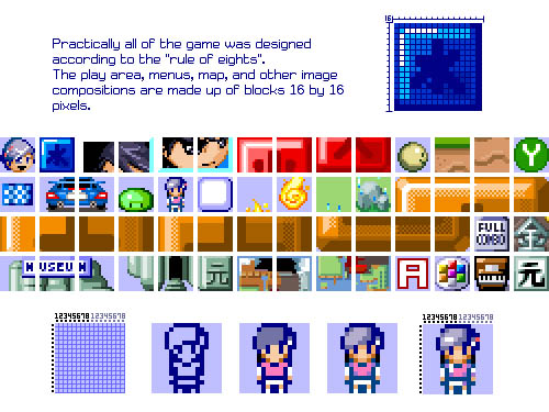
wnw_ruleofeights.jpg


We'll also be running our W&W 25% discount offer on both versions of W&W for the GP2X. Prices for now are $12 (~€8) for the normal version, and $18 (~€12) with the sprite!

Thanks and hope you enjoy our posts at the blog :D If you would like to know something in particular about W&W's development be sure to ask there!
 
Ha, nice! :) I always like "Making Of's". ^_^

And I know these "Rule of 8", makes many things more easy when pixeling graphix. I try this for fun to make some kind of indexed-colour-jump'n run graphic set with many Parallax Layers and I have to deal with 8x8 or 16x16 or 32x32. Good to know that this is the right way to make Pixel-Art. Now I just need more talent to paint Graphics and deal with a limited Palette. :lol: It really needs skill to make a small pixelated graphic look like something "real" from the right distance. Always impressive to see, when I study Graphics from all the old 2D "Sonic" Games. W&W's graphics are also that impressive. :) Some pixels combined in the right order and coloured in the right way can look like stones or even a person. That's Art.
 
Aye. I've always used 32x32 pixel tileset for all of my 2D RPGs I've worked on.
 
Awesome man! I'm glad you two had fun at GDC:08! Yeah they have them every single year and they became more important as of late, especially since Square-Enix Capcom, EA, and Konami has direct ties with the IGF. SO MANY AWESOME GAMES, I'm just excited to push through my development on my games.
 
fusion_power said:
Now I just need more talent to paint Graphics and deal with a limited Palette. :lol: It really needs skill to make a small pixelated graphic look like something "real" from the right distance. Always impressive to see, when I study Graphics from all the old 2D "Sonic" Games. W&W's graphics are also that impressive. :) Some pixels combined in the right order and coloured in the right way can look like stones or even a person. That's Art.

I have the same problem :(, my art talent is very lacking..
Something I've found helps (a bit) is to draw stuff bigger by a factor of 2 or 4 and then shrink them down afterwards - I found it hides my lack of talent a bit and ends up with something highlighted, etc much better than I could do it.
 
Last edited by a moderator:
kevcal said:
fusion_power said:
Now I just need more talent to paint Graphics and deal with a limited Palette. :lol: It really needs skill to make a small pixelated graphic look like something "real" from the right distance. Always impressive to see, when I study Graphics from all the old 2D "Sonic" Games. W&W's graphics are also that impressive. :) Some pixels combined in the right order and coloured in the right way can look like stones or even a person. That's Art.

I have the same problem :(, my art talent is very lacking..
Something I've found helps (a bit) is to draw stuff bigger by a factor of 2 or 4 and then shrink them down afterwards - I found it hides my lack of talent a bit and ends up with something highlighted, etc much better than I could do it.

I'm using Blender sometimes and render 3D Models of entire Objects like Buildings etc. With this, you have things like Shadows for free and they are always correct etc. I have not much talent to Pixel correct Shadows and light effects straight into 2D Dot-Art so I have to "Cheat" a little bit. ;)
My main problem is to find the right Combination of Art, Colours, arrangement etc. To paint a Tile or a Graphic you need the whole Level to see everything in combination and how the complete thing will look and then test it and correct the Tiles but to have a whole Level you need the Tiles first... :ph34r: There the dog bites in his own tail, it's really complicated. :lol:
 
Last edited by a moderator:
Back
Top