There are a few flaws in the Pandora that keep it from being precisely the last handheld electronic device a person would ever need for the foreseeable future. These flaws are entirely forgivable considering how few devices are providing an open handheld gaming/generic computing experience with a physical interface comparable to the Pandora, but when it is considered how likely another device from another company will probably come along in the near future to fill the Pandora's small but not adequately served niche and how mobile technology has advanced in the past few years to smaller, cheaper, and more efficient hardware, it becomes increasingly important that the few flaws in the Pandora become addressed as soon as possible (preferably by the first revision of the Pandora, AKA Pandora 2) so that OpenPandora Ltd. won't be pushed aside by another, more aggressive company with more funds and that people will still have plenty of reasons to buy a future Pandora revision.
I will first address the flaws in order of my preferences. Then I will summarize the flaws in order of a proposed logical business priority.
The first flaw I would like to address is the button layout. Currently, as it is, the button layout of the Pandora is simple and adequate for most games in general, but that does not mean it couldn't or shouldn't be improved. I have used and seen quite a few different controllers over the years, and I will show precisely which traits are best from a large pool of gamepads, which traits are to be avoided, and hopefully go into enough detail for you to imagine what a revised button layout may look like. The first aspect of the button layout that needs to be addressed is the layout of the face buttons. Yes, few retro gaming enthusiasts (or even gamers in general) are willing to criticize the classic diamond layout, but I believe this is simply because of its widespread use on so many controllers and the feelings of nostalgia retro gamers have for the Super Nintendo. I'm not putting down the Super Nintendo. I love its controller too:
After I used a gamepad with six face buttons, I found that the diamond layout is actually lacking. Sega was the first that I recall using a six button layout:
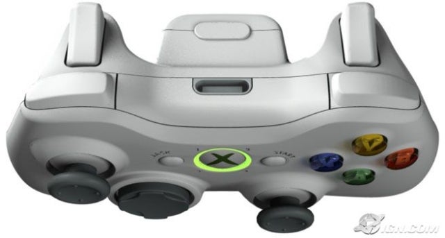
I recently experienced a modern gamepad using this layout that I particularly favor due to the top row being the same size as the bottom:
This layout gives the most extra advantage to fighting games specifically (Street Fighter needs this
bad.), but it's not unusual for games to need a couple more buttons especially if you only have two shoulder buttons. Your objection to this layout may be either that you don't play many fighting games or that most of your games require few buttons. I assure you that even if you play good old NES games, the other four buttons don't get in the way. The next aspect of the button layout I'd also like to address is the lack of analog nub buttons. This gamepad is the first one I remember with buttons in the analog sticks:
I feel this is much less important than having six face buttons, but it's a very nice feature to have for games that can make use of buttons in analog sticks. FPS games tend to use them a lot for sniping, and some games use them for changing the camera and/or crouching a character. It's simply a feature that I've come to expect from modern gamepads. I'll understand if designing a new analog nub capable of this would be a pain in the ass for OpenPandora Ltd. to actually implement, but as long as I'm making a post about the few flaws in the Pandora, I'll talk about
everything I can think of. The last aspect of the button layout I'd like to talk about (and probably the least important) is the number of shoulder buttons. It's not just modern gamepads that tend to make use of four shoulder buttons but a surprising amount of modern games have as well, so it's nice to have them available. Obviously we can't have this:
Or this:
Both of those layouts with four buttons would ruin the portability of the Pandora. I want my Pandora to fit in my pocket, so here's what I'm suggesting:
(I don't know what that thing in the middle is by the way.) I'm not sure how it would feel to reach and press those two circular buttons on the shoulders in an actual game, because I don't have a Wii game that really plays with them yet. However, this allows the Pandora to have two extra shoulder buttons without needing more space. It's worth mentioning, but the
importance of implementing the two extra shoulder buttons if the Pandora already had six face buttons is questionable. (I'd still prefer to have them.) I know what some of you may be thinking. All three of these suggestions in all amount to six more buttons, but I assure you all that I'm not advocating the same mistake as this gamepad:
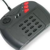
It is not unusual for someone to quickly judge that gamepad's problem as
only having too many buttons. It does have too many buttons (fifteen in all minus start/select), but most of the problem is that twelve of them are located in an inconvenient and indistinct/illogical positions. Pressing the three at the top is simple, but trying to find the right button for a particular action on the bottom twelve is hard. The bottom twelve are easily confused with each other due to the lack of distinct and convenient positioning. When we see the Xbox 360 controller,
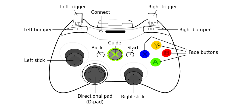
it is obvious that at least ten buttons (I'm not including start/select/home.) are easily manageable and not causing the gamepad to be overly complex. Together, all three of my suggestions only result in two more buttons than the Xbox 360 controller, and I hope to have explained in enough detail before now to show why 12 buttons is not too much. Before I finish talking about the button layout, I must caution against one single thing:
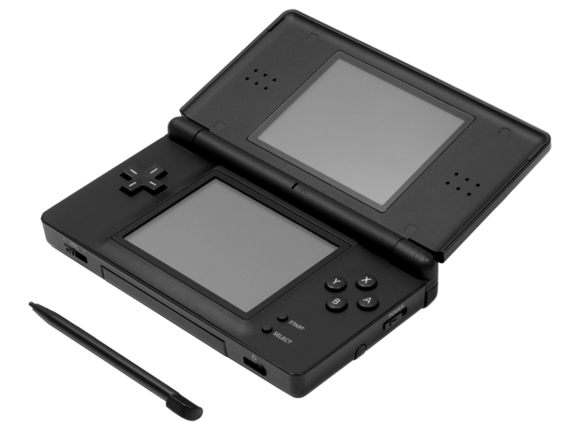
Don't see what I'm pointing out? It's the four face buttons. I couldn't find a picture with an adult hand on it, so you'll have to trust me if you've never used a Nintendo DS Lite. Those four buttons are
tiny and
too close together. This is an example of a safe and conservative button layout done terribly wrong except for children, and even children like big buttons sometimes. Please, OpenPandora Ltd., don't copy the DS Lite button size for Pandora 2. That Street Fighter IV gamepad up there has excellent button size. It's my favorite gamepad.
The second thing I'd like to address wasn't really a flaw not too long ago, but exciting new screen technologies are coming out that will soon make the Pandora's screen obsolete. These new screen technologies are going to allow readability in sunlight and lead to tremendous battery life. I will only show one example of these new screen technologies as I don't know which one is most favorable: http://www.pixelqi.com/ I firmly believe that the next revision of the Pandora needs to take advantage of some new screen technology to be relevant when it is eventually released. It won't be long before nearly every mobile device utilizes something like Pixel Qi. Also, if anyone wants to weigh the pros and cons of various touch screen interfaces that's fine, but the Nintendo DS showed me that resistive touch screen technology is very adequate.
The third and last flaw that I would like to address is the lack of mobile telephony, mobile internet, and a navigation system, such as (and probably preferably) GPS. This is probably the most important flaw to address for the next Pandora to be relevant at all. I have no idea why Apple is marketing their touchscreen only interface iProducts as gaming devices when they could slap a PSP Go style slider on the back of one to hide/show the gaming controls and compete seriously with Nintendo's ridiculous two screen gaming weirdness (Seriously, Nintendo, stop it. I don't like it.). The point is that at any moment some intelligent smartphone company could come along at any second and release a device with gaming controls. This entire time the Pandora has been in development
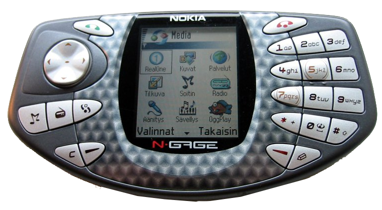
must have been some fluke because of all the time that has passed without any smartphone company waking from its slumber and making the first 'Gameboy-Phone' for insane profit. Before you raise your hand, the N-Gage was garbage that no serious gamer would want to touch. It doesn't count, because it doesn't have real gaming controls anyways. Look at it:
Do you want to play it? No, you don't. I assure you that it's some fluke that Sony hasn't given us the PSP phone yet (but I think I heard they're working on it anwyays). How long till Apple steps up the the plate and bats a homerun with a real gaming device? They already attracted all those developers and profit with a touchscreen interface. The last thing that needs to be said is that I don't want to carry both a Pandora and a cellphone. It's only making less and less sense as time marches on to not include all these extra features in a single device due to the miniaturization of technology.
Now that I've mentioned all the flaws I will summarize them in order of a proposed logical business priority from most important to least important.
Before I end this post, I would like to take the time to say that the clock speed of the processor and the amount of RAM in the Pandora are entirely sufficient and not flawed. A Pandora revision would of course have a greater processor due to how cheap and fast mobile technology (especially ARM technology) is getting, so it will be upgraded by default if Pandora 2 comes about and is not worth stressing. Lots of RAM is hardly necessary for gaming purposes, but we will most likely get it in a Pandora 2 anyways. The Xbox 360 only has 512 MB. The problem is that we don't have enough people developing for the current Pandora to make the most efficient use of the hardware available. We could have more battery life and faster emulators with the right code.


