Pyra Settings UI


elvissteinjr

Very Active Member
Joined
Jun 19, 2010
Messages
780
Age
28
Location
Germany
Leaving this here for the folks who are concerned about Zenity scripts.

I've taken up on the task of contributing GUI tools for pyra-specific settings.
They may not be the most fancy dialogs out there, but my overall goal is to have them not stand out and rather integrate into the desktop experience.

Notable features are:
  • Multilanguage support (English and German included as of now)
  • Scrollable dialogs (they are all still designed to fit on screen, of course)
  • XFCE Settings Manager integration
  • XFCE-Style headers (can be turned off via command-line switch)
The XFCE stuff is entirely optional and even if something else gets to be the default, I know one person who'll still use it. ;)
It's written in C++ with wxWidgets.


Current Status
  • Nubs -> Done, at least on Pandora feature-level, may be extended later on
  • Rest -> See below

Why I chose the Nub Settings as the first dialog to work on, when it wasn't even Zenity
Well, it the one that surely remains mostly the same on the backend. Others won't exist anymore or may be replaced by stuff newer DE versions or the Debian repo provides.

The Pandora Nub Configurator was fine for the most part and certainly not in an unfixable state, far from that, but for consistency's sake I'd implement it anyhow at some point.
It was namely a bit cramped and also showed all options at once, even if they weren't relevant.

The new version of the Nub settings is a bit more compact and hides sliders for inactive options.
Profiles have been moved to a second tab with slightly more advanced profile management (renaming and reordering).
And of course the stuff mentioned at the beginning.

Command-line interface for profile management from scripts also exists, but it's a bit different from the Nub Configurator's one.

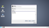
I've attached screenshots of it, one from within XFCE Settings Manager and one standalone.
Pandora version is on the repo as Nub Settings X, although most advantages can't really be used there.
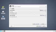
PyraSettingsUI_01.png PyraSettingsUI_02.png

Now for the rest of Pandora's custom settings, here's a list and my thoughts about them. Feel free to correct me when I'm wrong, of course. This is with thinking of XFCE 4.12 as default.
  • CPU-Settings -> Missing, from what I've heard, overclocking only works on fixed values. Can't tape a lot around single selections if that's the case.
  • Date and Time -> Missing, maybe use something existing like the one from gnome-system-tools instead of writing our own
  • LED-Settings -> Missing, needs implementation details first
  • Lid-Settings -> XFCE Power Manager Settings
  • Startup Manager -> Debian Login Screen/XFCE Session Settings?
  • TV-Out-Settings -> Obsolete/XFCE Display Settings
  • Video-Settings -> Obsolete? (are there still hardware scalers and is there anything to control?)

Frankly, I haven't dug deep when it comes to the implementation details, so I kindly accept pointers to them if there's anything set in stone already.


That's about it for now. I won't be super fast with writing them as time is limited, but I will deliver eventually.


@OS-devs:
This is also meant as proposal for integration into the default install.
I don't really have any experience in Linux deployment, but I have a configuration that builds a Debian package already.
What are the requirements? Do you need an extra source git to clone from (currently I just have everything offline)? Do you prefer to do the packaging setup entirely yourself?

My current plan is to have all dialogs in one executable. Not sure if that hurts the Linux philosophy too much. If separate ones for each are preferred, I'll set it up like that instead.
 
It's probably a good idea to put it on a publically available GIT repo with development in a separate branch.
It also has to go through the pyra specific repo quality assurance (ie. guard troll, aTc).

Split it up if it makes sense to split it up. Does some parts stand on their own legs? If not, no need to bother splitting it.

I assume you're using gettext for internationalization?
 
Split it up if it makes sense to split it up. Does some parts stand on their own legs? If not, no need to bother splitting it.
There's some common code to overwrite default wxWidgets behavior for the XFCE integration and of course the command-line options. The dialogs themselves don't really share anything else.
Not like the resulting executables are anything worth mentioning in size. On a second thought it may just make more sense to separate them actually.

I assume you're using gettext for internationalization?
wxWidgets' locale functionality, but in the end it's gettext for the strings, yes.
 
Cool. Nice to see someone else pick up where I dropped the ball. The Nub Configurator was supposed to be the first in a series of configuration tools, but I never got around to writing the rest (due to all my Pandoras breaking down and me giving up on it).

I did have one very specific use-case in mind which didn't crystallize either, but I do intend to tackle this project for the Pyra.

I've posted here several times in the past that I intend to utilize Kodi (back when it was still called XBMC), as a media-oriented user interface for people that prefer a more console-like interface. Hence, the nub configurator was a combination of shell-commands and python for easy integration into Kodi plugins at a later stage.

<edit>I need to read better, you actually answered my question in the first post (i.e. do you provide a cmdline interface?).

Glad to see you that you do. That will avoids duplication of effort in the future.
</edit>
 
My current plan is to have all dialogs in one executable. Not sure if that hurts the Linux philosophy too much. If separate ones for each are preferred, I'll set it up like that instead.

Good stuff.

It would be really great is if you could access all settings for Pyra (Nubs, power management, LED function, over clocking etc. etc.) from one place and you could generate a file which saved all of these settings as a profile and these profiles could then be applied as desired. People could also share these profiles.

So you could have instant access to a battery saver profile, an overclocked profile, a profile for certain types of gaming, factory default profile, etc. etc.
 
It would be nice, if the configuration could at lest be integrated inside the XFCE settings manager.
Else, we would end up with people saying "To configure you Pyra, go there, except for those things which are somewhere else."
 
It would be really great is if you could access all settings for Pyra (Nubs, power management, LED function, over clocking etc. etc.) from one place and you could generate a file which saved all of these settings as a profile and these profiles could then be applied as desired. People could also share these profiles.
That's actually quite a nice idea. My original plan was to display a selection for all Pyra settings when no dialog was specified via command-line (the .desktop files for the separate settings would contain them ofc) and exportable settings would be a nice addition to that.
I'll definitely look into adding profile functionality where it makes sense (like more than 2 options that related to each other in a dialog) and global ones can be helpful too (with selective content obviously).
Then again, there may not be a ton of pyra settings dialogs in the end. We'll see if the feature is fitting then, I guess.

It would be nice, if the configuration could at lest be integrated inside the XFCE settings manager.
Well, that's already the case, fortunately. The Nubs dialog is fully integrated into the XFCE Settings Manager, like most XFCE settings are (apart from the help button if you want to go into details, but still).


@comradekingu
Gotta admit, I first thought you tried to show me a screenshot of the Pandora build where everything screwed up. But I take this is supposed to be a mockup for a design suggestion, yes?
There are a few things wrong with it in my opinion:

First would be the unnecessary minimalism. We do have enough screen space for the dialog. It actually even fits on the Pandora's screen (header is only disabled because it would take all of the vertical desktop space there which looks meh).
Buttons with labels are easier to understand and to hit with touch since they're wider. You don't even save any space by omitting them.

If the header is not to your liking, you can disable it via command-line (practical approach would be to copy the .desktop file to the local applications directory and add that argument).
I'll probably also make it disabled by default if the DE isn't XFCE.
The horizontal arrangement of settings is kind of a matter of taste, really. But my argument here is the goal of fitting in with the rest of settings applications, in which it's typically a vertical arrangement.

Splitting the scroll rate directions in separate selections does not work or makes sense. The selections are also the active nub modes.

The icons there are not really necessary either.
Again, you don't save any space and they can easily be unfamiliar (I took a second to understand the mouse move one).
I also want to avoid using non-stock icons inside of the dialog to not clash with any custom icon themes the user may install.

The whole thing can be resized to ~370x400 before scrolling kicks in (and with that down to ~270x160, but hardly usable anymore), what I've shown is just the default size.

This may look like going great lengths to go against you suggestion, but I actually just wanted to address everything I saw there.
 
I'd vote for a horizontal arrangement, so you can visually see "left nub" and "right nub", and you don't have to do any mental gymnastics. (even if it's just a small stretch.) it's more beginner friendly, let's say.

but that's my 2 cents, disregard if it's too much work.
 
@comradekingu

... We do have enough screen space for the dialog
Enough for what? The relevant question is what do you get in return for doing more? Doing more for the same result is more irrelevant.
Why not take the opportunity to explain textually that left is less on the slider, and right is more?
At some point you end up with something everyone can navigate, and everyone gets lost in.

Instead of handholding the blind, I think presenting an overview is better.

I'd rather have, or the option to size up the "applet size" to 20-foot UI than needless complexion.

Buttons with labels are easier to understand and to hit with touch since they're wider. You don't even save any space by omitting them.
I'm not trying to save space. Its less verbose, less mental capacity used on orientation.

A quadrant is more to the shape of a thumb than a wide rectangle. We assume here that it meets the Y-height of the thumb.
Also, you are, as with mousing, aiming for centre, so a benefit to accuracy in the horizontal plane is negligible. Curiously you are moving farther to get to where the start of button 2 is re-located to, so you actually stand to lose efficiency.

Your argument makes sense when you add equivalent separation between them. And by that I mean all 4 buttons. I conducted a great deal of research in this matter with the space-debate, if you want to see the results I can point you to it.

The benefit to having wider buttons is you get a quick notice A of when to press CTRL+A, which is the fastest way to Apply. The second being tab-ing and pressing return/enter, or space.

If the header is not to your liking, you can disable it via command-line (practical approach would be to copy the .desktop file to the local applications directory and add that argument).
This only fixes my liking, in a way that doesn't sound like a sensible default. Nor explains why the default is sensible.

But as with the buttons, im fairly sure its in the control-panel, and outside the discussion of how to do the nubs program.

I'll probably also make it disabled by default if the DE isn't XFCE.
Why is Xfce different?
The horizontal arrangement of settings is kind of a matter of taste, really. But my argument here is the goal of fitting in with the rest of settings applications, in which it's typically a vertical arrangement.
It is a matter of spatial awareness. Left correlates to left more than it correlates to up.
A lot of mouse-suites and control panels have correct positioning. Because it is faster.
Using the program is more important than perception of style.

Splitting the scroll rate directions in separate selections does not work or makes sense. The selections are also the active nub modes.
It isn't split like you think. Each slider is for each nub. The design is quite weak at this point, maybe there should be a divider in between?

I did away with a separate X plane scroll, because I cant figure out why it makes sense to have it. Could you explain this one?
It makes sense to me that the options underneath would change as you pick something else from the dropdown.

The icons there are not really necessary either.

Again, you don't save any space and they can easily be unfamiliar (I took a second to understand the mouse move one).
I also want to avoid using non-stock icons inside of the dialog to not clash with any custom icon themes the user may install.
I agree.

The whole thing can be resized to ~370x400 before scrolling kicks in (and with that down to ~270x160, but hardly usable anymore), what I've shown is just the default size.
The shirt fits, but what you do with the pixels isn't irrelevant.
This may look like going great lengths to go against you suggestion, but I actually just wanted to address everything I saw there.
Now fight your corner.

Edit: Im thinking all bars should be of equal length. And if possible have equal valuers.

0-100 makes sense. 0-10 makes sense. Making the middle 50, or 5.

Edit2: The way you have it set up, horizontal arrangement, sequential order, I'd rather use all the deadspace to the left of the dropdown for other buttons. That way you get to see all the different options (albeit grayed out) that each nub can do.

Edit3:
Is smooth-scrolling on? The "Scroll-rate" isnt jumps (?) so maybe just call it speed?
"Scroll sensitivity (X-axis)" is also quite advanced language, maybe change that too?

What does "mouse button sensitivity" do in terms of "mouse buttons" is it sticky-keys or is it duration of press to trigger clicking?

Edit4: Btw, thanks for making a functional thing. Thumbs up.
 
Last edited:
I'm not trying to save space. Its less verbose, less mental capacity used on orientation.
That's a false premise. It may work that way for you but everyone's brains work differently. What you see as having the most cognitive efficiency will leave others scratching their heads. The default interface needs to be verbose enough to cater to everyone.

-Neelix
 
This only fixes my liking, in a way that doesn't sound like a sensible default. Nor explains why the default is sensible.
Why is Xfce different?
The header is an imitation of the ones used in the XFCE settings applications. I was under impression some may not want them when using a different DE which doesn't have them in their settings dialogs. That's all.
Such things could probably be made more comfortably configurable if there happens to be a selection dialog for pyra-specific settings. Although a settings dialog for settings dialogs may be a bit overdoing it.

I did away with a separate X plane scroll, because I cant figure out why it makes sense to have it. Could you explain this one?
I want to expose functionality offered by the system, not simplify it away. Horizontal and vertical scroll sensitivity can have different values.
I personally wouldn't set them to different values, but I'm not the one to decide if someone would want to. However, if the community wants just a single slider for the scroll sensitivity, they'll get that.

Edit: Im thinking all bars should be of equal length. And if possible have equal valuers.

0-100 makes sense. 0-10 makes sense. Making the middle 50, or 5.
The sliders all have the same length...or should have. I actually had code taking care of that specifically, but it appears it broke when using the latest release version instead of dev build of wxWidgets. Managed to work around that though.
The values are the raw ones written to the setting files. Ranges are taken from the old Pandora configurator.
Having equal ranges is something worth discussing. However, the actual raw ranges differ quite a bit from setting to setting. Mouse movement goes up to 300, scroll sensitivity goes into negative range to invert directions.
Instead of inflated ranges, multipliers of the default value could work, imo.

Is smooth-scrolling on? The "Scroll-rate" isnt jumps (?) so maybe just call it speed?
The scroll rate is jumps if you ask like that. At 1 it scrolls a single line every few seconds. Speed isn't a wrong term either, though, so I see no reason why not.

What does "mouse button sensitivity" do in terms of "mouse buttons" is it sticky-keys or is it duration of press to trigger clicking?
It's the threshold of how much the nub has to be moved to register a button press. In my blindly copying off labels from the configurator I failed to noticed that sensitivity is actually misleading since higher values are a higher threshold and in such less sensitive.
Label suggestions are very welcome, though.

It is a matter of spatial awareness. Left correlates to left more than it correlates to up.
A lot of mouse-suites and control panels have correct positioning. Because it is faster.
Using the program is more important than perception of style
How's this then? I've rearranged the dialog and adjusted the labels a bit to reduce redundancy.
Nubs-Rearranged.png
 
That's nice! I do think it should still say 'Left nub mode' and 'Right nub mode' rather than 'left mode' and 'right mode' if there's space though. I was slightly befuddled by that wording, as it stands.
 
For clicking by moving the nub leftwards,

"drag-" "nudge-" or "swipe-click"? And then distance as value. In mm?

edit: How about just "left" and "right" for each nub? It already says Nubs at the top.

Edit2: A tooltip could be nice to explain things.

"Moving the nub left triggers a leftclick, rightwards rightclicks. The slider adjust the distance at which this happens."
 
Last edited:
The sliders all have the same length...or should have. I actually had code taking care of that specifically, but it appears it broke when using the latest release version instead of dev build of wxWidgets. Managed to work around that though.
The values are the raw ones written to the setting files. Ranges are taken from the old Pandora configurator.
Having equal ranges is something worth discussing. However, the actual raw ranges differ quite a bit from setting to setting. Mouse movement goes up to 300, scroll sensitivity goes into negative range to invert directions.
Instead of inflated ranges, multipliers of the default value could work, imo.

If my input is welcome, I would opt for having the raw values in the sliders and NOT interpreting or normalizing them.

Probably outside of the scope, but I would also like to see a dot in a circle and two boxes with numbers that display the current measured input from each nub. I.e. where it positions the input from the nub and what those coordinates are. That way someone can then use the nubs to see the relative effect of their settings before leaving the adjustment screen. That kind of thing is possibly a lot more programming than you'd likely want for this exercise though.
 
A tooltip could be nice to explain things.
An obvious thing to add, but actually still missing. Noted.

Probably outside of the scope, but I would also like to see a dot in a circle and two boxes with numbers that display the current measured input from each nub. I.e. where it positions the input from the nub and what those coordinates are. That way someone can then use the nubs to see the relative effect of their settings before leaving the adjustment screen. That kind of thing is possibly a lot more programming than you'd likely want for this exercise though.
It kind of is outside of the scope to be honest. And I may be misunderstanding, but I have some doubts regarding the practical approach for this:
How is the information of the current(?) nub position useful for the user in this scenario? If it's just supposed to be a testing field, it's not that useful either. It would mean to set the nubs in joystick mode to get raw values (essentially turning off functionality the user just wanted to adjust) and also duplicate all relevant nub driver functionality (could be a pain to get right and also needs to be maintained if behavior changes were to happen). I wouldn't say it's worth it.
Clicking apply and checking the results is a compromise (though I wouldn't want a live adjustment of sensitivity while I change the slider value with the mouse either), but in my opinion still good enough.

Disregard this if I totally misunderstood you there, though.


Regarding visual design stuff: Keep the ideas coming. I'm currently not actively coding anything related to this or making changes, but I'll check what you guys want and if there isn't any opposition to the ideas, I may just make the changes eventually.
The slider display values for example aren't changed to anything yet as of now. I'm considering to be still open for discussion in case anyone has his opinion to add for that.
 
I take it it's a wxWidgets thing to have the grey colour to the right of the slider handle, and black to the left. On the other hand, if that's something you've coded, it might be nicer if it behaved differently on sliders where 0 is somewhere other than hard left. If the idea is the mimic linear pot slot covers in the real world, it might be neat to have two covers sliding in from the left and the right for something with a central 0.

It's hard for me to say if the current solution presents a problem since I haven't used it, but the still image with negative numbers confused me slightly. If I had a chance to play with the sliders and watch the numbers move it might not be an issue, but it would make still images slightly easier to read if the black area was always between the current slider location and the 0 mark, with the rest being marked as grey to indicate covers.

But if it's default behaviour, and you find it natural having used it, just ignore me.
 
I take it it's a wxWidgets thing to have the grey colour to the right of the slider handle, and black to the left.
I've waited for something like that to come up. This is just the theme on my desktop Linux install, the slider is the native gtk widget under the hood.
It was bound to spread some confusion as I've posted screenshots from a Pandora version, the build in a Debian testing VM @ 720p to demonstrate the screen space usage on the Pyra and from my actual Linux desktop, since I got lazy there. No worries.

It's hard for me to say if the current solution presents a problem since I haven't used it, but the still image with negative numbers confused me slightly.
0 is the center for the sliders with negative range. I find it clear enough after you've moved the slider once.
There's also an value labeling (min, current, max) option for sliders in wxWidgets, but I honestly don't find it visually appealing (it also takes quite some vertical space), so I just went with a manual single label next to it.
 
Yeah, I considered min and max numbers being shown, but I know that the first thing I do with almost any slider is whack it left and right (or up and down) to see what the min and max are, so in practice those are redundant. That's another example of something that can appear confusing in a still image, but is fine in reality.
 
My suggestion above was so that the user could see the 'raw input' and the 'adjusted output' at the same time to understand directly the changes that they are making to the values. If that isn't valuable, that's fine.

I didn't see where anyone had brought it up - sorry if this repeats.

Have you considered giving the user the option to have control over non-linear or curvilinear scaling and a zero shift? I.e. maybe I want a dead zone +/- 2% in all directions then at 3% it outputs 1%, 10% outputs 3%, 25% outputs 8%, 50% outputs 25%, 75% outputs 50% 90% outputs 75% and 100% outputs 100%. Why? FPS games. Easy 'full stop' increased dead zone, very fine controls at modest movements, retains 'full out' for fast movements. I could also see that type of non-linear response being handy for desktop cursor movements too.
 
Back
Top