Possible Icon Set


MDave said:
While your at it, why not this entire list? http://filext.com/alphalist.php?extstart=^A :p

Oh, thats only for extensions that begin with A too :p


Very funny.

I will take requests for icons, though. I have been planning to add a lot of your suggestions for awhile now. Here's the list as it stands:
A "Sound/Video" folder, A better CD, an SD card, a USB stick, bz2, gz (I put gzip instead of gz, oops), tar, mkv, ape, js, djvu, and everything 3d (obj, 3ds, blend, etc...).

To be honest, I've never heard of some of these before, but I don't mind adding them.

Anything else? I don't want to leave out any big extensions if I can help it.
 
Last edited by a moderator:
WOW these are amazing!!! I really like the idea of having different images for different ROM files. I also have to say (not that i dislike this) but it seems a little much to have a different icon for EVERY different file type but hey, if you are willing to do all that work then I am totally happy! It is looking great and I am really impressed at the amount of effort you have already put in!
 
Love this icon set, but NOT loving the sideways folders or the sideways carts!
I guess it was easier to do them this way in your style but the folders are the wrong way up just looks not right to me and same for some of the carts.

Why not try changing the folder graphic for that of say a little ring binder folder that should be in portrait?

EDIT - Actually why not do them like the MAME icon that has a wide image but has been put diagonal which looks much better than sideways same for the folders may look better like that than sideays with everything ready to fall out :)
 
Wonderful update there! I like the change you made with the lossless formats!
stustaff: It's a question of personal taste, I think sideways folders are way nicer.
 
GuSec said:
stustaff: It's a question of personal taste


I agree. It could be optional for the user (rename the icons) if taltoris is willing to do it. I like it either way.
 
Last edited by a moderator:
GuSec said:
Wonderful update there! I like the change you made with the lossless formats!
stustaff: It's a question of personal taste, I think sideways folders are way nicer.
I agree its personal taste and whilst I like the folder images as they are I much prefer them to match the other icons!

here is a quick and dirty re-work ( hope you dont mind taltoris I've done this because for the most part I love your icons)
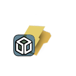
25z43yg.png
 
Last edited by a moderator:
stustaff said:
GuSec said:
Wonderful update there! I like the change you made with the lossless formats!
stustaff: It's a question of personal taste, I think sideways folders are way nicer.
I agree its personal taste and whilst I like the folder images as they are I much prefer them to match the other icons!

here is a quick and dirty re-work ( hope you dont mind taltoris I've done this because for the most part I love your icons)

25z43yg.png


I think I prefer the vertical folders, so I'm pretty sure that's how I'll keep them in this icon set. However, that's not meant to discourage you from changing them. I've provided SVG files that can be edited in Inkscape, so feel free to do so. If you make a modification, then post it and if I think its better, I'll swap it in. The current SVG file can be found here.

Its getting there. Here is the current incarnation:
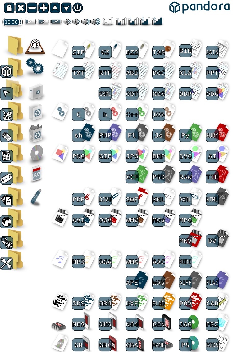
346p0ci.png


To view icons on top of a dark background, click here.

I'm not sure if I'm 100% happy with all of them, but I think I'll sit on it for awhile.

What do you think, guys? Did I miss any?

Edit: added background version
 
Last edited by a moderator:
Lovely. Just try design them while keeping in mind that files will be recognized by mime type first and extension second.
 
Two comments:

1. I think you should fix the perspective on the desktop icon - the bottom piece seems to have a bit too much of the train track effect.

2. You might want to reorient the cartridges for the roms so that they have the insertion part of the cartridge facing down. It seems a bit random the way it is - GB/GBC cartridges are facing down, but GBA/N64 cartridges are on their sides, for example.
 
Changing perspective on the desktop icon could be done, not sure how you want it to face.

There are two possible changes that I can think of are in regards to the cartridge and cd images.
The first is that the icons might look better if the cartridge colors matched the typical color of the game cartridges and had the system logo on the cartridges/cds.
For aligning them, you could either have them with the end to be inserted facing down as suggested by Vorporeal, or you could make their alignment similar to all the other file icons you have created to reach some kind of consistency.

For all the different icons that you have where its the same image but in a different color, I am wondering if there is really a point to doing all that. At a glance with that many colors I don't know how many people will know which shade belongs to a specific file extension. That is what the text in the box is there for. So you may be better off by sticking to one or two color schemes for the icons and just adding text for additional file extensions.
Having different colors just starts to make it look too busy, some people may like it but I think that it might not be necessary or beneficial.
 
By fixing the perspective, I meant that it shouldn't stretch as far towards the vanishing point. The two back corners should be separated a bit - they seem a bit too close together. Too trapezoidal.
 
Maybe a .ko/.la/.so icon, like for kernel modules and libraries? This is Linux after all. :)

Still looking very nice!
 
very nice Icons. But I prefer more monochrome Icons, clean, black/white or another dual color sheme. :) Is there a icon set in this direction we could use for the Pandora? Something like the great "LIQUIDO" skin for GP2X (Gmenu2X) for example. ^_^
 
Exported individual file icons are now available here. I haven't yet exported the other icons (buttons, battery, and the like).

This is not quite an icon theme yet. I haven't had time to work out the names of the individual icons yet. On top of that, I can't get my matchbox setup working quite right in Ubuntu, so I can't really test them.

So the only thing left to be done is rename them, place them in the appropriate folders, and test it. If someone could volunteer to do these last few steps to integrate this into the matchbox desktop and post some screenshots, I would be eternally grateful. Otherwise I'll do it, but it may be awhile before I can get around to it.

PS. For as nice as they look, these 128x128 icons only weigh in at slightly more than a meg. Not too shabby...
 
FWIW, Angstrom has an X86 Qemu image that you could probably set up fairly easily to test the icons with (it has Matchbox set up and running well).

I'm downloading the icons now! Thanks!
 
Back
Top