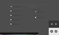
guihints - preview01, 02


I like this idea a lot. The name "guihints" is a bit strange though, perhaps "uihints" or "controlhints" would be better. The current graphics look good to me. Perhaps some guidelines of how to combine them (eg the angstrom example) would be nice, I mean a standard way to denote simultaneous keypresses, consequent keypresses, etc.


One way to use these hints would be to list the keys that are used followed by an explanation of what they do. Another way would be to show the entire keyboard, with the useful buttons highlighted, and their function shown by means of text balloons or small pictograms. This latter method gives a clearer mental picture in my opinion, because the button locations are much more evident.
 
Great that there is now a dedicated thread for usability and interaction design!
If I was a meme, my t-shirt might now state: "Cannot tell whether dry sarcasm -- or just the sad truth." (after all, having a single thread for usability-related issues would not be very usable itself...). For now I will stick with Richard Dawkin's definition of a meme though, and say that usability is not a concern separated from software development -- after all, /every/ software has some level of usability, and be that 'zero'.


That being said, welcome to this thread. ;)


-----

The name "guihints" is a bit strange though, perhaps "uihints" or "controlhints" would be better.
What exactly is it that makes it strange?

One way to use these hints would be to list the keys that are used followed by an explanation of what they do. Another way would be to show the entire keyboard, with the useful buttons highlighted, [...]
Well, both approaches have their benefits and shortcomings. I'm actually already tinkering with combining these approaches.

Perhaps some guidelines of how to combine them (eg the angstrom example) would be nice, I mean a standard way to denote simultaneous keypresses, consequent keypresses, etc.
I'm already working on a set of usage suggestions, as well as some graphics for 'linking' guihints like the ones in the Ångström example.


-----


PS: I'm aware the deadline has passed -- I'm sorry, but quality is more important and I can not spend all of my time on guihints-related things.
 
"guihints" is strange because these are not hints about the graphical user interface (the gui) but hints about the keyboard/button input conventions... whether or not the game or application actually has a graphical UI or a text-based one or whatever is irrelevant.
 
"guihints" is strange because these are not hints about the graphical user interface (the gui) but hints about the keyboard/button input conventions... whether or not the game or application actually has a graphical UI or a text-based one or whatever is irrelevant.
Well, I'm nöt a native English speaker, so I should not talk about this. My general reasoning was exactly as Gruso said, with 'uihints' and 'controlhints' having been my first thoughts, too.


Unless people tell me that they think the name is significantly weird (please do so if you think it is!), I won't change it.
 
Last edited by a moderator:
I have to apologize that I have not released a final guihints version despite the deadline having passed a month ago. This is just a note to inform everyone that this project is *not* halted.
 
I hope you're fine. Somehow i found this thread and was surprised to see the icons of PNDmanager in here. Now i understood why. Christoph, B-ZaR, thank you very much for this. I does look very professional. Double thumbs up and double luck to you two too.
 
Last edited by a moderator:
I hope you're fine.
...yes, why shouldn't I be fine?

Christoph, B-ZaR, thank you very much for this. I does look very professional. Double thumbs up and double luck to you two too.
I don't have a lot to do with PNDManager and B-ZaR doesn't have a lot to do with guihints, other than we've given each other feedback and ideas. There are many other people in this thread who have contributed feedback and ideas, and none of them should be forgotten. (It's not even guaranteed that B-ZaR will read what you've written here. If you want to thank him for PNDManager, it's better to do it in another way, such as via the thread PND management suite)
 
Last edited by a moderator:
Speaking of PNDManager though, it has given me a real world setting to test the effectiveness of the guihints.


What I have found is that I simply don't think of the action buttons by their assigned letters, (using letters to identify these buttons on a machine with a full keyboard itself seems counterintuitive to me but thats tangential to my point) and since I often use the pandora in dim lighting conditions, the letter references don't help me much because I can't easily see the markings on the buttons themselves. That leaves the positional markers, which I find ineffective in the current format. (too small, and the position relative to the other buttons is not apparent at a glance)


Also as has already been mentioned, the current enter key graphic doesn't scale terribly well.


The left and right shoulder button graphics work well.


- Neelix
 
[...] the positional markers, which I find ineffective in the current format. (too small, and the position relative to the other buttons is not apparent at a glance)
Which of the guihints used in PNDManager does this refer to? All of them?


Could you download the images attached to the post at http://boards.openpandora.org/index.php?/topic/7621-pnd-management-suite/page__st__80#entry139998 to your Pandora and describe how the guihints from these images are (not) working for you in comparison to the actual guihints used in PNDManager? The more expansive/informative/'chatty' the description, the potentially better, but a short description would be okay, too.

Also as has already been mentioned, the current enter key graphic doesn't scale terribly well.
Still you understood that it's the enter key's guihint nonetheless -- am I right in assuming that your realization of the enter guihint having scalability issues also was in PNDManager?
 
Last edited by a moderator:
[...] the positional markers, which I find ineffective in the current format. (too small, and the position relative to the other buttons is not apparent at a glance)
Which of the guihints used in PNDManager does this refer to? All of them? Could you download the images attached to the post at http://boards.openpa..._80#entry139998 to your Pandora and describe how the guihints from these images are (not) working for you in comparison to the actual guihints used in PNDManager? The more expansive/informative/'chatty' the description, the potentially better, but a short description would be okay, too.

This refers to all the hints referring to the ABXY gaming buttons used in PNDManager.


As for the comparison you requested, its difficult to get an objective sense of the difference between the two when not using them in an actual use situation (ie where my focus is on what I'm trying to accomplish rather than on assessing the guihint itself) but my impression is that it would not make much of a difference.


Specifically there is not enough emphasis on the 3 button_off indicators for me to immediately grasp the significance of the button_on indicator. The button_off indicators fade into the background as being irrelevant decoration; I do not actually perceive them at all when assessing the hint at a glance. Curiously enough the fact that the button_on position is shown relation to the letter itself also did not always assist with this.

Still you understood that it's the enter key's guihint nonetheless -- am I right in assuming that your realization of the enter guihint having scalability issues also was in PNDManager?

Correct, still in PNDManager. When I actually shift my focus to the Enter Key hint to work out what it is meant to be, I can work it out within a few seconds. (it should not take this long) When I look at it normally all I see is a few dots on a key outline which don't look like anything much at all.


- Neelix
 
Last edited by a moderator:
Specifically there is not enough emphasis on the 3 button_off indicators for me to immediately grasp the significance of the button_on indicator. The button_off indicators fade into the background as being irrelevant decoration; I do not actually perceive them at all when assessing the hint at a glance. Curiously enough the fact that the button_on position is shown relation to the letter itself also did not always assist with this.
That's interesting because they are supposed to fade into the background, as the somewhat bright ring around the hint is supposed to help with finding the button's location.

Curiously enough the fact that the button_on position is shown relation to the letter itself also did not always assist with this.
That's curious indeed. I have no idea how this is possible, and so I don't know what to do about it either.


The newer guihints from the PND management suite's thread are work in progress and have a somewhat 'unclear' letter, but I assume that's not relevant in this case, right?
 
That's interesting because they are supposed to fade into the background, as the somewhat bright ring around the hint is supposed to help with finding the button's location.

The trouble with that is that I don't associate the action buttons with a ring at all, so the ring itself also goes unperceived as irrelevant.

Curiously enough the fact that the button_on position is shown relation to the letter itself also did not always assist with this.
That's curious indeed. I have no idea how this is possible, and so I don't know what to do about it either.
I suspect it is because the letter itself conveys no positional information to me, and I don't associate the letter with the centre of the action buttons on the device. I don't think anything needs to be done about that per se but it does bring me back to the idea that emphasising the position of the button_on in relation to the button_offs is important for representing these keys.

The newer guihints from the PND management suite's thread are work in progress and have a somewhat 'unclear' letter, but I assume that's not relevant in this case, right?
Correct.
 
Last edited by a moderator:
Good news for everyone who thinks that guihints are stupid.


I have attached one image with nub guihints, so you can now tell me just how stupid these are. Oh, and everyone else is welcome to give feedback too.


In particular, I would like to know whether you actually recognize these as representations of the Pandora's analogue pads.

guihints-nubs01.png
 
Last edited by a moderator:
Yes, maybe you can show the directions by moving the disk instead of showing arrows.
 
Last edited by a moderator:
Back
Top