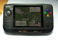
Gpx2 Pic


I also dont like the silver because of the paint chipping issue. My MP3 player is awesome but looks like crap after 3 years of use because of it's silver paint. The black is simply best in my opinion, white shows off dirt and grime way too easily I have to clean off my GP32 after every use or it'll look like something I pulled out of a dumpster.
 
junker posted on Sep 21 2005 at 07:33 PM said:
I too like the silver 2X, but would look a lot better with a matte finish and grey trim instead of black.

anyway, check out this cool snes 2X :D

gp2x.jpg


too bad i wasn't able to change the unit's color..

edit:
yeah, joystick does look a little low

It's not SNES until you fix the button arrangement! :p

(And I'll take the silver model if noone else wants it...)
 

Attachments

  • gp2x.jpg
    gp2x.jpg
    58.9 KB · Views: 183
Last edited by a moderator:
Idk I am not to crazy about the black, I liked the white alot better. Oh well, lets hope they sell total cases that we can replace the old case with.
 
Before you ask, yes I was really bored this evening...enjoy

Metallic Green
15008670a16601763b893442269l.jpg


Famicom
15008670a16601761b164194770l.jpg


Gamecube
15008670a16601760b991649396l.jpg


Graffiti/Doodle
15008670a16601762b352491412l.jpg


Gold MC Escher
15008670a16601759b289427440l.jpg


Might do some more tomorrow at work when I inevitably find myself with nothing to do. Or I might not.
 
I like the black, the silver AND the white one. tongue.gif I'd kill for a lime-green one, though... cool.gif

Dude Orr, did you see me post that on another topic?
Because I said the exact same thing....
Lime Green WOULD PWN. And it'd look sexy with my iPod.
Especially if it was the color of the Alein Ware Comp. cases.

I'd pay 30 bucks extra at least for a lime green.....
 
I hate to say it that "British Racing Green" looks really good, and I really wouldn't have thought it would work. Could be the yellow screen though. Again I would pay a premium for the buttons.
 
Nightmaresquad2 posted on Sep 22 2005 at 02:06 AM said:
I like the black, the silver AND the white one. tongue.gif I'd kill for a lime-green one, though... cool.gif

Dude Orr, did you see me post that on another topic?
I think so and irc I even answered... :ph34r:
Lime-green rules! I need to get into this painting buisiness... :blink:
 
Last edited by a moderator:
silentalarm posted on Sep 22 2005 at 01:05 AM said:
Before you ask, yes I was really bored this evening...enjoy
Graffiti/Doodle
ngp2z0ul.jpg


Looks just like one incarnation of the NeoGeo Pocket. :)
 
Last edited by a moderator:
I have a transparent yellow NGPC (it's a JPN Slimline model).

Now someone do a transparent yellow GP2X mockup and I'll be very impressed. :p
 
yeah, looks like the neo unit with the blue urban camo, right?
anyway, those all look damn nice, silent alarm!!! what method did you use to change the color? messing w/ hue/sat sliders, i wasn't able to change the black much(to white anyway).

a lot of painting fun ahead!! :p

clear yellow? impossible!! :p
 
junker posted on Sep 22 2005 at 01:07 PM said:
yeah, looks like the neo unit with the blue urban camo, right?
anyway, those all look damn nice, silent alarm!!! what method did you use to change the color? messing w/ hue/sat sliders, i wasn't able to change the black much(to white anyway).

a lot of painting fun ahead!!  :p

clear yellow? impossible!! :p


I thought the same thing...I must have subconsiously tried to make it like a Neo Geo, hehe

To change the colour of the unit I traced around the edge and the screen/buttons with the pen tool, then created a new layer over the top and changed the layer properties to 'overlay'. Load the path you drew with the pen as a selection and paint away! (use ctrl+alt+i to toggle between selecting the unit's body and the buttons) You can also mess with the colours more if you adjust the brightness/contrast of the layer with the original pic on it, just mess around and see what happens...

p.s - daminator's photochop is buttery...niceness!
 
Last edited by a moderator:
Back
Top