Black Borders, Bezels, And Other Emusings.

Your display preference

  • Scale to full screen

    Votes: 0 0.0%
  • Black bars

    Votes: 0 0.0%
  • Fancy bezel

    Votes: 0 0.0%
  • Don't care really

    Votes: 0 0.0%

  • Total voters
    0

gruso

thunderbox
Joined
Feb 28, 2008
Messages
7,461
Age
47
Location
Sydney, Australia
Website
pandorapress.net
This is one of those things that sits on your mind until you're bored enough to start a thread about it.

With all the emulators we're going to have access to, there are going to be a ton of different video resolutions and scaling options to deal with. If your preference is just to scale everything to fit the screen (assuming the option is available) then the rest of this thread probably won't be of much interest.

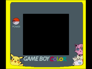
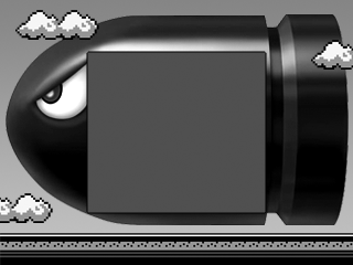
For those who like to preserve the original look of games, black bars/borders will be par for the course. Some emulators use bezels to fill this space, like the nice ones in Lemonboy2x:
default.png
cannon.png


So are you cool with black bars, or would you like a bit of eye candy? If enough people want bezels, perhaps some of our artistic talent could put some designs together in this thread. Personally I like the ones that look like the actual system you're emulating. That sort of theme could extend to classic Commodore/Atari monitors, and old TVs.

Thoughts?
 
I think the virtual screen should be scaled by an integer amount as large as possible, then the rest filled in with a bezel or black bars.

It seems like it should be simple enough to be an option, though:

1. Original size
2. Scaled
3. Scaled with bezel
4. Scaled with no regard for the laws of aspect ratio or antialiasing, to make sure every last pixel on the screen is associated with a virtual pixel, even if it's ugly as sin.

If there's already a windowed / fullscreen option, that might be combined with it.
 
Personally, my preference is to scale up to fill the screen, but keep the aspect ratio and fill the rest in with black. I'm quite picky about the aspect ratio.

The eye candy looks quite nice, but I feel it might prove something of a distraction. The only light emissions I want form my screen are from the content of the game.

That's all my opinion of course.
 
Black bars! I hate it when games scale things out of resolution and ruin the pixel-perfection. It's even worse when the aspect ratio is wrong. Every PSX->PSP port I know of is guilty of this, though, so that makes me sad :(
 
I'm really fussy these days. It has to be unscaled or integer scaled - it's ALL about the pixel art. Something I didn't really wake up to until the crispiness of the GP2X.

I'm kinda torn on the black vs bezel issue to be honest. I love the idea of feeling like you're on the original system, but like Loonie I don't want to be distracted either. Subtle surrounds could work though, maybe with reduced brightness or semi-opaque.
 
The Pandora has the power to put more than just black bars though, we could have things like small audio controls for a music player or options for the emulator on the sides.
 
fischju2000 posted on May 31 2009 at 04:27 PM said:
The Pandora has the power to put more than just black bars though, we could have things like small audio controls for a music player or options for the emulator on the sides.
That sort of thing would be really cool. Some emus on the DS do this on the lower screen IIRC. That would be up to each dev to implement though, whereas a range of bezel designs could be our gift to them. :)
 
Last edited by a moderator:
Black bars are my preference, although what I would actually like to see (and I'm certain we will see, so I'm not going to be asking :p) are options to suit everyone.

Anything else (bezels, extra doodads for the emulator, or whatever) would be too distracting in my view, but again, options to have them are the way to go, I think. :p
 
Having a music player in the emu would be a good idea....
... If the Pandora was like the NDS or iPhone and couldn't run both concurrently.

Incidentally, I wonder how media hotkeys will work on the Pandora. It doesn't really have them, and the game buttons will be tied up when you're playing an emu.
 
OPTIONS!

I think every emulator should have options to let the user do what they want.

To me fractional scaling is the devil. 1:1, 2:1, 3:1 etc is best to me even thought his will mean borders most of the time. Megadrive doubled to 640 x 448 with borders will look much better than having it stretched to a fractional 800 x 480.

But again some will just want full screen even if it looks like crap. That is why there should be options to do everything.
 
^ Yeah, that's what I meant by full screen. Aspect ratio all screwed up.

I should make it clear that my intention with this thread is not to request emulator features. I think it's a given that most emulators will offer scaling options. Just wanting to gauge interest in bezel graphics, and whether or not it's worth putting some together.

[edit] This is the kind of approach I like. Makes use of black space, but doesn't draw your eyes away from the gameplay area:

11rrui8.png
 
I wouldn't want such stuff, especially because the Pandora display isn't too large neither. You could possibly just upscale it to fit the real-device dimensions and it would still look good. (and either make the rest black then or keep the desktop and other windows visible)
Something else I could think about (and many others did) was upscaling to fullscreen, with black bars on the side using some filters like this emulator does it: http://www.gamedev.net/community/forums/to...topic_id=536303 - Looks pretty cool I think!
 
You might also do some ambient lighting in the black bar area, like some televisions supposedly do.
The program samples the colors in the scene, then paints the black bar area with the average color.
 
I prefer to keep the original aspect ratio / black bars

original
fxeut.png


scaled with proper aspect ratio (good)
28ist2u.png


fit to screen (stretched) - bad
ir5jjt.png


this is how it should be imo (the proper aspect ratio ones)
we should have options for all three as well as fancy boarders
 
Gruso posted on May 31 2009 at 09:21 AM said:
[edit] This is the kind of approach I like. Makes use of black space, but doesn't draw your eyes away from the gameplay area:
11rrui8.png


I prefer up-scaling as much as possible.
If I use black bars or a bezel really depends on how much black there is left around the image. If there's only thin black bars at the side then I'd leave it. If there is a lot of black on all sides like in the gameboy example, I would prefer to use a border/bezel.

That one looks nice Gruso and I wouldn't find it distracting at all :)
 
Last edited by a moderator:
Back
Top