Vns Game (really Short....)


deadlychicken22

Man is a reasoning rather than a reasonable animal
Joined
Mar 18, 2004
Messages
1,501
Location
MN, USA
Website
Visit site
Production of my VNS game Fate has slowed to a crawl due to my crappy drawing skills so I've decided to release the first "scene" (I split the game up into scenes and acts). The first scene is very, very, very, short and isn't really a game, its more of an introduction scene, but If you like it, please tell me because I will probably never finish it otherwise. Also, if anyone is interested in helping me draw, that would be greatly appreciated and would speed up the production of the game. Right now I have the code for about 2.5 scenes (the second and third scenes are much longer than the first, although they still aren't that long). I haven't quite finished all of the drawings for the first scene and many of them may look kinda rushed (they actually took me a long time but I suck at drawing. Also, I should note that saintdragon helped on some of the drawings). I have almost no pictures for the second and third scenes done (I have a big checklist of things to draw and am trying to get it done but when it takes me almost an hour to finish one drawing there comes a time when its just not worth it).

Sorry for the chunky writing, I didn't really plan it out very well ;)

Heres the link:
http://www.geocities.com/savemasterchief/fatethegame.zip

Please tell me what you think

title.jpeg


EDIT: If anyone would like to test/debug the second and third scenes for me, please send me a PM.
 
I haven't d/ld this yet, but by the look of your attached screen I'd say that's real stylish! I like the 'non-busy' look of it, too much stuff these days is over-designed.
When I can I'll have a wee play with the vns file.


Edit: Well I just played through that first scene and I like it! Nice sense of suspense, kind of noir-ish story, nice basic pics.
I hope someone who can draw will help you out with this, it'd be a shame to go unfinished. These VNS games are fun.
 
Thanks for the reply. The title picture was drawn by my brother (who is actually pretty good at drawing but doesn't really care to draw anymore for me). I do my drawings in macromedia flash mx 2004 and sometimes GIMP (which I prefer but find more difficult). Please give suggestions on improving (be specific! Possibly even wording that you don't like and have an alternative aproach for). Also, how is the lighting? On my NLU the pictures look really dark but that could just be the absence of a direct light....


All of you artists out there who have time on their hands, I really need help :D
(Send me a PM and I will explain what pics I need)

EDIT: Can anyone help me get the music to work for VNS? I got the gp32 converter and converted some music but when I ran it it ran WAY too fast and then my gp32 reset....
 
It looks great on my Blu+, so now worries there. I like that you put a red screen background behind the text, makes it very legible.
I guess you could make the changes of pics a little slower, but I don't know if VNS allows for a fade effect or not. It'd make for a nice suspenseful environment.
Maybe the descriptions could be a little longer, but I'm not sure. I did speed through it quite quickly which may be an issue.
I think the drawings are spot-on to be frank, I like that simple style you've employed. Too much design and it stops being a novel, becoming a graphic adventure instead. And there's enough of those out there already. This (and WFM) are more like a return to text adventures, nice and atmospheric (and a good deal smarter, though I'll be called a snob for saying so). I even wonder if you'll necessarily need pictures for every location? Has anyone considered doing a purely textual VNS game?
I really hope you get a collaberation going, this is extremely promising. I'm actually kind of excited to see what happens next, seeing my mother's blood through the floorboards is creepy!

EDIT: Pedantic spelling correction. Why does tequilla improve my verbal acuity?
 
Damn I'd help you out if I had time, My own attempts at VNS games took a huge hit when other projects became huge time consuming monsters. I havent gotten a chance to load this on my GP32 so I havent seen it yet but do you scan drawn artwork before using flash or do you just draw right into the program? the one suggestion I can make is to use scans as a guide to draw by.

I'll try to take a look at it soon to see if I can make a more helpful suggestion!
 
Thanks for the positive comments!
Here are the possible transitions:
FADE, WIPR, WIPEL, WIPEU, WIPED, BLINDSR, BLINDSL, BLINDSU, BLINDSD, CLOSEH, CLOSEV, OPENH, OPENV, PIXELREPLACE, NORMAL.
I haven't gotten around to switching any of the transitions yet (was planning to save that for later when I did all of my fine tuning) so they are all NORMAL (just switchs immediatly). I think I will try PIXELREPLACE and FADE later (right now i'm drawing pictures. I already made three pictures tonight but when I view them on my gp they look bad.... Could be becuase I have a NLU. I want to get a BLU but I just don't have the money....) I'm glad you like the pictures, maybe I will continue to do them.... The ones I actually put in the game are the best pics I have made (I drew his bedroom but it sucked so I didn't put it in). The biggest problem I have drawing is how long it takes me (roughly an hour to get 1-2 good pics). The door pic with the shotgun sucks too but I got really tired of redoing it so in the end I decided to put it in anyways.

@Alpha2
I don't scan my drawings because they are simply terrible. The reasons my drawings on the computer look good is because I use an autosmooth function in macromedia flash mx 2004. However, I do search google for ideas and then sketch the basic outline by hand for reference.

EDIT: added some stuff about drawing
 
I've dl'ed it, and I will try it later on and report back. VNS is a pretty cool system.

I'm planning a new VNS project myself (but that will only begin after I get done with Gameparknewbie..
 
I'm currently trying to reword the second scene (its not nearly as realistic as the first which makes me mad). I'm also making drawings for it. I've currently done three of the 9 pictures I need (It would look better with more, but these 9 are required). In the second scene you get to make a lot more decisions, but, ultimately, they don't really affect anything that much....I think I'm going to try to change that so that they do but that makes it much more complicated, plus it might me just completely recoding the second scene (and while coding for VNS is very basic, its a pain to redo ~1000 lines....and add more).

EDIT: To give you an idea, the first scene has 186 lines, the second scene has 1060 lines, and the third scene has ~1000 but is nowhere near complete.
 
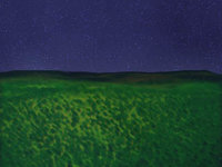
I'm having difficulties drawing so I decided to post on my progress so far:

The coding fot the third scene is nearly complete (its actually a rather short scene but may take many tries to beat). I touched up the writing for scene 2 and now it is at least bareable. I am going to try to make it so that you can explore a lot more in scene 2 (so far its not going very well....) and finish the last 5 required pics and then I am planning on releasing it on this thread.


Also, do you think I should take out the option in the first scene to "go back to bed" or should I take the time to draw some more pictures for it?


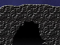
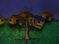
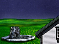
EDIT: Here's the four pictures I have made. How do they look?
mountain-overlook.jpeg

cave-entrance.jpeg

amaro-edge.jpeg

town-center.jpeg


And here's a redone picture for the first scene:
wooden_door_with_gun.jpeg
 
The cave entrance pic could stand to have a few more lines for rock detail and maybe a arched opening. Other than that the art seems to be clear enough for the story.
 
I tried to make the cave more detailed but it didn't look good so I decided to leave it.

EDIT: There are supposed to be people in the one with the fountain thing but I suck at drawing people so I haven't drawn them yet (at least not well enough to release :D ).
 
grrr, il love to still help, but my patience for thing like this get to me!

hmmm, them drawings are scaring me, maybe il fix it abit, i dont mean like good pieaces of art but il tidy abit up later ok.... also if i dont you have to send me a pm, i will forget!
 
If you're interested, I've reproduced your 4 pics as a try; but I'm not a very very good drawer. If you judge them good enough for your job, just tell it on this forum or by PM, I'll be happy to help you ! But if you're not satisfacted, it really doesn't matter !!! ;)

Image1%20pour%20VCS.jpg


Image2%20pour%20VCS.jpg


Image4%20pour%20VCS.jpg


Image3%20pour%20VCS.jpg


PS: I'm french, sorry for my english faults !
PS-2: I can translate the game in french if you want; there is still a big GP32 community in France... :)
 

Attachments

  • Image1%20pour%20VCS.jpg
    Image1%20pour%20VCS.jpg
    27 KB · Views: 206
  • Image2%20pour%20VCS.jpg
    Image2%20pour%20VCS.jpg
    49.2 KB · Views: 210
  • Image4%20pour%20VCS.jpg
    Image4%20pour%20VCS.jpg
    46.9 KB · Views: 203
  • Image3%20pour%20VCS.jpg
    Image3%20pour%20VCS.jpg
    35.6 KB · Views: 188
It would be great if you would translate the game to french. The pictures look great but i'm not sure if I should completely change the art style of the game. I will have to think about it. What does everyone else think? Which art style should I use?

EDIT:Lagagaffe, About translating the game to french, please send me a PM with your e-mail adress and I will e-mail you everything I have done for the game so far so that you can keep up with my writing instead of waiting for each release and then translating it.
 
deadlychicken22 posted on Aug 9 2005 at 06:37 PM said:
It would be great if you would translate the game to french. The pictures look great but i'm not sure if I should completely change the art style of the game. I will have to think about it. What does everyone else think? Which art style should I use?

there really good! one small giffy, they dont fit with the rest of the games style, but yet really good man, gj(good job)
 
Last edited by a moderator:
I am almost done with the second and third scenes... I just need some more pictures and to finish coding a battle in scene 3. I am also (with the help of my little brother) making a website for the game. I will have a forum (mostly for suggestions), pictures, an overview of the story, and news. If I continue to consistently work on the game I am also considering having a way in which people can donate to me through paypal (i am spending most of my free time on this plus paying for domain name and other stuff so a little money would be appreciated). Thanks for your support, please continue to suggest ways to improve.

Also, please tell me which art style you prefer ASAP because I don't want to draw more pictures and then find out they all have to be redone.

EDIT: Does anyone know if I am allowed to enter this into competition if I have already released it?
 
Well, I sent you a PM, but I'me not sure you received them. (but maybe did you get it twice).

Edit: Thanks for your comments, Saintdragon; but I think he's right, he should keep his own pictures, they are too differents, and it woud be too long to redo everything from the beginning...
 
I just finished the code for scene 3. Now I need to draw a lot of pictures for scenes 2 and 3 and tidy up the code and script a bit and then I will release both of them.

EDIT: I just finished the french version of scene 1. I have found only one problem with it and have contacted lagagaffe to help me solve it.
 
Here's the monster/demon I drew for the game:
demon.jpg


Please tell me what you think.

EDIT: The picture quality on the image above is kinda low but the original pic is fine. The original pic is in .bmp format and this forum doesn't support that type so i had to change it to .jpg and I lost some of the quality in the transition. Damn macromedia conversions... I shoulda used GIMP (thats what I used for the others).

EDIT2: Here's a higher quality one (done in GIMP, of course)
demon..jpeg


EDIT3: and here he is standing
demon2.jpeg
 
Back
Top