Pyra website improvement suggestion


the_marshal

Very Active Member
Joined
Aug 27, 2010
Messages
212
Just a quick list of info that might need a small update, some broken link - nothing major, just thought I'll made a quick list.
Maybe Evildragon (or is someone taking care of the site) can take a look at some point.
  • https://pyra-handheld.com/boards/pages/pyra/
    • "The Pyra is upon us!" section needs a bit of an update as production (pre-order) Pyra are now shipping
    • "Visit our Image Gallery" point to a page does doesn't exist
    • Suggestion: Add direct link to "Firmware image" (similar to Pandora)


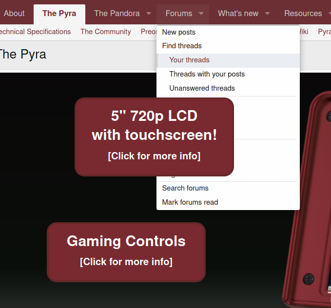
  • Some of the page element are displayed on top of the menu
    • Only noticeable if closing the "Preorder now" banner
1622632332901.png
 
Yeah, I'm not that good designing websites myself, that's why so many design errors are there...
Is there anyone who could help? :)
 
And the few pages that exist but are not linked anywhere so you have to google them.
Like the pandora wiki or pre pandora stuff like the old repo.

And the embedded irc webchat points to freenode too.
 
And the embedded irc webchat points to freenode too.
I updated https://pyra-handheld.com/wiki/ - link now point to Libera Webchat, no sure if you're referring to something else

Yeah, I'm not that good designing websites myself, that's why so many design errors are there...
Is there anyone who could help? :)

I imagine you're thinking of redesigning the whole front page, other related pages... considering Pyra are now shipping, that would be nice.

I don't feel I have the time and skill to do proper a Web design. I'll try to update the Wiki and help in some way if I can though.
 
The issue in the image seems to be solvable by changing:
CSS:
.p-navSticky {
    z-index: 100;
}

to
CSS:
.p-navSticky {
    z-index: 500;
}

I see that in css.php:29 but you may see it in app.less

If that's not a proper place to do changes you could maybe just add somewhere:
CSS:
div.p-navSticky.p-navSticky--primary
{
    z-index: 500;
}

I'm not good with choosing colors or fonts or anything aesthethic, but if someone points me to a code repository and people test and make a list of bugs I can try and give it a look. Someone else should ideally review any patches I'd propose.
It needs to be the other way round. The forum is basically properly set up - and the main information is one page with all these infos.
It's a standard HTML page.

You can find the HTML page here:


I'm happy about any improvements by someone who knows what he's doing :D
 
Then substract 50 from all those z-index properties.
 
  • Like
Reactions: rSl
And the few pages that exist but are not linked anywhere so you have to google DDG them.
Like the pandora wiki or pre pandora stuff like the old repo.

And the embedded irc webchat points to freenode too.
FTFY ;)
 
Back
Top