Pandora Logo?


Cauterize said:
panlayout1.jpg


panlayout2.jpg
Those are really nice, they look very good on the device.
I think I like the first one best. I'm not a big fan of the little '+' symbol though, it reminds me of a hospital-related logo.

I would prefer a 'box' logo, like the one from evilwallpaper: it's consistent with the name, and the symbol is clear and strong.
 
Last edited by a moderator:
craigix said:
I'm interested in your ideas for what the official pandora website should look like too, friendly & simple? Geeky? etc.
By all means, avoid that traditional "shiny" corporate style as you can see here. Those sites don't look any different from placeholder sites for some reserved domains, they all use the same shiny vectorial graphics and the clip-art photographs that are hardly even related to what they do.

Avoid the shiny, it's a trap everybody falls in, but on the other hand be sure to avoid the circa 1996 Geocities look.

As for the logo.. what about a logo with letters made off a hundred Pandoras? J/k. I think what's needed the most is a kick ass font that stands out, like to one font used on the PowerPC logo. That font was bad-arse.

As for what's been done, well, that's nice and shiny in a good old 2000's fashion, but nothing stands out really, they all just look like yet another logo, you know..

Oh wait, I just had a tremendously awesome idea! A contest on deviantART! It would consist in creating an original looking and standing out Pandora logo and the winner would win err.. $250?
 
Last edited by a moderator:
Everybody knows that &=and. Therefore any idiot will arrive at P&|A=PAND?A at the very least.

I think if they know the system is called Pandora they will be able to figure out what it means. Anybody that thinks "I won't buy that, the logo sucks" can fuck off and die basically.
 
Yes, I'm liking the designs, but I do feel that P&|a should be incorporated somewhere... even discretely. Of course that's just my opinion.

evilwallpaper's box logo is great, and as Dubya' says it would look awesome with Cauterize's font :)
 
LHC said:
Everybody knows that &=and. Therefore any idiot will arrive at P&|A=PAND?A at the very least.

I think if they know the system is called Pandora they will be able to figure out what it means. Anybody that thinks "I won't buy that, the logo sucks" can fuck off and die basically.

This thing is supposed to appeal to geeks, not chavs. Having leet speak in a logo looks utter cack.

I quite liked Cauterize's 'New combination designs' (particularly the second one) myself.
 
Last edited by a moderator:
White Demon said:
LHC said:
Everybody knows that &=and. Therefore any idiot will arrive at P&|A=PAND?A at the very least.

I think if they know the system is called Pandora they will be able to figure out what it means. Anybody that thinks "I won't buy that, the logo sucks" can fuck off and die basically.

This thing is supposed to appeal to geeks, not chavs.

Even if this is the case, I'd expect geeks to be far less likely to give a shit about the logo than chavs.
 
Last edited by a moderator:
Only just found this thread, I'm a graphic designer, sorely in need of something cool to design for, so I'm going to have a crack at this and I'll post something up ASAP...

...I never made the deadline for the old GP2X contest, I had a name and a logo all artworked up before I heard that they'd chosen the 'winner' already, so I don't want to miss this one!

®
 
A_SN said:
Oh wait, I just had a tremendously awesome idea! A contest on deviantART! It would consist in creating an original looking and standing out Pandora logo and the winner would win err.. $250?


WORD!
 
Last edited by a moderator:
The winner should get a Pandora...

...and not be limited to Deviant Art either, unless you're planning on a poetic-angst-ridden-manga-vampire-emo logo...

®
 
Cauterize said:
evilwallpaper said:
something Ive been tinkering about with

pandy878.gif
Now that is impressive! I like it alot!

All of the desings everyone is bringing out now are fantastic :)


craigix said:
I'm interested in your ideas for what the official pandora website should look like too, friendly & simple? Geeky? etc.
Been trying out a possible web layout design etc
Its just a very quick mock up though...

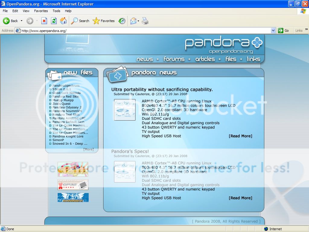
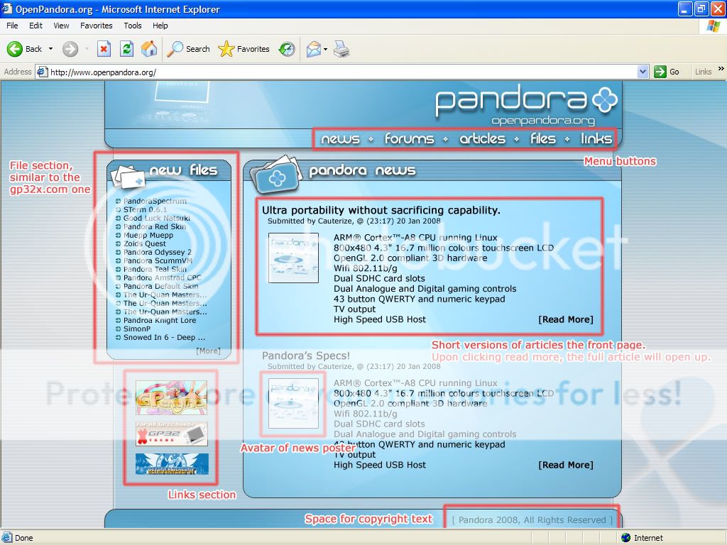
I personally feel that alot of the current gp32x features should be implemented. The news system works great, the new files are easy to access and so on.

websitemockup03.jpg


websitemockup03annotations.jpg


As for this design, dont forget its a single scrren view. The finished page would scroll and feature alot more news reports and the 'recent forum posts' box that were all familiar with!


For those who didnt see my designs earlier today, the ones that are used in this layout. Here is a link to them
http://www.gp32x.de/board/index.php?s=&am...st&p=581728


ill be back shortly ;)

Adam


:eek: :eek: :eek: :eek: :eek: :eek: :eek: :eek: :eek: omdays this is perfect but your only missing one thing a buy option on the menu were we can buy the pandora and stuff for it :p this is the layout out of choice i'm sold! could we change it now i'm eager :D :lol:
 
Last edited by a moderator:
Wow, fantastic webdesign by Cauterize! Love this one. Lot of sites are too crowded or flashy, with some tweaks this one will be great.
 
Not too sure about that site design, in terms of structure it looks fine, but it IS too flashy, lots of drop shadows, text and headings as graphics rather than HTML, and just basically no calm space at all. Every single pixel is screaming it's heart out.

I'm working on something at the moment, but basically, I think we should be a bit more 'quietly confident'. If the logo and the identity is strong, the website shouldn't have to try that hard, it should just work and not get in the way.

This whole thread is great though, is this a structured response? Is Craig going to officially accept suggestions from us here?

®
 
evilwallpaper said:
something Ive been tinkering about with

pandy878.gif
Somehow I think at the Gamecube Logo. I hope Nintendo doesn't think the same... ^^"

A quick Idea of me, plain, simple Logo. The "Font" is just an example (I have done this Logo completely per Hand with Blender :lol: ) I like the Idea of an included Box into the Logo.

pandoralogoke9.png


pandoralogo2tn8.png
 
Last edited by a moderator:
Good looking, but maybe something smaller, considering we're gonna view it on the pandora :)

EDIT: I meant the webpage.
 
White Demon said:
LHC said:
Everybody knows that &=and. Therefore any idiot will arrive at P&|A=PAND?A at the very least.

I think if they know the system is called Pandora they will be able to figure out what it means. Anybody that thinks "I won't buy that, the logo sucks" can fuck off and die basically.

This thing is supposed to appeal to geeks, not chavs. Having leet speak in a logo looks utter cack.

I quite liked Cauterize's 'New combination designs' (particularly the second one) myself.


What are you talking about...? It's not 1337 at all. If anything it's coder speak... something that is very geeky and hence entirely fitting.

7/ ]-[ ][ 5 ][5 /_ 3 3 7/
th15 15 1337
(translation: This is leet)

This is not: P&|a
 
Last edited by a moderator:
I really love some of the suggestions here :)

This is my contribution (sorry for the large pictures).


pandlogo2.jpg


pandlogo4-1.jpg
 
Ooooh, nice work, Eolair!

Tell me, what are your ideas/ reasonings behind the logo?

EDIT:
cowai said:
Good looking, but maybe something smaller, considering we're gonna view it on the pandora :)
Um, the width of it is well within the limits of the Pandora. I do find that 90% of the sites I visit take up way too much space up top, though, so I agree in the vertical sense.
 
Last edited by a moderator:
Magnulus said:
Ooooh, nice work, Eolair!

Tell me, what are your ideas/ reasonings behind the logo?
I'm not too sure about the logo, but I didn't feel like making another box. There are plenty of box suggestions already and good ones too :)
So I thought about making an eye design instead. Something with antiquity and elegance in mind. I just went with that ;)
 
Last edited by a moderator:
Back
Top