Official Portable Famicom == Gp32 Ripoff?


pocket-famicom13.jpg


Who else thinks this new officially licensed portable famicom looks like the GP32?  I know, the GP32 is basically a GBA ripoff, but the curves down the bottom and the white coloring are, AFAIK, unique to the GP.

The gp32 came before the GBA. And these guys have actually managed to make
it uglier :eek:. I don't think the gp32_console is that ugly, but this *ugh*...

edit: Actually I think this looks more like a GBA...See the D-PAD, one (1) speaker, and both the start and select buttons are on one side.
 
Last edited by a moderator:
Can't the thing just look like itself..? :unsure:

And the GP32 did not come before the GBA. GamePark was throwing around hideous vertical designs and things until a little while after the original GBA was revealed. Then the GP magically transformed itself into something that looks uncannily like the GBA. But that doesn't really matter because I think the GP32 is by far the better design of the two.
 
I never thought the GP32 was ugly, although my vision could be clouded with love.

The only thing "wrong" with the look of the GP32 is the Color. It actually looks pretty good in black.

That portable Fami thing has a screen size of only 2.5" ? That makes the GBA screen look big, ouch!
 
Last edited by a moderator:
The nes doesn't really have a big screen resolution.

I think the handheld game systems that are independent from the major game companies look cool, simply because they're different from everything else. :D

Seriously, the only reason I wouldn't have a NeoGeo is because I don't know what games are for it... heck, I haven't even heard of it until a few years ago. Same story with the gp32.

But anyway, on topic, that portable famicom looks like itself. I really can't think of anything it looks strikingly similar to. Like, the gp32 looks a lot like a gba at first sight, but that portible famicom doesn't really look similar to anything. That neogeo either. :p
 
maybe there are only a few ways that a handheld can work...


screen in the middle, and controller parts on the sides... 99% of handhelds have followed this formula. everything else is cosmetic.


for bonus points, name one handheld that *hasn't* followed that formula, and provide pics...
 
I do actually think the GP32 would have benefitted from 4 buttons like that. That would make it easier to do two player games on the same GP ( (1) D-Pad + R-Shoulder + Start, (2) 4-buttons as a D-Pad + L-Shoulder + Select).... not to mention better control for emulators etc
 
Are you talking about that third image in Drag's post, Jarska? Because that image is a prototype of the GP32.. not a TurboGrafx.

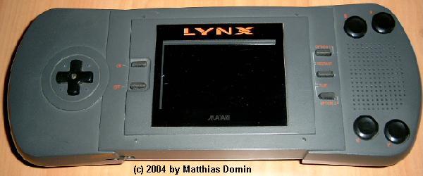
Indeed. It says so in the machine. :p However, Turbografx and Lynx are my entries to the non-standard button/screen placement competition, to which the pictures in Drag's post were for, too. :)
 
Last edited by a moderator:
Well, that's a prototype.

I think the Portable PC-Engine looks quite different. And Lynx could be turned upside-down, IIRC, and payed like that. That's innovation.


You could indeed turn the Lynx upside down. The manual said it was so the system could be used by "Lefties" - presumably left-handed people, not liberal minded people.

It also meant that it worked very well when played vertically too and because the screen was kind of widescreen, games like Klax rocked.

J(ohn)
 
Last edited by a moderator:
You could indeed turn the Lynx upside down. The manual said it was so the system could be used by "Lefties" - presumably left-handed people, not liberal minded people.

I honestly don't really see how this would help lefties..
If they've been playing games on any other console at all then they would already be used to the directions being on the left.. not the right...
 
Back
Top