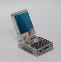
Is the Pyra beautiful? (mathematically speaking, Φ phi)


FBnil

They'll own everything and be miserable.
Joined
Dec 14, 2012
Messages
5,118
Location
Yurp
Pandora's dimensions, taken from the website are 140×83 mm

Now phi Φ has a value of 1.618 and represents the Golden Ratio (things in those proportions are "beautiful")

Thus, 140 ÷ Φ = 86.526, which means the Pandora is just 3.5 mm shy from having these divine proportions.

The screen though (without the bezel) is 9.5 and just shy from 5.8, the golden ratio... so what about the Pyra?

Pyra's dimensions, taken from the website are: 139 × 87 × 32 mm (and why does the site use x instead of × ?)

139 ÷ Φ = 85.9085 so that is just 1.1 mm shy from the golden ratio, much better than the Pandora.

As for the screen, I'll have to count pixels in a rendering, which are 1393 × 789

The result is 861, which is 72 pixels (15%) away from 789 pixels. Granted, it is now a wide screen, so this is expected.

The logo inlay also does not have the phi ratio, unfortunately.
 
maxresdefault.jpg


Probably...
 
Pyra's dimensions, taken from the website are: 139 × 87 × 32 mm (and why does the site use x instead of × ?)

139 ÷ Φ = 85.9085 so that is just 1.1 mm shy from the golden ratio, much better than the Pandora.

Cool! That's close enough, I guess. Maybe the shoulder buttons stick out by exactly the needed 1.1 mm?

The display is 1280x720 square pixels to suit HD video, so about 1.78:1; but if you put 56 or 64px-wide toolbars at both sides, that leaves the middle part very close to the golden ratio while keeping both dimensions a multiple of 16px.
 
Last edited:
Pyra may be close to the Golden ratio but for me, it's just not that "beautiful" design at all. A brick may fit in the Golden ratio but this doesn't make it a beautiful brick. ;) maybe with half the thickness but the Pandora/Pyra is actualy not a nice design. It may be functional and good but not "beautiful". Of course these are just opinions and everyone may have adifferent one.
I would have done an different design if I would have had the opportunity but OK, we have to live now with the current pyra appearence.
 
I like dark bricks, they give me a feeling of down to earth no fringes reliability.
Something you may not instantly fall in love with but will love dearly once you really get to know it and got used to it.
The exact opposite of all the rounded bright designer items which are gone like they come: in a flash.
 
Pyra may be close to the Golden ratio but for me, it's just not that "beautiful" design at all. A brick may fit in the Golden ratio but this doesn't make it a beautiful brick. ;) maybe with half the thickness but the Pandora/Pyra is actualy not a nice design. It may be functional and good but not "beautiful". Of course these are just opinions and everyone may have adifferent one.
I would have done an different design if I would have had the opportunity but OK, we have to live now with the current pyra appearence.

Well, most of the design proposals I've seen from you are rounded shapes, rounded shapes and rounded shapes.
Which is what I personally hate on modern devices. In my opinion, the GPD Win is really really ugly. The GPD XD looks a lot better.

But that's how different opinions can be :)
 
Well, most of the design proposals I've seen from you are rounded shapes, rounded shapes and rounded shapes.
Which is what I personally hate on modern devices. In my opinion, the GPD Win is really really ugly. The GPD XD looks a lot better.

But that's how different opinions can be :)
I never sayed I'm talented enough to visualize my imaginations. ;) "Rounded but not round" may be the trick, at least for tiny "sharp" edges. I had some ideas about more sloped shapes but of course that's all just theory since I can't print out these shapes for testing how it feels(3D printers are the future of course).

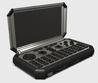
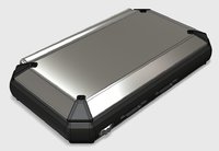
Maybe something like that, more "streamlined" overall but not really rounded, nothing new actualy but just to get some direction. Overall just plain sloped but the transitions between the angles are basicly all rounded a little bit:

P2 alt case 01.jpg P2 alt case 02.jpg P2 alt case 03.jpg

OK, current Pyra Battery would not fit (must be shorter but could be thicker/wider to fit) base is higher here and lid thinner, but overall (almost) the same measurements but looks thinner imho. Materials are hard rubber or rubberized plastic and metal at least for the base top for heat spreading...
Yes, I know it looks like a Sandwich-Maker! :p

I think ED just confirmed that the successor to the Pyra will look like a tiny ThinkPad. :D
I like the Think Pad design, at least the thinner ones.
I like the "rugged" design of some Panassonic Toughbooks and also some more sleak designs if done right. The new HP Spectre 13 is not that bad designed actualy.
 
Last edited:
Back
Top