You are using an out of date browser. It may not display this or other websites correctly.
You should upgrade or use an alternative browser.
You should upgrade or use an alternative browser.
GuiHints for the Pyra
- Thread starter pmprog
- Start date
skeezix
Internal Development
Bundling the images.. thats a pretty good idea. Need 'em in svg and raster 
jeff
jeff
- Joined
- Jan 18, 2010
- Messages
- 11,483
Since we have a Pyra specific Debian repository setup, we could have an official package that can be installed by default and updated when needed.Okay, so not technically OS development, but will there be a new set of GuiHints (or at least an update for the new buttons)?
Could they be included in the OS too? So programs could refer to them without the need to redistribute?
levi
Still fresh, damnit!
In case the smiley doesn't mean you're joking (or for anyone else visiting I guess), Guihints are the icons that represent the buttons of the Pandora, most obvious (to me) in PND Manager, but available to any developer who wants to use them.
rygD
Nihilistic Mystic
Don't we need to know what the button markings will be before we can decide if this is needed?
Last edited by a moderator:
levi
Still fresh, damnit!
It could begin in the Pyra repo as just being the Pandora buttons plus (+) and (-) buttons (or maybe 'ins' and 'del' ones), and once the final design and plastics have been decided upon, can be updated to look more like they will do in reality.
pmprog
DNF (Did Not Finish)
- Joined
- Apr 25, 2011
- Messages
- 4,150
Not at all! You need to know the button markings before they can be made, but you can certainly decide if you want them before that.Don't we need to know what the button markings will be before we can decide if this is needed?
rygD
Nihilistic Mystic
Ok, well I don't think they are needed unless the Pyra gaming buttons will have some sort of confusing markings like the Pandora has. If it gets PgUp/PgDn/Home/End/Ins/Del there is no need. Since we don't know what will be on those buttons it probably makes sense to wait to decide if they are needed.
- Joined
- Jan 18, 2010
- Messages
- 11,483
I'm still confused that people think the Pandora markings are confusing.Ok, well I don't think they are needed unless the Pyra gaming buttons will have some sort of confusing markings like the Pandora has.
rygD
Nihilistic Mystic
I agree up to the point where a program, other than a game, says "Press X for something" since there are 2 things with that label. In a game I would assume X is the X button, if that doesn't work I try the X key (and in an emulator I will have it mapped to the location of X on that console's controller, so now a third location for X, but this discussion is about native software). I think most people would find it easier to understand if it said "Press PgDn"...but that is not how they are labeled on the Pandora, so it would potentially be more confusing, which is why I suggest waiting before devoting effort to this.I'm still confused that people think the Pandora markings are confusing.Ok, well I don't think they are needed unless the Pyra gaming buttons will have some sort of confusing markings like the Pandora has.
I am not sure how you can work on something without knowing what you will be doing, but pmprog insists that it can be decided now if they will be needed. I don't know what the expected next step is after the uninformed decision is made.
Neelix
Insecticidal Maniac
Ok, well I don't think they are needed unless the Pyra gaming buttons will have some sort of confusing markings like the Pandora has. If it gets PgUp/PgDn/Home/End/Ins/Del there is no need. Since we don't know what will be on those buttons it probably makes sense to wait to decide if they are needed.
I'd say that you're missing the point. There doesn't have to be anything confusing about the keyboard markings for GuiHints to be useful.
The point is to communicate what each button does in whatever program uses them in a clear, and increasingly familiar way. They can help ease the learning curve for learning the button mapping in any particular application or game. It also helps provide a uniformity across different software packages that suggests a level of polish that a truly open platform can't otherwise achieve.
I think having a set included in the base OS is an excellent idea.
-Neelix
rygD
Nihilistic Mystic
There wouldn't be uniformity unless someone is going to add them to everything on the Debian repo, and anywhere else someone might get their software. A common way to inform users of what keys do in a particular program is to have it listed next to items in the menus. These are usually just text, identifying modifiers and keys to press. Is there some major problem with doing things that way that is solved by using images that will require more storage and larger file sizes?
Neelix
Insecticidal Maniac
Nothing in the debian repo will be customised for the Pyra, but that doesn't mean there won't be Pyra specific software, and Pyra specific versions of software. I would like to see them used for any OS interfaces, and anything Pyra specific, I'm sure there'll be equivalents of the Pandora's PND Manager and SysInfo for example.
-Neelix
-Neelix
rygD
Nihilistic Mystic
I prefer text that can be resized to an appropriate size on whatever display I am using, and which will fit with the theme I am using. I suppose if you all want to make pictures instead, go for it. It makes more sense to me to keep everything simple and let users decide what they want things to look like.
rygD
Nihilistic Mystic
Then explain to me what is being discussed here.@rygD: I suppose you are speaking about something else...
PowerGod
Forum Addict!
- Joined
- Jun 20, 2011
- Messages
- 4,634
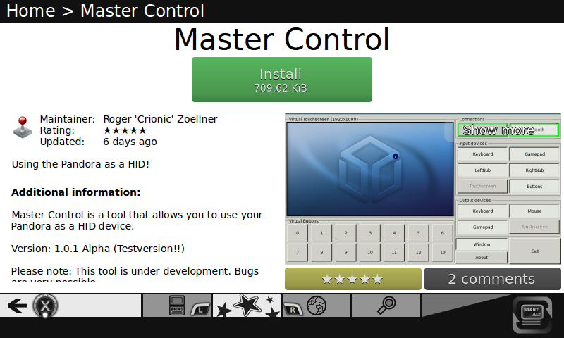
You can see them used on the lower left "X", the lower right "Start/Alt", also the little "L" and "R"... those are logos, not just characters, for example note the little dot under the "X", it represent the position of the button... if you look at the "Start/Alt" you can see on the bottom 2 lines that represents the other two keys in the same area of the keyboardThen explain to me what is being discussed here.@rygD: I suppose you are speaking about something else...

Last edited by a moderator:
rygD
Nihilistic Mystic
In other words, exactly what I am talking about. Why not use a short character string if it matches both the function of the button/key and the markings on it? The user can optionally add pictures if they fit their needs. Those (button and key markings) must be selected before you can decide if a picture or text is the better choice. People are free to make pictures until then.You can see them used on the lower left "X", the lower right "Start/Alt", also the little "L" and "R"Then explain to me what is being discussed here.@rygD: I suppose you are speaking about something else...

levi
Still fresh, damnit!
The benefit of the GUIHints buttons versus text is that they not only document what the button is called, but also what it looks like and that little dot also indicates its position within the diamond. A picture is worth a thousand words and all that. They don't document its function in a textual environment, so text wins there and should be used in preference to the GUIHints icons in those contexts, but I think the icons win when explaining game buttons and the likes.
Those indicator dots will probably need rethinking for the two new buttons at least. Perhaps diagonals would do fine, or perhaps they're not that close to the diamond so some alternative representation would be best.
You could argue that we shouldn't make icons and include them in the distro until we know if anyone wants them, but I want them, and I don't think we need to know exactly what they look like, since they can be updated at any time. We just need to have consistent dimensions so that if anyone includes them in a layout now they won't get messed up later; and should the representations of the two smaller buttons also be smaller than the main A/BX/Y buttons?
I suppose you'd argue that if everyone has to implement a layout that can reflow to accept icons or longer text, then the size of the icons isn't actually that relevant, but on that front I wouldn't want to require devs to make adaptable layouts for every use - in games and similar interfaces, being pixel-perfect is often more important that a user's whim about whether text or pictures is preferable.
Last edited by a moderator:
rygD
Nihilistic Mystic
Believe it or not, I am not trying to argue completely against them. I just think it makes more sense to wait to see if they are needed. Since several of you have decided they are, I have a couple questions.
Can they be made to not take up much screen real estate and still be legible/easy to identify?
Can they be added to the smileys here?
Actually, can we add the Pandora ones to the smileys here now?
Can they be made to not take up much screen real estate and still be legible/easy to identify?
Can they be added to the smileys here?
Actually, can we add the Pandora ones to the smileys here now?
Similar threads
- Replies
- 131
- Views
- 39K
- Replies
- 51
- Views
- 11K
- Replies
- 18
- Views
- 4K
- Replies
- 9
- Views
- 5K
- Replies
- 40
- Views
- 13K

