efegea
Active Member
Here it is, the new design I've been planning for Pangea, the simple mode interface for Pandora on which I'm working on.
Originally, Pangea idea was a simple interface with an screen with a list of categories and applications icons, where the layout was taken form a .xml skin file. The idea was that each component was a widget, and that users would be able to develop new widgets and modify the skin as they liked.
But I wasn't convinced about the design, neither the way to develop it. That made me to redesign it again from scratch a lot of times. But thanks to the new QML - or Declarative UI - technology of the Qt toolkit - the toolkit used to develop Pangea - and after a lot of discarded ideas, I've found what perhaps could be the definitive Pangea interface. I like to call it Pangea PINJALA - Pangea is not just a launcher anymore.
The design
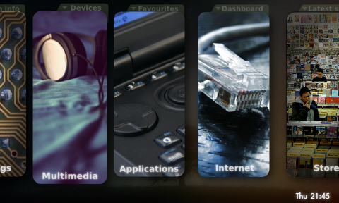
This is a concept of what could be the Pangea look when on the main menu. It consists of a row of buttons named after each of the Pangea sections. You can switch them by using the d-pad, or you can touch them on the touchscreen. You can also do iphone-like kinetic-scrolling.

Now, what you can't see on the picture:
Each button has on the top a little tab. That tab means that you can open an area where you can see, for example, favourite and most used applications, or an area with internet widgets -social networks, rss....- To open it, just slide your finger from the top of the screen downwards, or press "down" on the d-pad. The area will show up with a nice animation. To hide it, just press "up" or slide the finger upwards, although it's not needed to hide it, you can still switch the big buttons without having to hide it.
If you press one of the main menu big buttons, a new screen will be shown, depending on the selected option:
-Applications: launcher mode
-Store: app store mode - for this, the Pandora app store MUST have an API for applications to interact with it.
-Multimedia: media player mode - integrated player or external one, configurable.
-Internet: to be decided
-Settings: the configuration..
Pictures are placeholders. They are Creative Commons pictures taken from Flickr, but I haven't asked for permission yet. In the future I'll ask for help to find better pictures with permission for use on Pangea. The words used also have to be changed for better ones.
At this moment I'm working on a prototype with this design..I hope I can upload a video soon!!
Nothing from this design is definitive, anything can still be modified.
That's all. I'll update the post in the future. Now you can comment, discuss and suggest
Originally, Pangea idea was a simple interface with an screen with a list of categories and applications icons, where the layout was taken form a .xml skin file. The idea was that each component was a widget, and that users would be able to develop new widgets and modify the skin as they liked.
But I wasn't convinced about the design, neither the way to develop it. That made me to redesign it again from scratch a lot of times. But thanks to the new QML - or Declarative UI - technology of the Qt toolkit - the toolkit used to develop Pangea - and after a lot of discarded ideas, I've found what perhaps could be the definitive Pangea interface. I like to call it Pangea PINJALA - Pangea is not just a launcher anymore.
The design
This is a concept of what could be the Pangea look when on the main menu. It consists of a row of buttons named after each of the Pangea sections. You can switch them by using the d-pad, or you can touch them on the touchscreen. You can also do iphone-like kinetic-scrolling.
Now, what you can't see on the picture:
Each button has on the top a little tab. That tab means that you can open an area where you can see, for example, favourite and most used applications, or an area with internet widgets -social networks, rss....- To open it, just slide your finger from the top of the screen downwards, or press "down" on the d-pad. The area will show up with a nice animation. To hide it, just press "up" or slide the finger upwards, although it's not needed to hide it, you can still switch the big buttons without having to hide it.
If you press one of the main menu big buttons, a new screen will be shown, depending on the selected option:
-Applications: launcher mode
-Store: app store mode - for this, the Pandora app store MUST have an API for applications to interact with it.
-Multimedia: media player mode - integrated player or external one, configurable.
-Internet: to be decided
-Settings: the configuration..
Pictures are placeholders. They are Creative Commons pictures taken from Flickr, but I haven't asked for permission yet. In the future I'll ask for help to find better pictures with permission for use on Pangea. The words used also have to be changed for better ones.
At this moment I'm working on a prototype with this design..I hope I can upload a video soon!!
Nothing from this design is definitive, anything can still be modified.
That's all. I'll update the post in the future. Now you can comment, discuss and suggest


