PandoraRox
Still Fresh
- Joined
- Oct 25, 2008
- Messages
- 41
Hello, my name is PandoraRox, and I have an idea. I realized early on that the Pandora will have many emulators, with inconsistent menu systems and control mapping, and I decided that there must be a better way.
Thus I came up with this type of hierarchical menu system, and I think that it will make gaming on the Pandora more intuitive and beginner-friendly.
Here is the first picture:

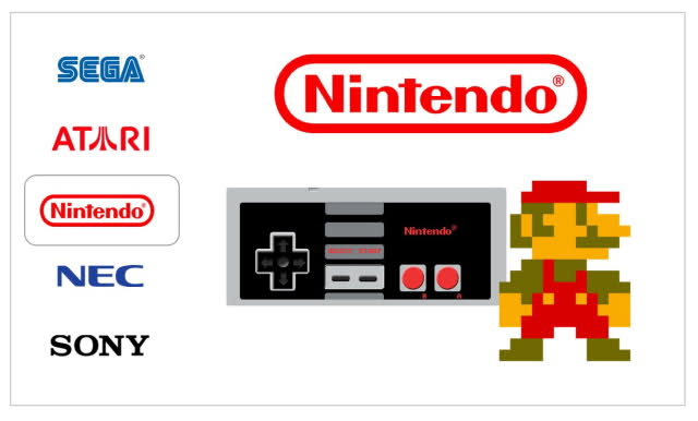
As you can see, this menu system shows the different video game brands. you can scroll through the logos with the analog stick or control pad. The parts that move are the logos. There is also a splash screen for each manufacturer. You can select with the select button.
If you click on Nintendo, it shows this:

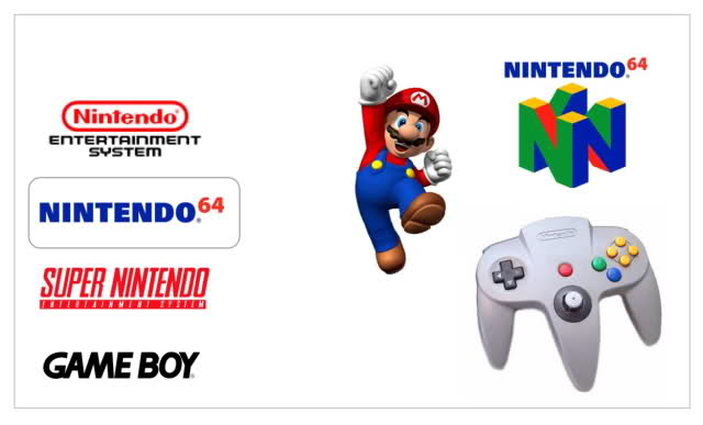
As you can see, it shows a list of systems, both console and handheld, to choose. You can select up and down. It has a splash screen, a logo, and maybe a description could be put in place.
If you click on Nintendo 64, it shows this:

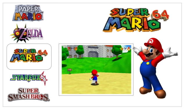
It has a list of games, and you can scroll up and down. The game starts up in the background, showing you how it works. There is a logo and there can be a description of the game.
If I click on Mario 64, it shows the game:

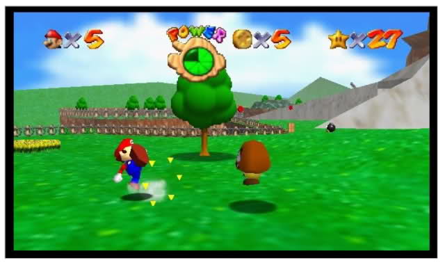
You can control the game and bring up settings.
So in 4 clicks, you can get to any game on your machine. I think that it would bring a level of usability to the Pandora that may not be found in regular consumer devices. Now, I am not a coder. I am presenting my idea with hope that this community will be able to do what I can't. If someone does decide to do this, I will be happy to provide any ideas, images, or help with the design of the menus that you may need.
Thus I came up with this type of hierarchical menu system, and I think that it will make gaming on the Pandora more intuitive and beginner-friendly.
Here is the first picture:
As you can see, this menu system shows the different video game brands. you can scroll through the logos with the analog stick or control pad. The parts that move are the logos. There is also a splash screen for each manufacturer. You can select with the select button.
If you click on Nintendo, it shows this:
As you can see, it shows a list of systems, both console and handheld, to choose. You can select up and down. It has a splash screen, a logo, and maybe a description could be put in place.
If you click on Nintendo 64, it shows this:
It has a list of games, and you can scroll up and down. The game starts up in the background, showing you how it works. There is a logo and there can be a description of the game.
If I click on Mario 64, it shows the game:
You can control the game and bring up settings.
So in 4 clicks, you can get to any game on your machine. I think that it would bring a level of usability to the Pandora that may not be found in regular consumer devices. Now, I am not a coder. I am presenting my idea with hope that this community will be able to do what I can't. If someone does decide to do this, I will be happy to provide any ideas, images, or help with the design of the menus that you may need.


